How to Design a Logo With AI: A Practical Guide
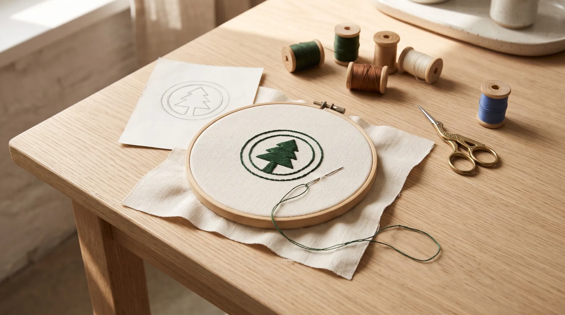
To design a logo with AI, write a short brief first: the name, what the business does, its personality and the smallest place the logo must work. Choose a logo type, then generate several concepts with a text-capable image model, asking for bold, simple shapes and two colours at most. Pick one direction, refine it with targeted edits, make horizontal, stacked, symbol-only, one-colour and reversed versions, and test them at favicon size and in real mockups before you finalize.
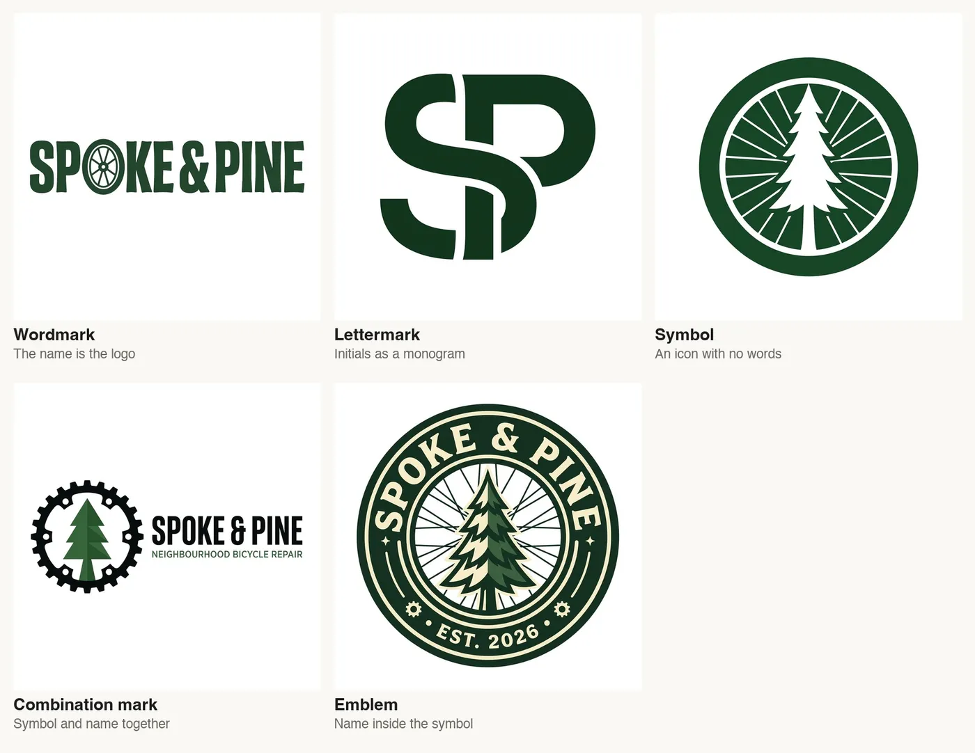
Five logo types for the same made-up shop, Spoke & Pine, generated on getimg.ai.
What Makes a Good Logo
A good logo is less about how impressive it looks at full size and more about how reliably it identifies a business everywhere it appears. Designers judge logos on a handful of qualities, and each one can be checked in a few seconds. The table below lists them with a quick test you can run on any AI-generated concept.
Quality | What it means | Quick test |
Simple | Few shapes, no fine detail | Can you describe it in one sentence? |
Distinctive | Doesn't look like the obvious version of the idea | Would a competitor's logo be mistaken for it? |
Relevant | Fits the business and its audience | Does it suit the tone of the business? |
Scalable | Works from a 16-pixel favicon to a shop sign | Shrink it to 16 px: can you still tell what it is? |
Works in one colour | Holds up in black only or reversed | Fill it solid black: is it still recognisable? |
Timeless | Not tied to this year's visual trend | Would it look dated in five years? |
An AI logo generator handles the first three on its own. Scalability and one-colour versions are where most generated logos need help, because models add detail by default. That's a prompt problem, and it's easy to fix once you know to ask.
The Five Types of Logo
Before generating anything, decide what kind of logo you want. Most logos fall into five types, and each suits different businesses. Naming the type in the prompt gives you more predictable results than asking for "a logo".
Type | What it is | Best for | Watch out for |
Wordmark | The name set in distinctive lettering | Short, memorable names | Long names get tiny at small sizes |
Lettermark | Initials combined into a monogram | Long names, professional services | Initials alone say little about the business |
Symbol | An icon with no words | Brands that will become well known | Needs the name next to it at first |
Combination mark | Symbol and name together | Most small businesses | The symbol must also work alone |
Emblem | The name inside a badge or seal | Craft, food, heritage brands | Small text inside fails at small sizes |
For a new small business, a combination mark is usually the safest choice. You get the name for recognition now and a symbol that can stand alone on a favicon or app icon later.
How to Design a Logo With AI, Step by Step
1. Write the brief before the prompt
A logo brief is five lines. Write down the exact name and spelling, what the business does, who it's for, three personality words (for example "friendly, local, practical"), and the smallest place the logo has to work, such as a browser tab, an embroidered cap or a stamp. That last line matters most. It decides how much detail the logo can carry, and it's the line most people leave out.
2. Generate concepts across models
Open Create image on getimg.ai and pick a model that renders text well, such as GPT Image 2.5, Nano Banana 2.1, Seedream 5.0 Pro or FLUX 3. Generate a few variations per prompt, then run the same prompt on two or three models.
Each model has its own taste in shapes and lettering, so comparing them is the fastest way to see the range of possible directions. Put the business name in quotation marks so it comes out spelled exactly; our guide on readable text in images covers how to phrase lettering requests.
3. Prompt for the sizes the logo must survive
A plain prompt such as "logo for Spoke & Pine, a bicycle repair shop" produces logos that look good at full size and carry too much detail for small sizes. Adding one sentence about the smallest use changes the result.
In our test, the same four models produced bold, simple symbols as soon as the prompt asked for a design that works at 16 pixels, with thick shapes, no thin lines, no text inside the symbol and two flat colours at most.
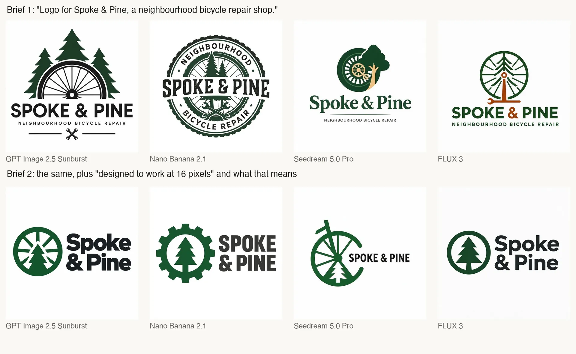
Top: the plain prompt. Bottom: the same prompt plus a sentence about small sizes. Same four models, generated on getimg.ai.
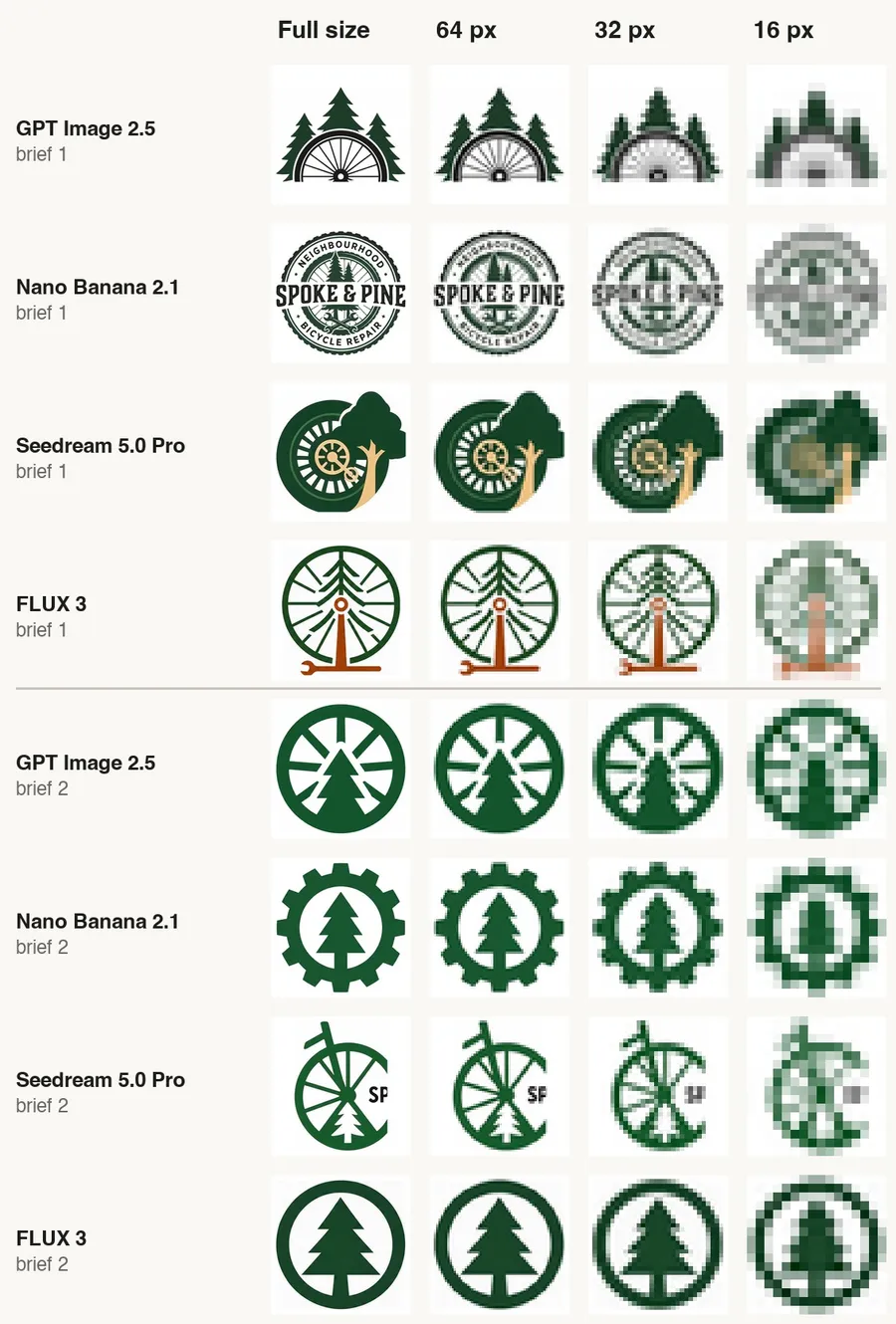
Each symbol shrunk to 64, 32 and 16 pixels. The second prompt's symbols stay readable.
4. Pick one direction and refine it with edits
Choose the concept that passes the quick tests above, then improve it instead of starting over. Attach the logo as a reference image and describe one change per edit, for example "make the gear teeth thicker" or "change the name to a heavier typeface", and add "keep everything else exactly the same". Small, single changes keep the parts you already like intact.
5. Make every version the logo needs
A finished logo is a small set of files, not one image. With the chosen logo as the reference, ask for each version by name: a horizontal lockup, a stacked lockup, the symbol alone (which doubles as your favicon and app icon), a one-colour version and a reversed version on a dark background. Check that every version uses the same symbol and typeface as the original.
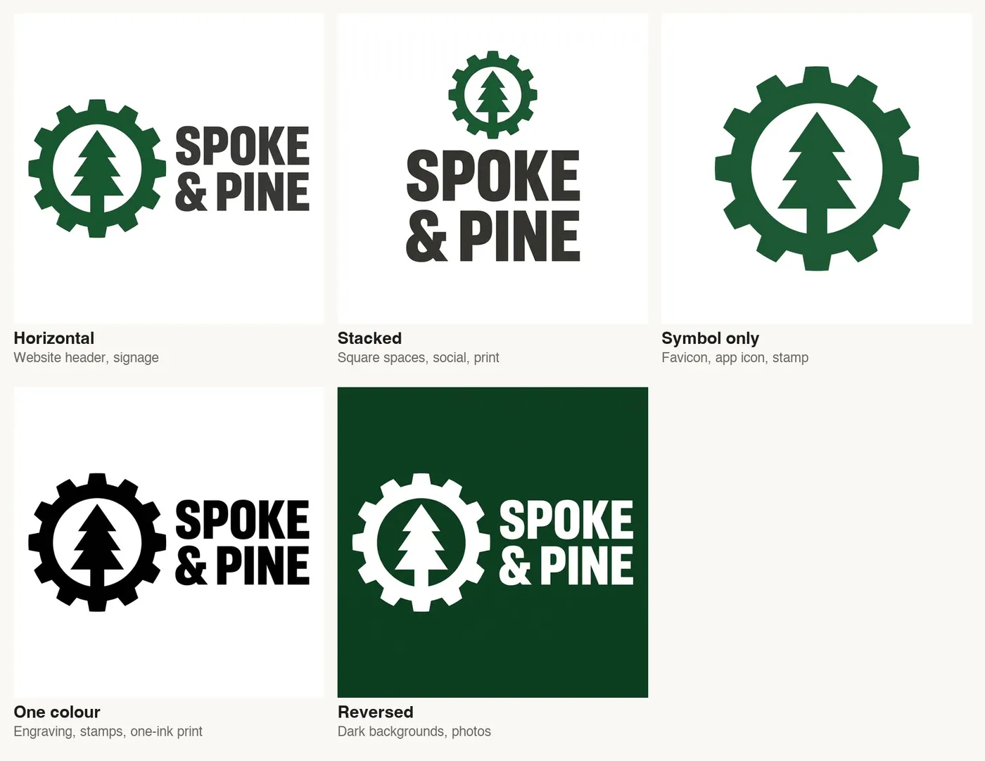
Five versions of one logo, each made from the original as a reference image on getimg.ai.
6. Test the logo where it will live
Shrink the symbol to 16 and 32 pixels on your own screen and look at it at normal viewing distance. Then put the logo into a few real contexts with mockups: an app icon on a phone, a business card, embroidery and a sign. Mockups reveal problems a white background hides, such as a symbol that disappears on a busy photo or lettering too thin to stitch.

Favicons at their real 16-pixel size in browser tabs, shown at 2x.
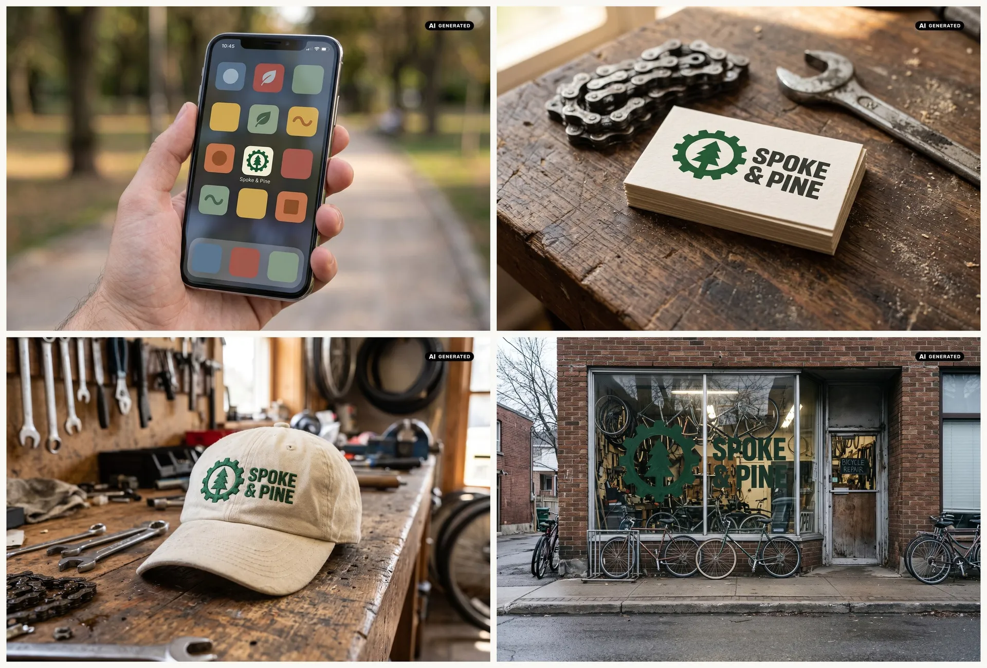
Mockups of the finished logo as an app icon, on a business card, embroidered on a cap and painted on a shop window. Generated on getimg.ai.
7. Prepare the final files
Image models produce raster images, so finish the logo with a few practical steps. Use Remove background to get a transparent PNG, and Upscale image for large print.
For signs, vinyl cutting, embroidery files and anything that must scale without limit, redraw or trace the final logo as a vector (SVG or EPS) in a vector design tool. The AI-generated version becomes your approved design reference for that step.
Which Logo Files and Sizes You Need
Most small businesses need the same short list of files. Making them all at the end saves you from stretching a single image to fit places it was never designed for.
File | Size | Used for |
Vector logo (SVG or EPS) | Scalable | Print, signage, embroidery, merchandise |
Transparent PNG, horizontal and stacked | 2000 px wide or more | Website, documents, presentations |
Symbol-only PNG | 1024 x 1024 px | Social profile pictures, app stores |
Favicon | 16 x 16, 32 x 32 and 48 x 48 px | Browser tabs |
Apple touch icon | 180 x 180 px | iPhone and iPad home screens |
Android and web app icons | 192 x 192 and 512 x 512 px | Android home screens, web apps |
One-colour and reversed versions | Same as above | Single-ink print, dark backgrounds, photos |
Logo Prompt Examples
These prompts follow the structure that worked in our tests: logo type, business, the key idea, the size requirement and the style limits. Replace the business details with your own.
Goal | Prompt |
Combination mark for small sizes | "Logo for [name], a [business]. One bold, simple symbol with thick shapes, no thin lines or small details, no text inside the symbol, two flat colours at most, the name in a heavy sans-serif next to the symbol. Flat vector, white background." |
Wordmark | "Wordmark logo for [name]: the name only, in a distinctive heavy typeface with one custom detail in one letter that hints at what the business does. One colour, flat vector, white background." |
Lettermark | "Lettermark logo for [name]: the initials combined into one bold monogram with thick strokes. One colour, flat vector, white background, no other text." |
Emblem that still reads small | "Emblem logo for [name]: the name and one simple symbol inside a bold circular badge, large lettering, no more than five words in total. Two colours, flat vector, white background." |
One-colour version | "Use the exact logo from the reference image: the same logo in one colour only, solid black on white, no greys." |
Reversed version | "Use the exact logo from the reference image: the same logo reversed out in white on a solid [colour] background." |
How to Keep a Logo Distinctive
The first idea a model has is usually the first idea anyone has. For a bike shop called Spoke & Pine, every model we tried reached for a wheel and a pine tree. That's relevant, but it's also predictable.
To push past the obvious, ask for several concepts that each take a different angle: one built from the initials, one from a single object related to the business, one from negative space, one purely typographic.
Compare them side by side and pick the one that still feels right after a day. A symbol that combines two ideas, like a pine tree inside a gear, often reads as more ownable than either idea alone. If your brand already has colours, typefaces or imagery, keep the logo consistent with them, as covered in our guide to a consistent brand style.
The Bottom Line
Designing a logo with AI works best as a short design process, not a single prompt. Write a brief that names the smallest place the logo has to work, choose a logo type, generate concepts across a few text-capable models, refine one direction with targeted edits, make every version, and test them at favicon size and in mockups. Then prepare the final files, including a vector version for print.
Start your first concepts in Create image.
Frequently Asked Questions
Yes. Current image models such as GPT Image 2.5, Nano Banana 2.1, Seedream 5.0 Pro and FLUX 3 produce clean, well-spelled logo concepts on the first try. The quality depends mostly on the brief: if you ask for a logo that works at small sizes, with bold shapes and no text inside the symbol, the results are far more usable than from a generic prompt.
Name the logo type, the business, one key idea, the smallest place the logo must work and the style limits. For example: "Logo for [name], a [business]. One bold, simple symbol with thick shapes, no text inside the symbol, two flat colours at most, the name in a heavy sans-serif next to it. Flat vector, white background."
Image models generate raster images (PNG or JPEG), not vector files. For a vector logo, trace or redraw the final design in a vector design tool and export it as SVG or EPS. Use the AI-generated image as the approved reference for that step. A vector version matters for signs, embroidery and large print.
A favicon is usually provided at 16 x 16, 32 x 32 and 48 x 48 pixels. Home-screen icons need 180 x 180 pixels for Apple devices and 192 x 192 and 512 x 512 pixels for Android and web apps. Use the symbol alone for these sizes, not the full logo with the name.
Use one simple symbol with thick shapes, avoid thin lines and small details, keep text out of the symbol and limit the logo to two colours. Then test it: shrink the symbol to 16 pixels and check that you can still tell what it is. Ask the AI model for these constraints directly in the prompt.
In many cases, yes, but commercial use is subject to the terms of the platform you use and to other people's rights. Check that the logo doesn't resemble an existing brand, and talk to a trademark professional before registering it, because rules on protecting AI-generated designs differ between countries.
Related Articles