How to Create an Instagram Carousel With AI (2026 Guide)

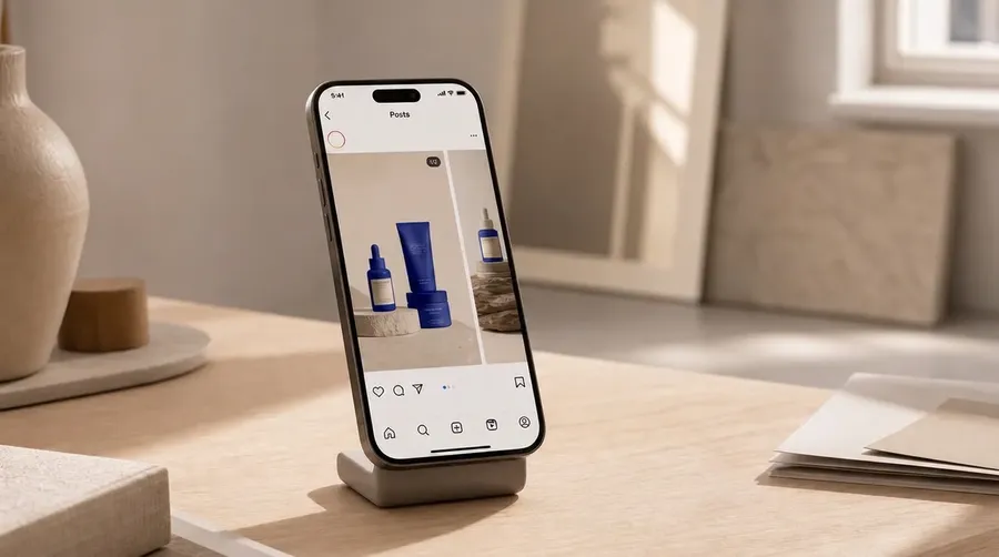
To create an Instagram carousel with AI, generate every slide from one locked set of visual references so the images read as a single sequence rather than five unrelated posts. Plan the narrative first, a hook, the problem, your product, the benefits, and a call to action, then produce each slide against one shared style reference so color, lighting, and treatment stay identical across the swipe. In getimg.ai, one Create image Action with reusable Elements generates every slide on brand and at a matching 4:5 ratio, all in one place.
The Problem: Why AI Carousels Usually Look Disjointed
A carousel is one Instagram post made of multiple images people swipe through, up to 20 slides in a single post. Because it counts as one post, the slides are seen in immediate succession, side by side as the viewer swipes, so any mismatch is obvious in a way that separate feed posts never are. When images share the same color, lighting, and treatment, the eye reads them as one connected sequence. When they do not, the carousel feels like several unrelated posts glued together, and the message loses momentum halfway through.
This is exactly where naive AI generation breaks down. Standard Text to Image generation samples each run independently, so color, lighting, and composition re-roll every time, and the model reinterprets anything vague in the prompt a little differently on each pass. Even the identical prompt comes back with a slightly different look on the next click.
Five slides prompted one at a time therefore arrive in five slightly different visual languages. Nobody can name the problem, but everybody feels the seams. Cohesion, not any single strong slide, is what makes a carousel work, and it has to be built in deliberately rather than hoped for.
Before: What an Inconsistent Carousel Looks Like
Picture a five-slide product carousel built one prompt at a time. Slide one lands warm and photographic. Slide three comes back cooler and flatter because the model reinterpreted the scene. The product looks a size larger on one slide and a shade off on another. The framing jumps from tight to wide with no rhythm. Swiped in sequence, it reads like five different accounts stitched together, and the pitch loses momentum right where it should build.
The usual fixes do not hold. Reusing the exact same prompt on every slide still drifts, because the randomness lives in the sampling, not the wording. Editing each slide by hand to match is slow and never quite lands. And the cost is real: a disjointed carousel reads as lower effort, and viewers quietly extend that impression to the product itself. The root cause is structural. Every slide was generated in isolation, with nothing shared between them to hold the look steady.
-1920x476.webp)
An example of inconsistent AI-generated Instagram carousel.
The AI Instagram Carousel Workflow, Step by Step
The fix is a repeatable five-step workflow for your social media feed. Plan the story, lock one look, set the format, generate each slide from the same references, then finish and export. The discipline is separating the creative decision (what each slide says) from the consistency decision (how every slide looks). Lock the look once and every slide inherits it, so you direct the narrative instead of fighting drift.
Step 1: Map the Five Slides to a Story
Before generating anything, write down what each slide does. This guide builds a five-slide pitch, one of the most common carousel structures, but the same workflow runs at any length up to Instagram's 20-slide limit, and other narratives use different beats (the Carousel Formats section below lays out several). For a pitch, five slides is a clean arc:
- Hook: stop the scroll and promise a payoff. One bold image, room for a headline.
- Problem: name the pain the viewer already feels. A quieter, relatable scene.
- Product: introduce your product as the answer. A clean hero shot.
- Benefits: show the outcome, three quick wins the product delivers.
- Call to action: tell them exactly what to do next, with space for a button or link.
Each slide is a beat in one sequence. Whatever the count, deciding the beats first means you generate against a plan, not a blank prompt box, and it keeps the visuals in service of the message.
Step 2: Lock One Look With Elements
This is the step that turns five images into one carousel. Text prompts alone cannot hold a look steady, because diffusion models re-roll color, lighting, and style on every generation. The reliable fix is persistent visual conditioning through Elements, reusable references stored in your account and called into any prompt with `@ElementName`.
Build one Style Element and you have the core lock. A Style Element captures the whole look at once, the palette, the lighting, and the treatment together, from a handful of reference images, so calling it in every slide holds all of that steady. From there, add an Element for anything else that has to stay identical across the carousel. A Product Element built from real photos keeps the actual item on the product slide, not a lookalike. A Person Element keeps the same model, creator, or founder on every slide they appear on, which is what makes a face-led or testimonial carousel feel like one shoot.
Several Elements can be called in a single prompt, so one slide can lock the style, the product, and the person together. Call your Elements with `@` in every slide and the same conditioning applies to all of them, which is how you keep a consistent brand style without re-describing it each time. Elements are shared across a team automatically, so anyone can produce on-brand slides.
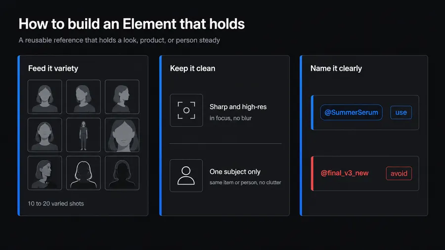
Build a reusable Element on getimg.ai so your product, model, or brand style stays consistent across every carousel slide.
Step 3: Set the Carousel Format and Batch Size
Instagram crops every slide in a carousel to one shared aspect ratio, so decide the ratio before you generate. Use 4:5 portrait, which fills the most feed height since Instagram's shift to a taller 4:5 feed; square 1:1 still works if you prefer it.
Set that aspect ratio in the Create image generator and keep it identical for every slide. Output size follows the model, and on many models a quality or resolution setting controls how large the render is, so the ratio is the setting that matters at this stage. You can upscale a slide later if a placement needs more detail.
For batch size, generate 2 or 4 options per slide (the Create image generator produces 1, 2, 4, 8, or 16 at once) so you can pick the best take of each beat rather than settling for the first render. Leave the model on Auto for photographic slides; switch to a text-strong model for any slide that carries words baked into the image.
Step 4: Generate Cohesive Slides
Now produce the slides. The subject and mood change per beat, but every prompt starts with the same Style Element so the look holds. Where a slide carries a few words, write them into the prompt in quotes so a text-capable model renders them on the image. Using `@CarouselStyle` for the look and `@HydratingSerum` for the product as example names, a skincare pitch carousel looks like this:
- Slide 1 (Hook): @CarouselStyle bold opening composition, warm red and cream split background, LUMEN 12-Hour Hydration Serum bottle positioned on the right side of the red upper section, large editorial serif heading reading "Your best skin by 7am", with "Your best" in cream and "skin by 7am" in black, subtle hand-drawn underline beneath the final line.
- Slide 2 (Problem): @CarouselStyle extreme close-up of dry, flaky facial skin and one eye filling the right side of the frame, warm terracotta and cream editorial palette, large black serif heading arranged on the left reading "Dry and flaky by noon?", small hand-drawn yellow squiggle underneath.
- Slide 3 (Product): @CarouselStyle LUMEN 12-Hour Hydration Serum bottle centered over a bold terracotta-red circular shape, cream background, large black editorial serif typography reading "Meet the 12-hour serum" arranged around the bottle, small yellow hand-drawn squiggle underneath.
- Slide 4 (Benefits): @CarouselStyle editorial skincare composition with a close-up portrait of fresh, hydrated skin inside a geometric cream-and-red layout, decorative black wavy lines and thin framing elements, three rounded terracotta labels reading "All-day moisture", "No greasy finish", and "Visibly plumper".
- Slide 5 (CTA): @CarouselStyle minimal cream closing scene, LUMEN 12-Hour Hydration Serum bottle centered vertically, large terracotta editorial serif headline at the top reading "Hydration that keeps up with you.", rounded terracotta CTA button at the bottom reading "Shop the serum" with a small cream hand-drawn squiggle.
Notice what changes and what does not. The scene and the story move forward each slide, and the words move with them, but the look, the palette, and the font stay pinned by the one Style Element. Generate the slides with the AI image generation Action at your chosen ratio, review each beat's options as a contact sheet, and pick the strongest take.
Baking the copy in with a model tuned to render readable text keeps everything to one step. If you would rather control the exact font and spacing, generate the slides with clean empty space where the words go and add the text afterward in a separate design tool. Either way, keep words within the middle of the frame, clear of the bottom bar and profile row Instagram overlays on the post.
Step 5: Refine and Publish
When a slide is almost right but one detail is off, a stray object in the background, the light a touch too warm, the product turned the wrong way, edit that detail instead of regenerating from scratch. Open the slide and describe just the change; the rest of the image holds, so you keep the take you already liked rather than rolling the dice on a fresh generation.
Because every image edit saves as a new version and leaves the original intact, you can try a fix and still fall back to the earlier take. Once every slide is right, upload them in order as one carousel.
A few things sharpen the publish step itself. Whichever slide sits first becomes the cover, the single frame shown in the feed and on your profile grid, so set that order deliberately. Rearranging is easiest in the composer, where you drag slides into their final sequence before posting, and a beat out of place breaks the arc. In the caption, lead with a line that reinforces the opening slide, since only that first line shows before Instagram truncates the rest. Two small extras are worth considering: Instagram lets you add tracks from its music library to photo carousels, which can bring better results than using your own music, while adding alt text to each slide makes the post more accessible to people using screen readers.
You should also do one quick pass at phone size, the way your audience will actually see it. Swipe through and check three things: the palette holds from the first slide to the last, the product looks identical on every slide it appears on, and every line of text sits clear of the bottom bar and profile row. If one slide drifts, regenerate just that beat against the same Elements rather than rebuilding the whole set.
After: The Finished Cohesive Carousel
Run the workflow and the five slides arrive as one set. The same warm light carries from the hook to the call to action, the palette is identical across every frame, and the product looks like the product on every slide it appears.
The eye glides across the swipe instead of catching on a seam, so the narrative does its job: stop, relate, introduce, convince, act. The difference from the before version is not a single better image. It is that all five now belong to each other, which is the entire point of a carousel.
-1920x476.webp)
A cohesive IG carousel generated with AI on getimg.ai.
Extra Tips for Sharper AI Carousels
A few refinements separate a competent carousel from a scroll-stopping one, the details that decide whether a post gets noticed on social:
- Earn the swipe on slide one. Leave a visual cue or an unfinished thought so the viewer wants the next slide. The first frame decides whether the other four get seen at all.
- Hold the palette, vary the composition. Keep color and lighting locked, but change the crop and angle slightly each slide so the set reads as a sequence, not the same frame five times.
- Give each slide one job. A frame that crowds in three messages gets skimmed and swiped past; one clear idea per slide keeps the reader moving to the next.
- Signal how long it is. A small counter like 1 of 5, or a row of progress dots across the slides, sets expectations and nudges people to swipe all the way through.
Five Carousel Formats and When to Use Them
The five-beat pitch is one structure among many, and the same locked-Style-Element workflow drives all of them; only the narrative and the slide count change.
Match the format to the goal: awareness posts do well as educational or listicle carousels that pay off slide by slide and earn a save, while conversion posts lean on a pitch, testimonial, or before-and-after arc that builds to a clear ask. Whichever you pick, keep the arc tight and let the final slide name the next step. A few formats worth knowing:
Product Pitch
Hook, problem, product, benefits, call to action. The classic conversion carousel: name a pain, present your product as the fix, show the payoff, then ask for the click. Best when you have one clear offer to sell.
-1920x476.webp)
Cohesive carousel AI images for a coffee brand.
Educational
A hook, then one teaching point per slide, and a recap to close. It delivers real value swipe by swipe, which is what earns saves and shares. Best for how-to breakdowns, tips, and myth-busting.
-1920x1191.webp)
Educational AI-generated IG carousel.
Listicle
A title slide, then one tip, stat, or example per slide. Easy to scan and easy to extend, so it scales toward the 20-slide limit when the topic runs deep. Best for roundups and "X ways to" list posts.
-1920x397.webp)
A tips-style carousel that holds one editorial look across all six slides, generated with AI on getimg.ai.
Before-and-After
Setup, before, process, after. It shows a transformation in sequence, which is inherently swipe-friendly. Best for results-driven niches like skincare, fitness, design, and renovation.
-1920x794.webp)
A before-and-after story carousel that keeps a single consistent style from slide to slide, made with AI on getimg.ai.
Testimonial
Hook, customer quote, the result, supporting proof, call to action. It turns social proof into a narrative instead of a static quote card. Best for case studies and reviews.
-1920x397.webp)
A results-driven case-study carousel unified by one color system, generated with AI on getimg.ai.
Build Your First AI Carousel
Start with one post. Write the five beats, build a Style Element for the look, set the ratio to 4:5, generate each slide from that same Element, and upload them in order. Run it once and you have a template every future carousel reuses, plus a reference that keeps your feed consistent as you scale.
Create your social media content with getimg.ai.
Frequently Asked Questions
Instagram supports up to 20 slides in a single carousel, but most effective carousels run shorter. Five to ten slides is the practical range: long enough to tell a complete story, short enough that people swipe to the end. A pitch carousel works cleanly at five slides, one each for the hook, the problem, the product, the benefits, and the call to action. Match the count to the narrative rather than filling slots for the sake of it.
Use 4:5 portrait, the format that fills the most height in the current Instagram feed. Square 1:1 also works if you prefer it. The important rule is that every slide in a carousel shares one aspect ratio, because Instagram crops the whole post to a single shape, so decide the ratio before you generate.
Generate every slide from the same reusable reference instead of relying on prompt wording. In getimg.ai, build a Style Element, which captures the whole look, palette, lighting, and treatment, from a few reference images, then call it with `@ElementName` in every slide's prompt.
For a product carousel, add a Product Element so the item stays accurate, and layer a Color Palette or Lighting Element on top only if you need stricter brand control. The subject and mood change per slide, but the locked Style Element holds the look steady, so the five images read as one set rather than five separate generations.
Yes. Modern image models, like Nano Banana 2 and GPT Image 2, render text well, including headlines, benefit labels, and longer lines, so you can write the copy straight into the prompt in quotes and have it baked onto the slide. The reason to add text separately is control and iteration: if you expect to re-edit the wording several times, or you need an exact brand font with precise kerning and placement, generate clean slides with space for the copy and set the type in a design tool.
On getimg.ai, all paid plans include commercial rights, so carousels you generate can be published to a business account and used in campaigns without extra licensing. This covers social posts, ads, and client work, subject to the platform's use policies. If you are unsure how the rules apply to a specific case, review the details on using AI-generated images commercially before you publish.
The right tool for carousels is one that holds a consistent look across many slides, generates in batches, and outputs straight to feed ratios, all in one place. A consistency system like Elements is the deciding feature, since carousels live or die on whether the slides match. getimg.ai combines reusable Elements, batch generation of up to 16 images at once, generation at a 4:5 feed ratio, and commercial rights on every paid plan, so the full carousel workflow runs without switching tools or re-uploading files between steps.
Related Articles