AI Product Photography: How to Build a Full Campaign From One Photo (2026 Guide)

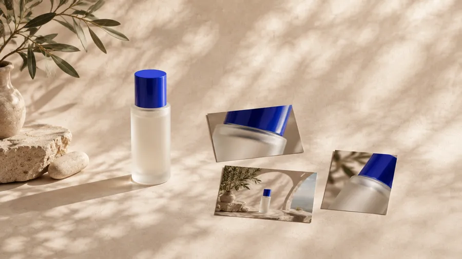
AI product photography turns a single clean product photo into a full campaign without a studio, a set, or a shoot. You keep the product fixed as a reference, then change the world around it: the background, surface, lighting, camera, and creative concept. From one image you build a hero shot, macro details, an art-directed set, an ambitious surreal scene, and ad-ready compositions. The product stays recognizable while the creative direction moves, so the result reads as one campaign rather than a folder of unrelated pictures.
Start With One Strong Product Reference
Choose the cleanest image you have of the product. It does not need to look like a finished advertisement, but the product itself has to be easy to read: a clear silhouette, correct proportions, visible materials, minimal obstruction, and recognizable packaging. A sharp phone photo on a plain surface is usually enough.
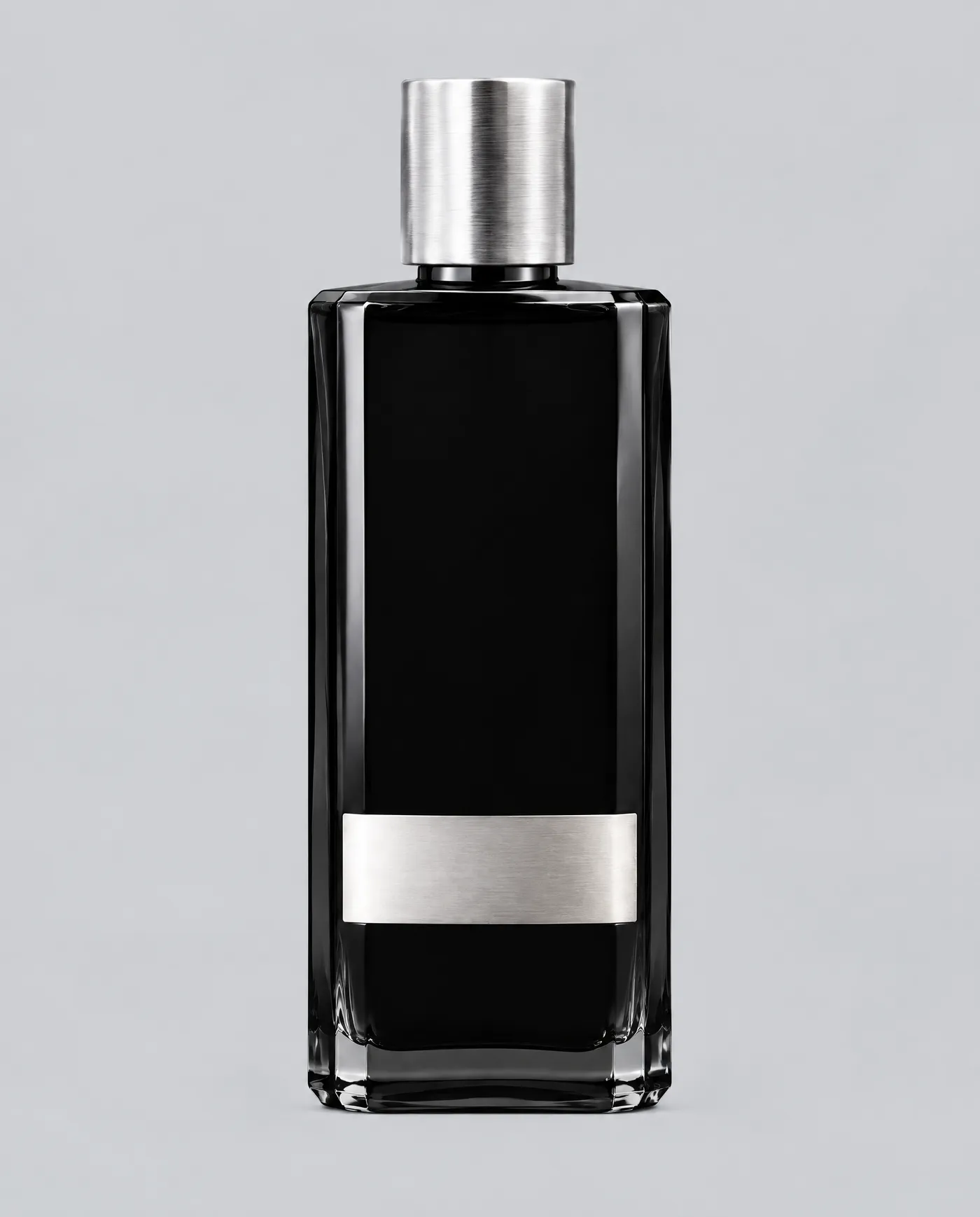
Throughout, we'll use Noir01 as our example, a fictional fragrance in a black glass bottle with a silver cap and a minimal label. Nothing real sits behind it, which is the point, since the whole campaign grows from a single reference image and nothing else.
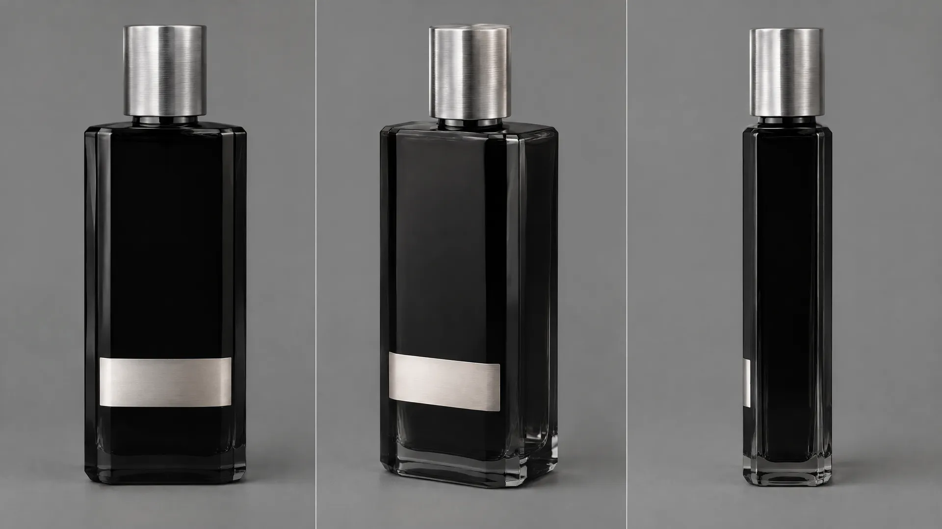
Upload that one shot as a reference image so the model has an accurate anchor for the product instead of inventing one from words. Judge one thing at this stage: does the product look correct? Accuracy matters most here, because e-commerce AI product shots have to match what the customer actually receives, not just look good on screen. Once the product reads correctly, it becomes the anchor for everything that follows.
Fix the Product, Change the World
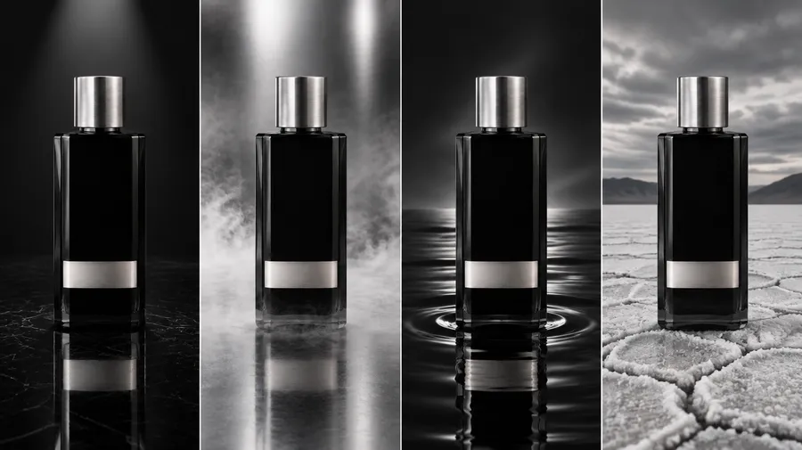
This is the most important rule in the workflow. Split the image into two categories: what stays fixed, and what is free to move. The bottle shape, the cap, the packaging, and the proportions stay. The background, surface, props, lighting, environment, camera, and campaign concept all change. Get this split right and one product carries an entire campaign. Get it wrong and you generate a different-looking product in every shot.
Keep Fixed (the Product) | Free to Change (per Shot) |
Bottle shape and silhouette | Background and set |
Cap and closure | Surface and props |
Proportions and scale relationships | Lighting direction and intensity |
Packaging and label | Camera angle, distance, and lens |
Material identity (glass, metal) | Mood and campaign concept |
The product's own color | Aspect ratio and composition |
Attach the reference on every generation, or, for a longer campaign, save the product as an Element and call it by name (`@Noir01`) so the same anchor carries across every shot without re-uploading. As a side note: an Element doesn't have to be a product. When it is a person, a brand campaign built around one AI character keeps the face and signature details locked while the scene changes.
Build a Shot List Before You Generate
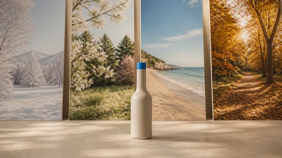
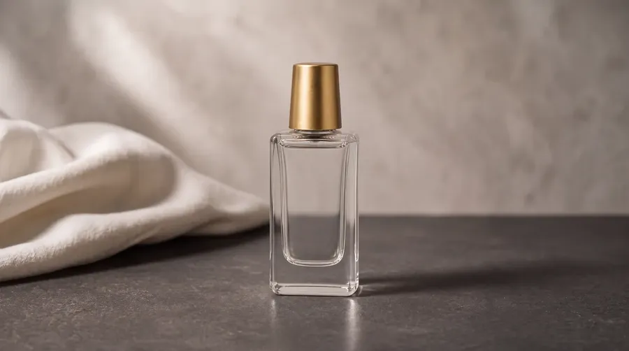
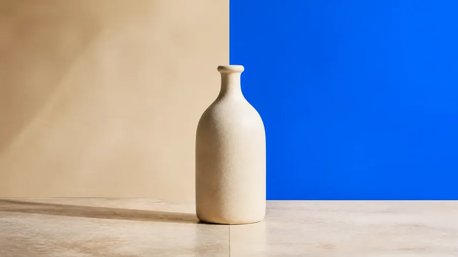
This is where a lot of AI campaigns go wrong. You generate one striking image, then another, then another, and end up with six pictures that look like six different brands.
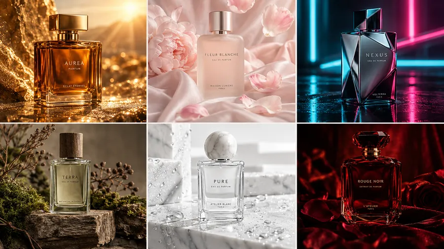
An example of what not to do.
Decide what the campaign actually needs before generating anything, so every image has a defined job.
Shot | Job in the Campaign |
Hero | Establishes the product and the overall look |
Macro Detail | Shows craftsmanship and material quality |
Material Shot | Product interacting with a key material, such as water or stone |
Environmental | Places the product inside a built world |
Ad-Ready | Composition with negative space left for copy |
With the list written, you are no longer creating random images. You are filling a campaign. Each generation answers to a slot, which is what turns a set of pictures into a coherent body of work rather than a pile of one-offs.
Define the Visual System
Before writing prompts, set a few visual rules the whole campaign checks itself against. Specific rules give you far more control than stacking words like cinematic, luxury, or dramatic, which mean something different to the model every time. For Noir01, the system looks like this.
Element | Noir01 Direction |
Palette | Black, graphite, silver, pearl white |
Materials | Glass, obsidian, water, chrome |
Light | Narrow directional highlights, deep shadows, soft atmospheric diffusion |
Mood | Minimal, cold, premium, slightly surreal |
Composition | Strong product focus, clean framing, negative space |
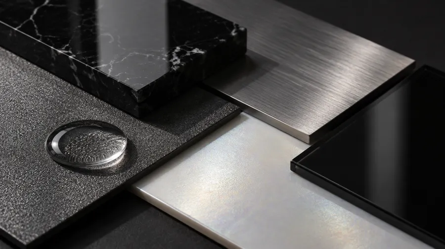
That is enough to create a recognizable world. Writing the rules as constraints rather than adjectives is what separates a coherent campaign from a folder of unrelated pictures, and it is the foundation of generating images in a consistent brand style.
Build the Hero Shot First
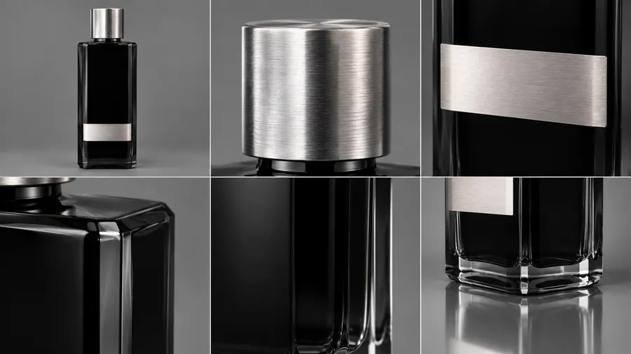
Before building impossible landscapes, make sure the basic product shot works. The hero defines the direction, so it earns the most attention. Place the product cleanly, light it deliberately, and inspect the result closely.
A hero prompt for Noir01 might read:
- Luxury studio product photograph of `@Noir01` standing vertically on polished black obsidian, deep graphite background, narrow directional light from camera left creating a precise silver highlight across the glass, subtle reflection beneath the bottle, realistic glass and metal materials, controlled shadows, minimal fragrance campaign.
Batch-generate a range of directions with the Create image Action, review them together, and pick one. Then inspect the winner: the bottle shape, the cap, the label, the edges, the glass, the reflections. If the product already looks wrong here, do not make the scene more complicated. Fix the basic shot first, because everything downstream inherits its weaknesses.
Change the Scale With Macro and Detail Shots
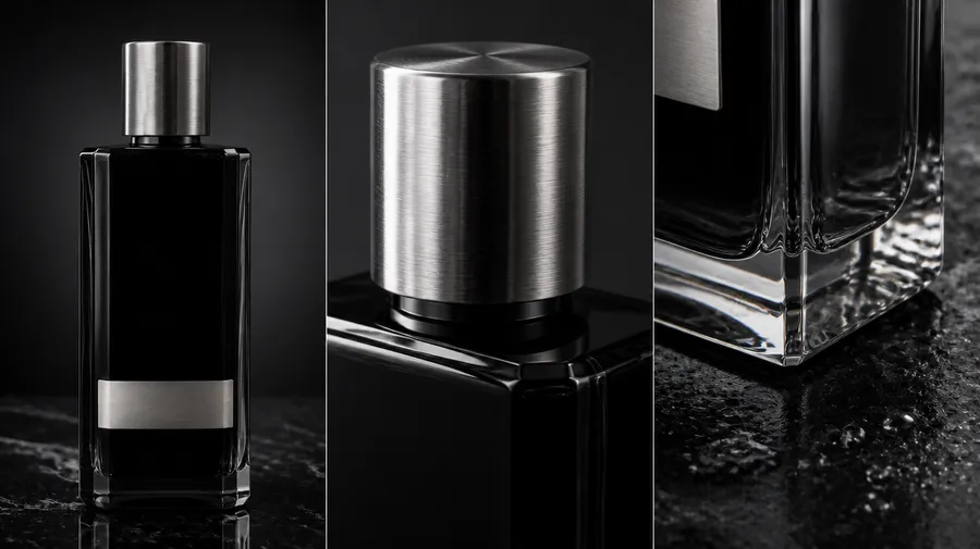
Once the hero works, go closer. Macro photography adds variety to the campaign without changing its visual language, so the set feels richer while staying unmistakably the same product.
Two macro directions for Noir01:
- Extreme macro photograph of `@Noir01` focusing on the transition between black glass and polished silver cap, tiny condensation droplets, narrow white reflection through the bottle, shallow depth of field, graphite background."* Or: *"Extreme close-up of the bottom glass edge of `@Noir01` resting on wet polished obsidian, tiny droplets, silver reflections, and deep blacks.
Same product, same world, different visual scale. Detail shots feed carousels, website sections, and teasers, and because they share the palette and materials of the hero, they read as one campaign rather than separate ideas.
Design the Set Like an Art Director
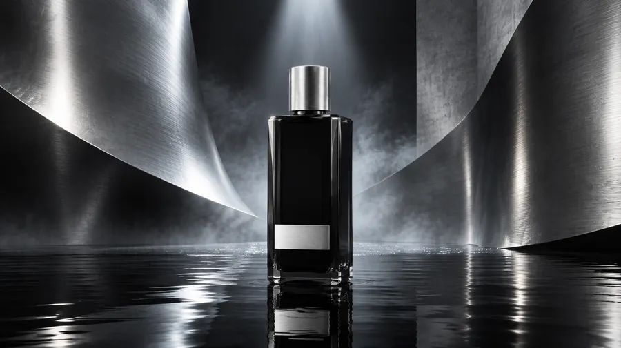
Now build a more complex image. Instead of asking for a "cool futuristic background," describe what physically exists around the product. Concrete sets give the model something to reason about, and each element earns its place.
A set prompt for Noir01:
- `@Noir01` standing inside a sculptural set built from large curved sheets of brushed chrome, black reflective floor covered by a thin layer of water, subtle mist behind the product, narrow overhead spotlight, cold silver reflections, monumental scale.
Every element has a job here. Chrome creates shape, water creates reflection, mist creates depth, and the overhead light separates the bottle from the background. Think of the set as something you could physically construct, even if you never build it. The e-commerce prompt book collects product prompts you can adapt as you design each new set.
Push Into the Impossible Shot
Once the realistic campaign language works, push it. This is where AI product photography adds something a normal studio cannot, because it produces images that would otherwise need huge sets, complex effects, or a production budget most brands never have.
An impossible shot for Noir01:
- Monumental `@Noir01` fragrance bottle standing in the center of a vast black salt landscape, surrounded by a perfect circle of still water, distant silver monoliths emerging through fog, pale overcast sky, surreal scale, photorealistic materials.
Or:
- `@Noir01` suspended inside a giant transparent glass sphere above a dark ocean at night, silver moonlight refracting through the sphere, calm black water below.
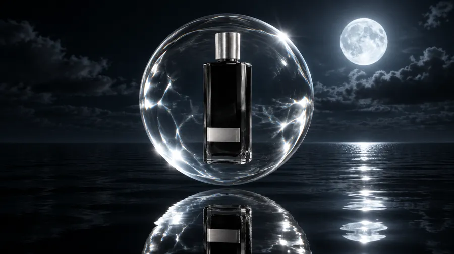
Same palette, same materials, same product, completely different production scale. Keep the materials photorealistic so the surreal scene still reads as a real photograph rather than an obvious render.
Compose for Real Ads
A striking image is not automatically a useful advertising image. If the campaign needs a headline, a logo, and a call to action, the composition has to leave room for them. So place the product with intent and design the empty space on purpose.
An ad-ready prompt for Noir01:
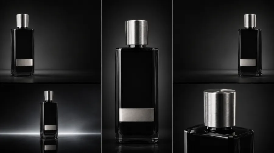
- `@Noir01` positioned in the lower-right third of the composition on a black reflective pedestal, monumental curved silver backdrop, deep graphite background, subtle mist, large clean negative space across the upper-left side for advertising copy.
Now there is room for a headline, a logo, and product information. From one creative direction, produce the product on the left, on the right, a vertical version, a wide version, and a tighter crop with the AI resizer.
Commit to the Winning Direction
When one direction works, say the black-water look, do not immediately invent another aesthetic. Use it. Build a centered hero, a side composition, a macro detail, a low-angle shot, and a vertical social version, all from the same direction.
Five connected images are usually more useful than five unrelated pictures, because they share a world and each one has a job. That is how you stop generating individual images and start building a campaign.
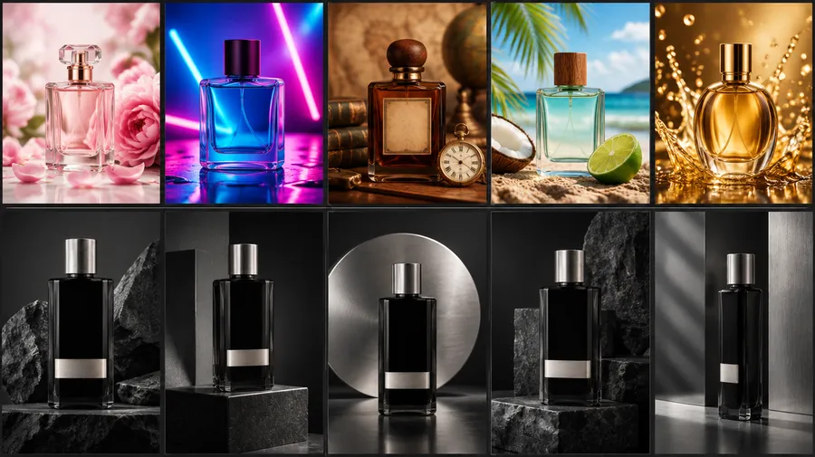
Teams running this across channels can reuse the same product reference and visual system for all of their marketing and social content, so nothing has to be planned from scratch for the next placement.
Check the Product for Accuracy
Now zoom in. A generated product shot can look beautiful and still be unusable, so hold the commercial product to a tighter standard than the scene around it. Run through a short checklist on every image you plan to publish:
- Shape: did the silhouette change?
- Proportions: did the cap suddenly get taller or the bottle wider?
- Color: did black packaging drift toward blue?
- Material: does the glass now read as plastic?
- Label: is the packaging still recognizable?
- Details: did small hardware quietly change?
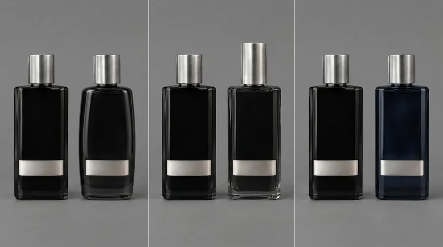
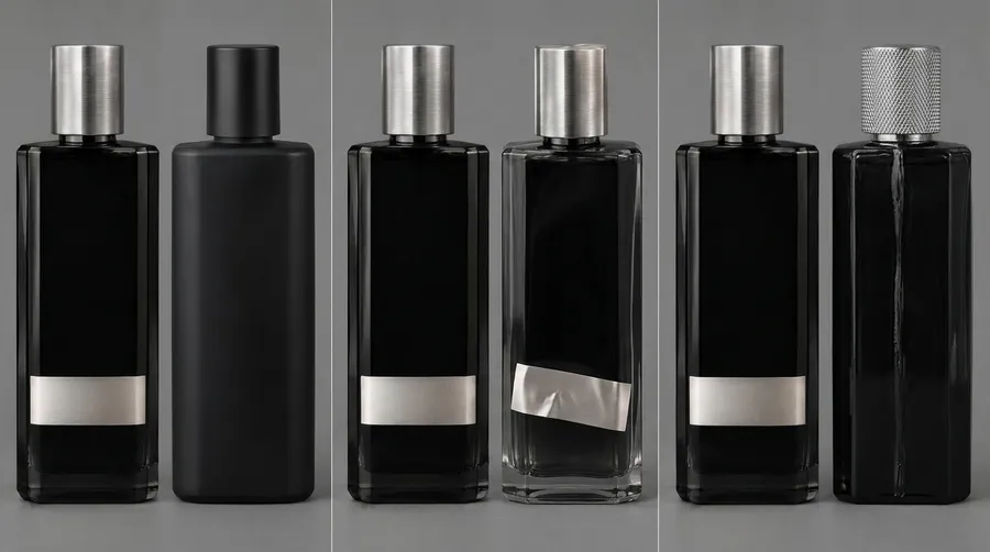
The environment can be as creative as you like, but the product needs to stay true. Accuracy is only half of it: the light, shadows, and materials have to agree as well, so the shot reads as a photograph rather than a render, which is what makes AI product photos look real. Where exact packaging text or fine hardware matters, a final retouching or compositing pass is often the better option than another generation.
Edit the Winner Instead of Regenerating
Say an image is almost perfect. The bottle works, the lighting works, the composition works, but one background object ruins it. Do not rebuild the whole image. Edit the problem.
A targeted edit reads like an instruction:
- Remove the floating silver object behind the bottle. Keep the product, camera position, reflections, lighting, and background unchanged.
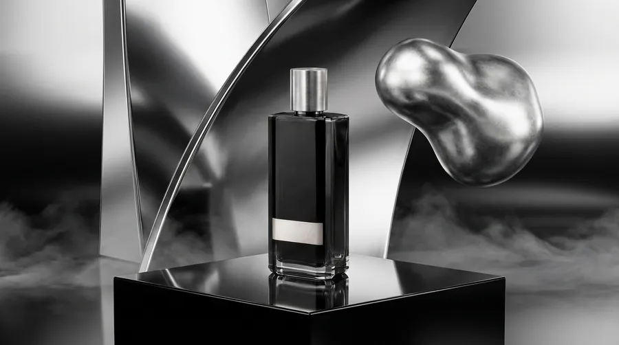
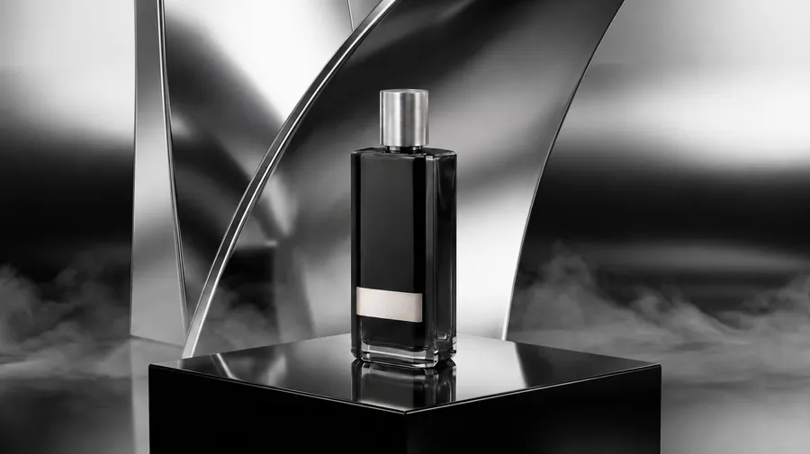
Or:
- Replace the chrome pedestal with polished black obsidian. Preserve everything else.
Refining the strongest version is one of the biggest improvements you can make to the workflow. Generation finds the direction. Editing makes it usable.
The Seven-Part Prompt Formula
For a repeatable structure, think of each prompt in seven parts. Describing what physically exists gives you more control than a list of moods.
Part | Question It Answers |
Product | What has to stay recognizable? |
Shot | Hero, macro, overhead, or environmental? |
Set | What physically surrounds the product? |
Materials | Glass, metal, stone, fabric, or water? |
Light | Where does it come from, and how hard or soft is it? |
Camera | Macro, low angle, wide, or top-down? |
Composition | Centered, off-center, or built around negative space? |
Instead of "luxury perfume advertisement," you get something like:
- @Noir01` standing on polished black obsidian inside a shallow circular pool of still water, monumental brushed chrome backdrop, deep graphite studio, narrow directional light from upper left, realistic silver reflections, low-angle product photography, centered composition, large negative space above.
From One Photo to a Full Campaign
Worked through in order, one basic product photo becomes a complete set: a hero on polished obsidian, a macro of the cap and condensation, a material shot of the bottle meeting water, an environmental image in a chrome architectural set, a surreal hero in an impossible landscape, and an ad with negative space left for copy. Different compositions, different jobs, one product, one visual language.
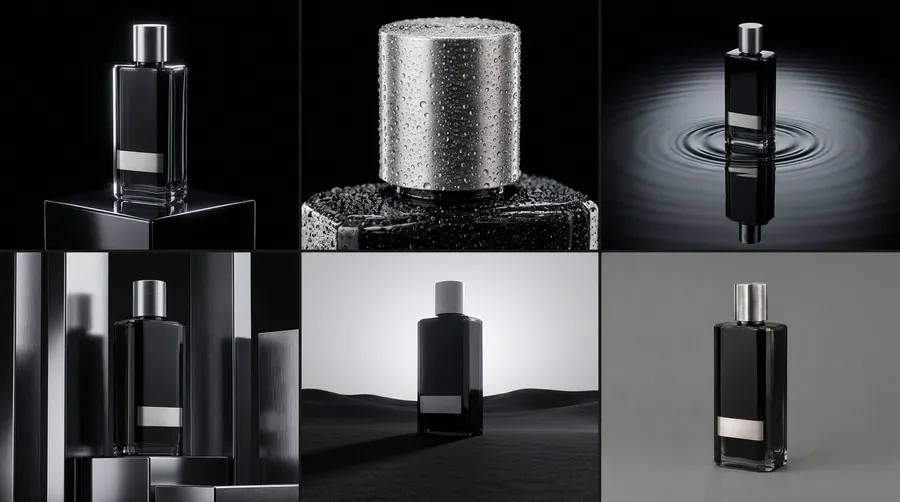
That is the difference between generating pictures and building a system. Extend that discipline beyond one product, across a logo, packaging, and every channel, and you are building a full visual identity with AI. When the set is right, upscale each image to the resolution its channel needs.
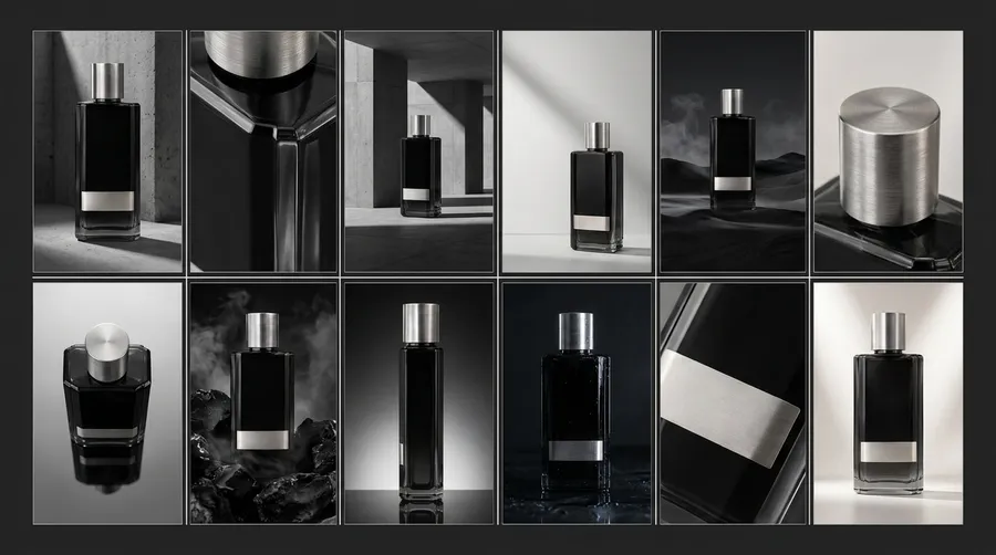
The workflow stays simple: start with one clean product image, keep the product fixed, define the visual system, build a shot list, create the hero first, go closer, change the set, push the scale, compose for ads, and refine the strongest direction instead of constantly starting over. One product photo, one creative system, a full set of campaign-ready assets.
Create your product photos in getimg.ai!
Frequently Asked Questions
Yes. AI product photography generates finished product images from a reference photo and a written description, without a physical studio, set, or camera. You upload one clean shot of the product, keep it fixed as a reference, then describe the background, surface, lighting, and camera you want around it.
Modern image models hold the product's shape and materials while building a new scene, so a single photo can produce a hero shot, macro details, and full campaign images. Exact packaging text and fine hardware are the hardest parts to hold, so those sometimes still need a final retouching or compositing pass.
No, but you need a clear one. The reference does not have to look like a finished advertisement; it has to show the product plainly, with a clean silhouette, correct proportions, visible materials, minimal obstruction, and recognizable packaging. A sharp phone photo on a plain surface is usually enough.
If you do not have any product photo, generate the product from a detailed description first, lock the version that looks correct, and use that as your reference. Either way, get the product right before adding backgrounds, props, and lighting.
Separate what stays fixed from what is free to change. Lock the product (shape, cap, proportions, label, and material identity) and let the set, surface, lighting, camera, and mood vary per image. Anchor the product with the same reference image on every generation, and for heavier reuse save it as a named Element so you call it in any prompt without re-uploading.
Reinforce the fixed details in the prompt text too, since the reference and the description strengthen each other. When one image drifts, edit it back toward the product rather than accepting the change.
It depends on where the campaign runs, but a useful set usually covers five jobs: a hero shot, a macro detail, a material shot, an environmental image, and an ad-ready composition with space for copy.
From there you adapt each into the formats a channel needs, such as square feed posts, vertical stories, and wide banners. Five connected images built from one product and one visual system are more useful than a dozen unrelated pictures, because each one has a defined job and they all read as the same brand.
Think in seven parts: the product that must stay recognizable, the shot type (hero, macro, overhead, environmental), the set physically around it, the materials, the light source and its hardness, the camera angle and lens, and the composition.
Describing what physically exists gives you more control than stacking adjectives like luxury, cinematic, or dramatic. For example, "brushed chrome sheets, a thin layer of water on a black floor, a narrow overhead spotlight" tells the model far more than "cool futuristic background." Specific, physical rules are what make the result predictable.
Edit it. If the product, lighting, and composition already work but one background object is wrong, regenerating the whole scene throws away everything that was right and hands you a fresh set of problems.
Keep the strongest version and change only what fails: remove a distracting object, swap one surface, or fix a single reflection, while telling the model to preserve the product, camera, lighting, and background. Refining the best image is one of the biggest improvements you can make to an AI product photography workflow.
Related Articles