Business Card Design Ideas: 9 Styles You Can Make With AI

Good business card design ideas start from what the business already is: a minimal type-only card for an accountant, an engraved illustration for a vet, foil and a monogram for a jeweller, kraft and a woodcut for a joiner. Pick one idea, one type family and two or three colors, then keep the details to a name, a role and two ways to get in touch. On getimg.ai, each style takes one short prompt with your own details set in clean type.
What every business card needs
Before choosing a style, settle the content. A card is about the size of a credit card, so every extra line makes the rest smaller and harder to read. Most good cards carry four or five pieces of information at most.
Element | Why it matters | Keep in mind |
Name | The one thing people need to remember | Largest or most prominent line on the card |
Role or trade | Tells people why they kept the card | Two to four words, not a slogan |
Phone or email | How people reach you | One or two contact methods, not five |
Website | Where the rest of the information lives | Drop "https://" and "www" |
Logo or mark | Recognition across everything you print | Optional for individuals, important for businesses |
Address | Only if people come to you | Shops, studios, clinics and cafés |
Everything else, such as a list of services, social handles or opening hours for each day, belongs on your website. A card that tries to be a brochure looks crowded at arm's length and is harder to get right in print.
Business card size and bleed
Sizes differ by country, and printers expect the file to be slightly larger than the card so the color runs to the edge after trimming. That extra margin is the bleed.
Card type | Trim size | Size with bleed | Closest aspect ratio to generate |
Standard US and Canada | 3.5 x 2 in (88.9 x 50.8 mm) | 3.75 x 2.25 in | 16:9 |
Standard Europe | 85 x 55 mm | 91 x 61 mm | 3:2 |
Japan | 91 x 55 mm | 97 x 61 mm | 16:9 |
Vertical US | 2 x 3.5 in | 2.25 x 3.75 in | 9:16 |
Square | 2.5 x 2.5 in | 2.75 x 2.75 in | 1:1 |
A US card is 1.75 times as wide as it is tall, and a 16:9 image is 1.78, so the generated design needs only a sliver trimmed from the sides. Keep every line of text at least an eighth of an inch (about 3 mm) inside the trim edge, which printers call the safe zone. Prompting for "generous margins" usually takes care of it.
Resolution is rarely the problem. A 2K image at 16:9 is 2,848 pixels wide, which works out to well over 600 pixels per inch across a 3.75 inch card with bleed. Printers ask for 300.
9 business card design ideas
Each card below was generated on getimg.ai from a prompt with the real details in quotation marks, shown next to a photo of how it looks printed. What separates them from a template is one idea tied to the business, such as a name that becomes a joke or a drawing the type rests on. The tip under each one shows the part of the prompt that does the work, so you can reuse it with your own name and trade.
1. Type-only minimal
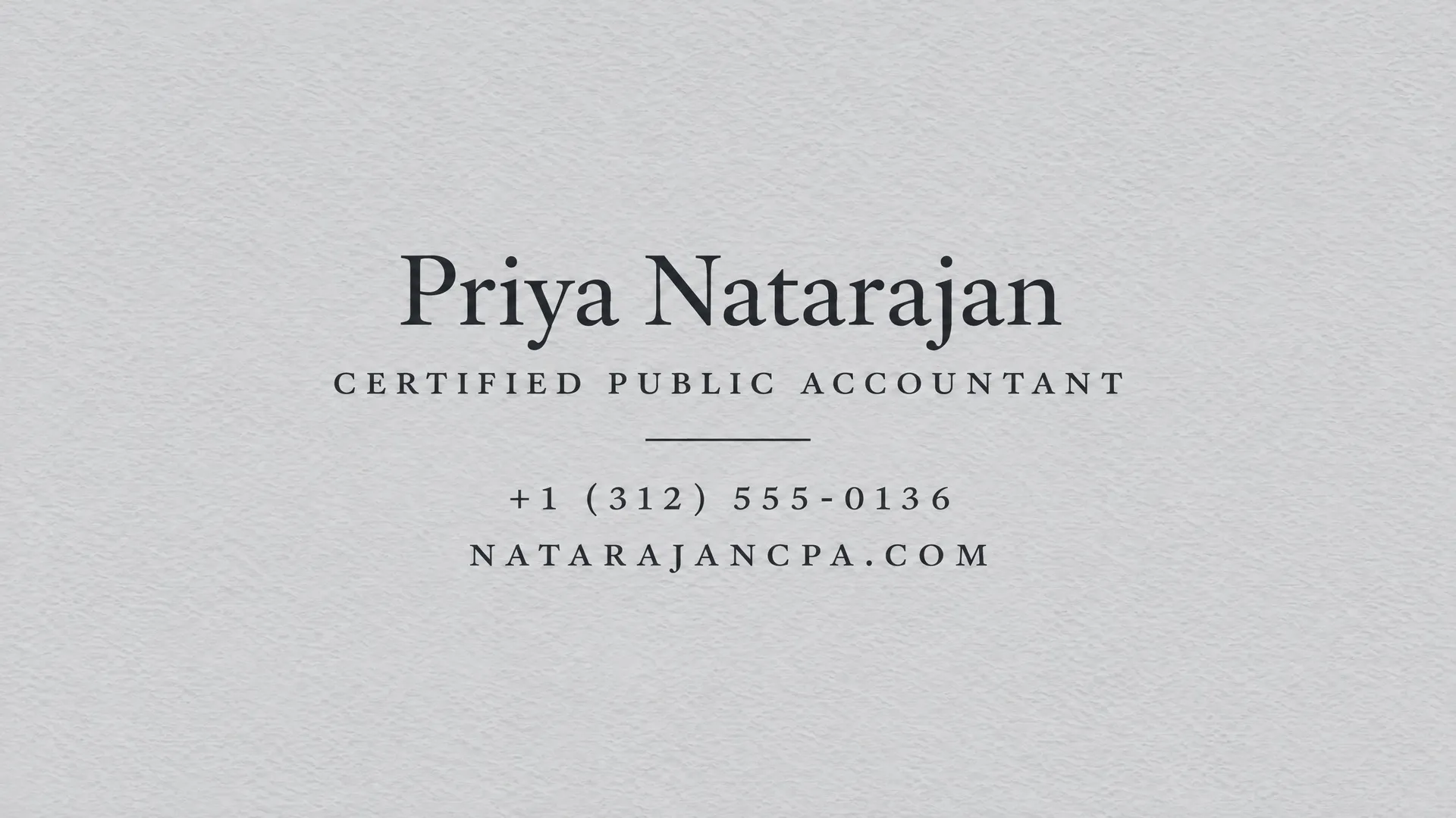
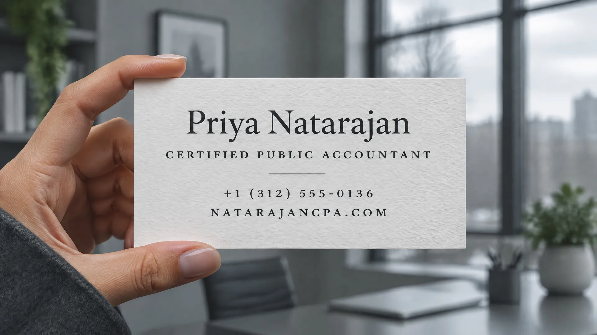
No illustration and no logo, only the name, the role and two contact lines set with care. It suits accountants, lawyers, consultants and anyone whose work is precise and quiet. Minimal doesn't mean empty: the text sits together as one balanced group, a single hairline rule separates the name from the details, and the paper and the typeface do the rest.
Ask for "everything centered as one compact group" or "aligned to one left edge on a clear grid", and name a refined serif or grotesk. Without a stated arrangement, a type-only card tends to scatter its lines into the corners and leave a gap in the middle.
2. One bold color
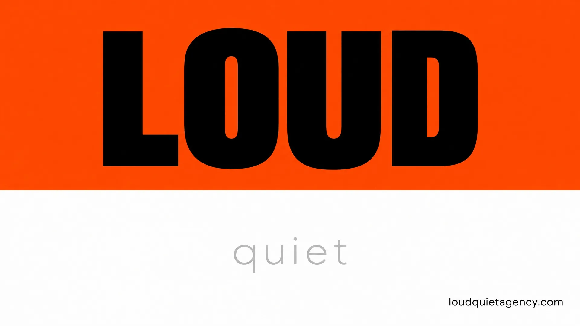
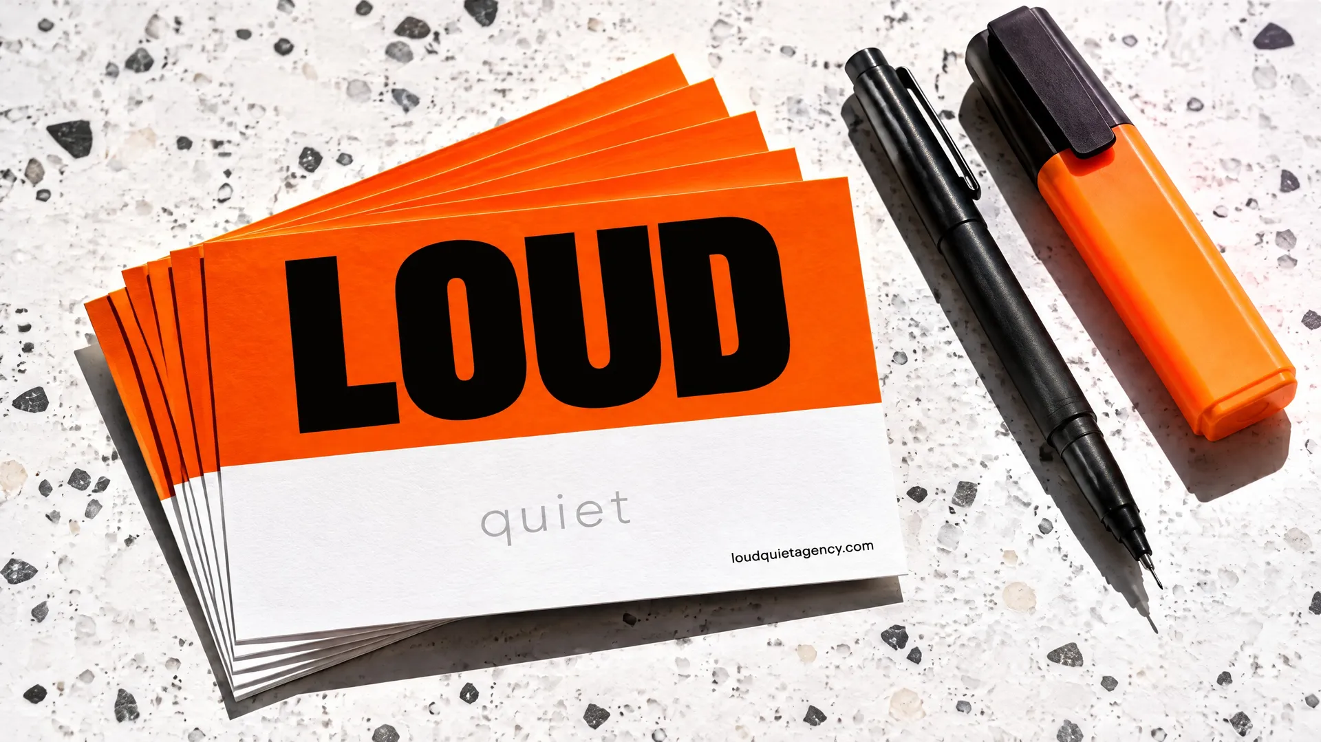
A loud color with one huge word stands out in any stack of white cards. Agencies, studios and retail brands can carry it, as long as there is an idea behind the volume. This agency is called Loud Quiet, so the card is split in two: "LOUD" in heavy black on fluorescent orange across the top, and "quiet" in thin pale grey type on plain white below. The name becomes the layout, and people remember it.
Describe the split and what goes in each half ("the top half fluorescent orange with LOUD in a heavy black condensed grotesk, the bottom half plain white with quiet in a thin light sans"), and ask for margins of at least an eighth of the card width so the big word doesn't touch the edges.
3. An illustration of your trade
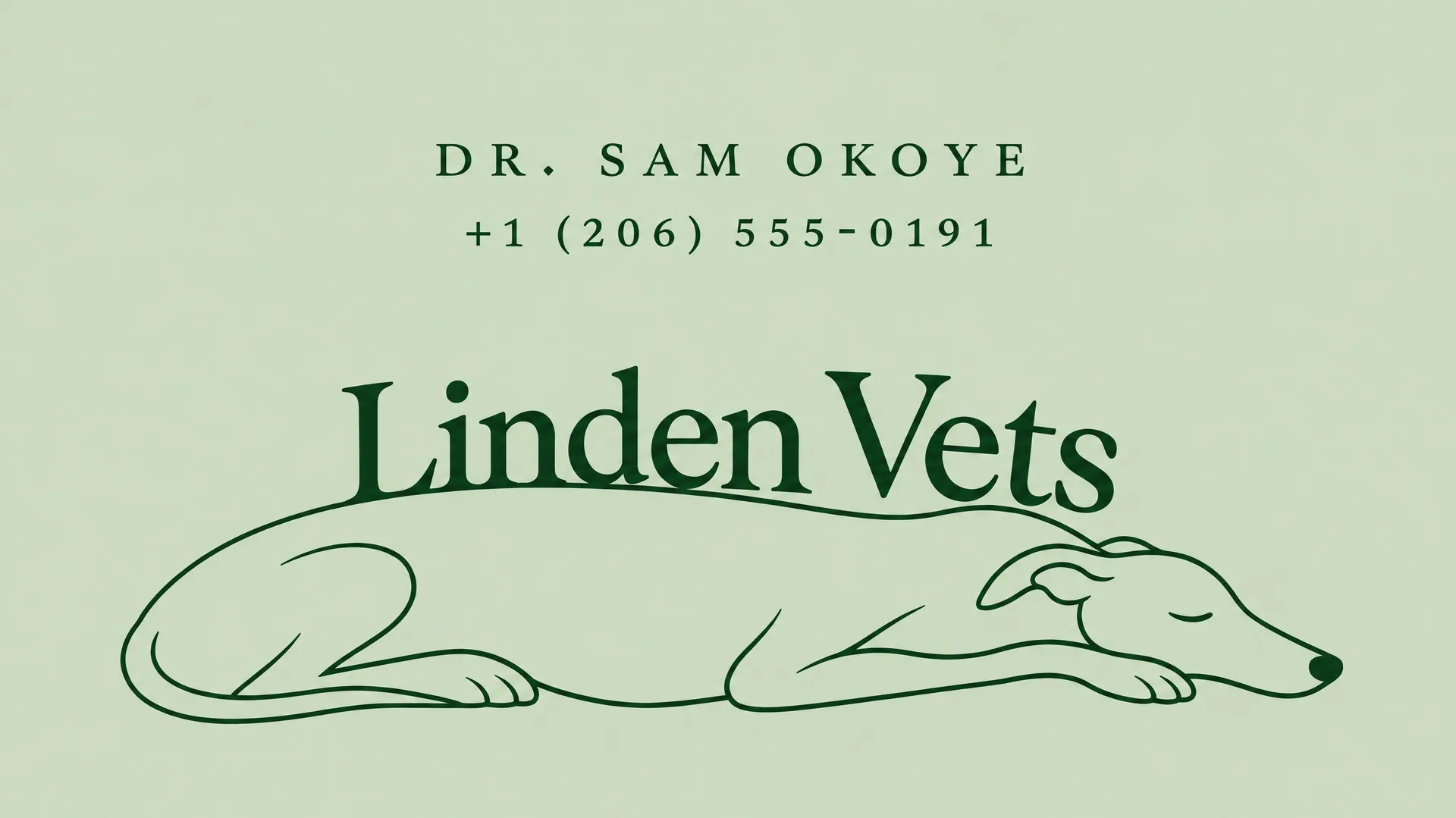
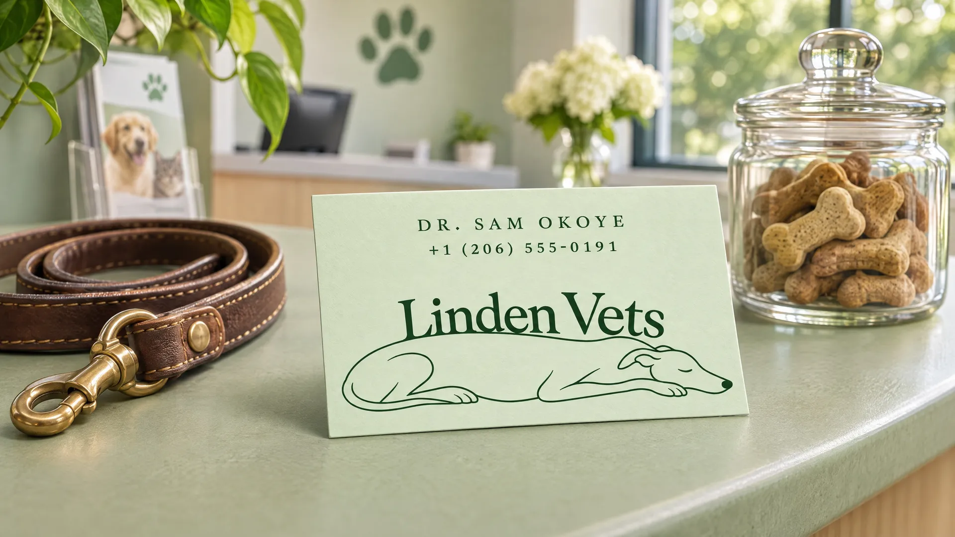
A drawing of something from your work tells people what you do before they read a word. It gets memorable when the drawing and the type work together. On this card for a vet, printed on pale sage, a greyhound sleeps along the bottom of the card, drawn in one continuous line, and the clinic name rests on its back.
Describe how the illustration and the name relate, not only what the illustration is: "a sleeping greyhound drawn in one continuous line, its back forming the baseline on which the name sits".
4. Photo-led layout
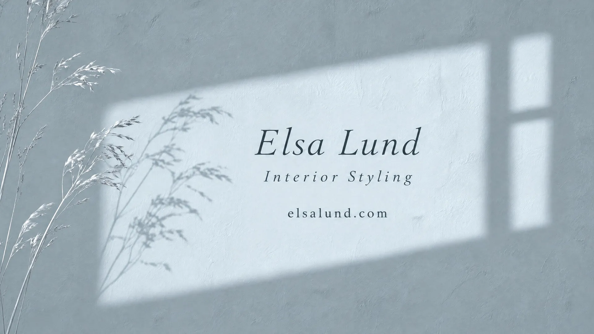
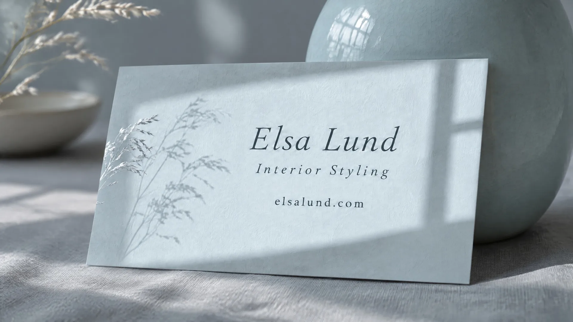
A photo can carry the whole card when the type belongs inside the picture. For an interior stylist, the card is a blue-grey plaster wall with a patch of morning light, and the name is set inside the light, as if the room is spelling it out. It sells the stylist's eye for light and space without showing a single sofa.
Describe the scene, the light and exactly where the text sits inside it: "the name set small in a light serif inside the patch of sunlight on the wall".
5. Vertical layout
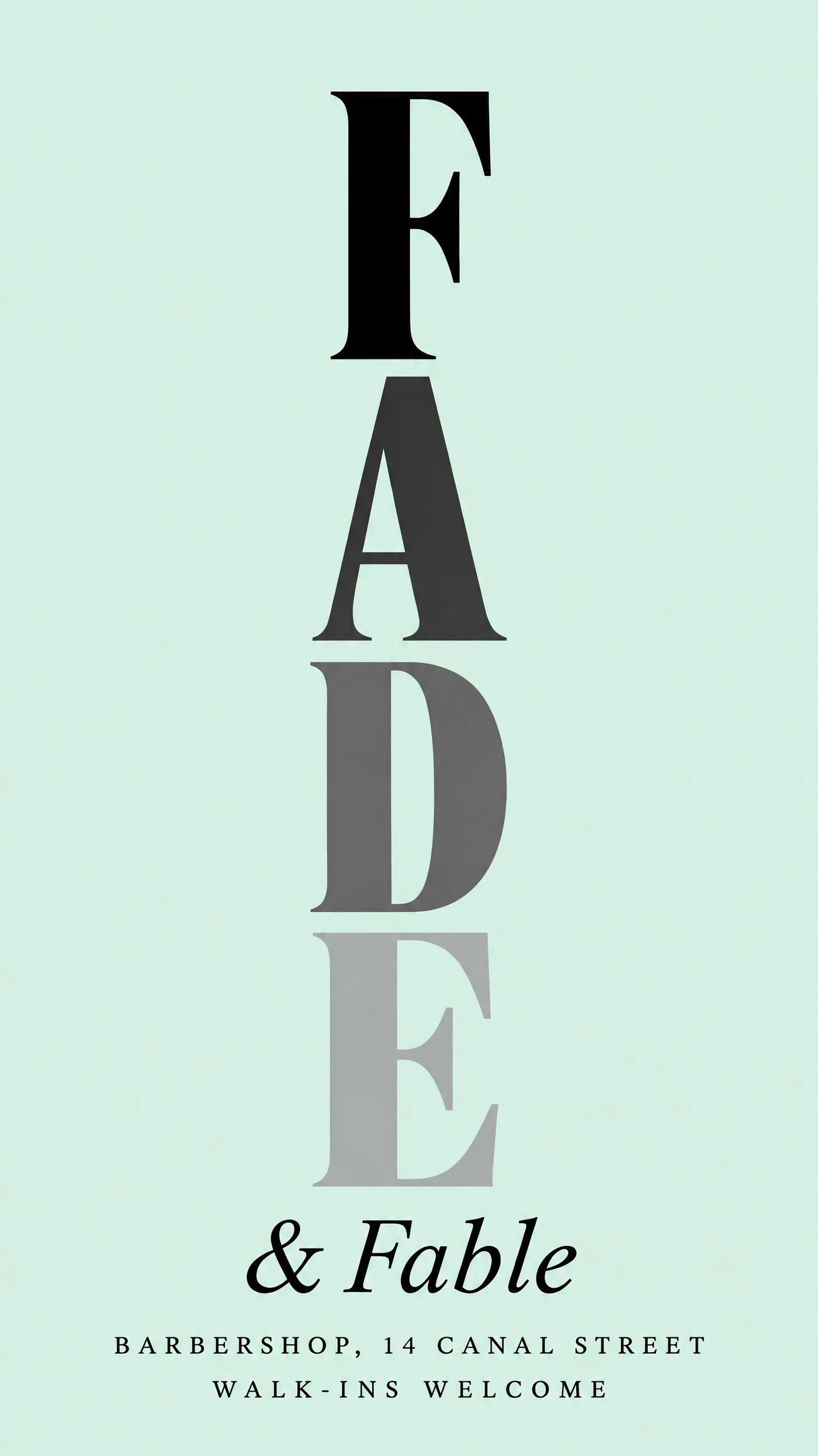
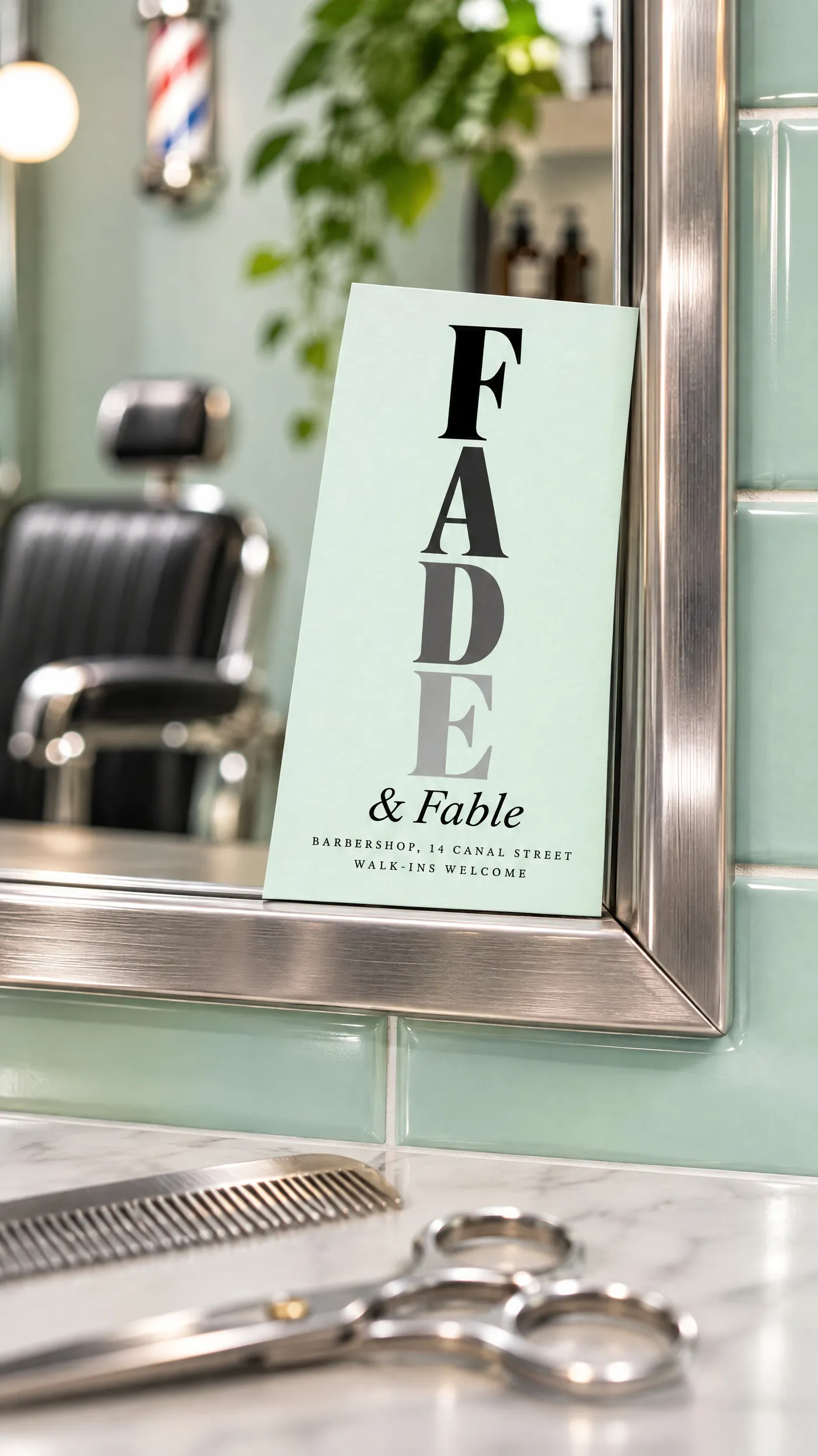
Turning the card on its side makes it feel different in the hand before anyone reads it. Barbers, tattoo studios, fashion brands and bars use it well, and the tall shape suits one stacked word. This barbershop is called Fade & Fable, so "FADE" runs down the card one letter per line, each letter lighter than the one above, like the haircut.
Generate at 9:16 and say "vertical business card" and "filling the whole portrait frame", or the model may draw a horizontal card inside a tall image. Describe the effect letter by letter: "from solid black at the top to pale grey at the bottom". The mint card color borrows from old barbershop tiles.
6. Monogram and foil
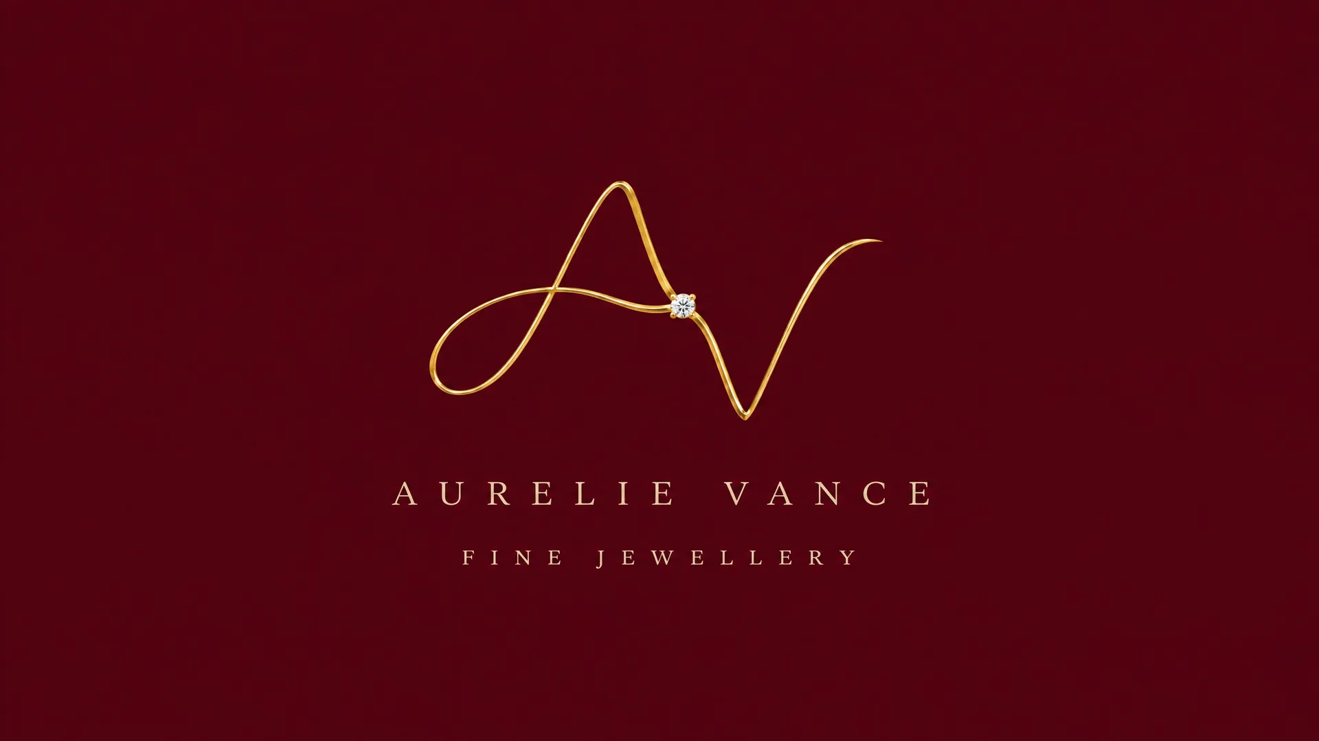
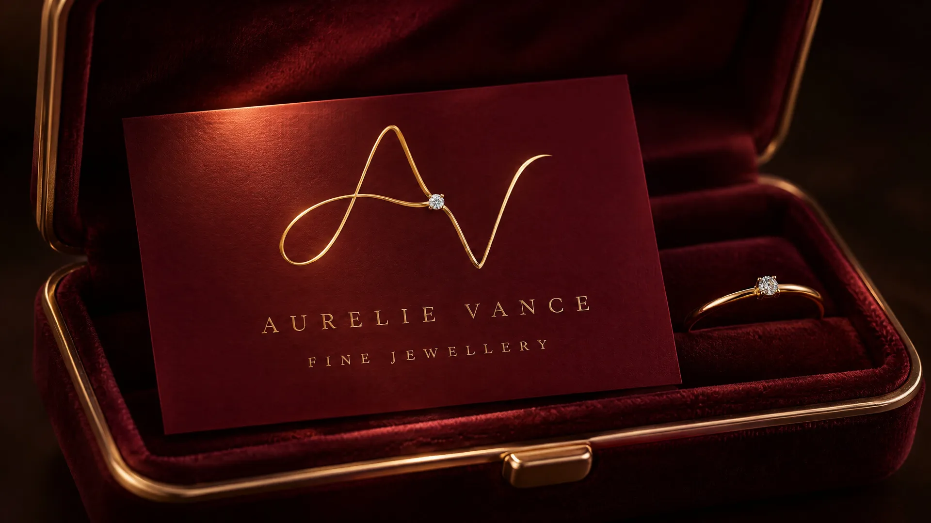
Foil and a monogram read as established and discreet. They look generic when the monogram is two letters in a circle. For a jeweller, the initials are bent from one fine gold wire, like a handmade ring, with a single tiny diamond where the strokes meet. On a printed card the foil is applied from a separate layer, so treat the generated foil as a preview of the effect.
Describe the monogram as an object from the trade ("drawn as one continuous fine gold wire, bent like a handmade ring") and keep the card color soft and plain so the foil carries the design.
7. Retro lettering
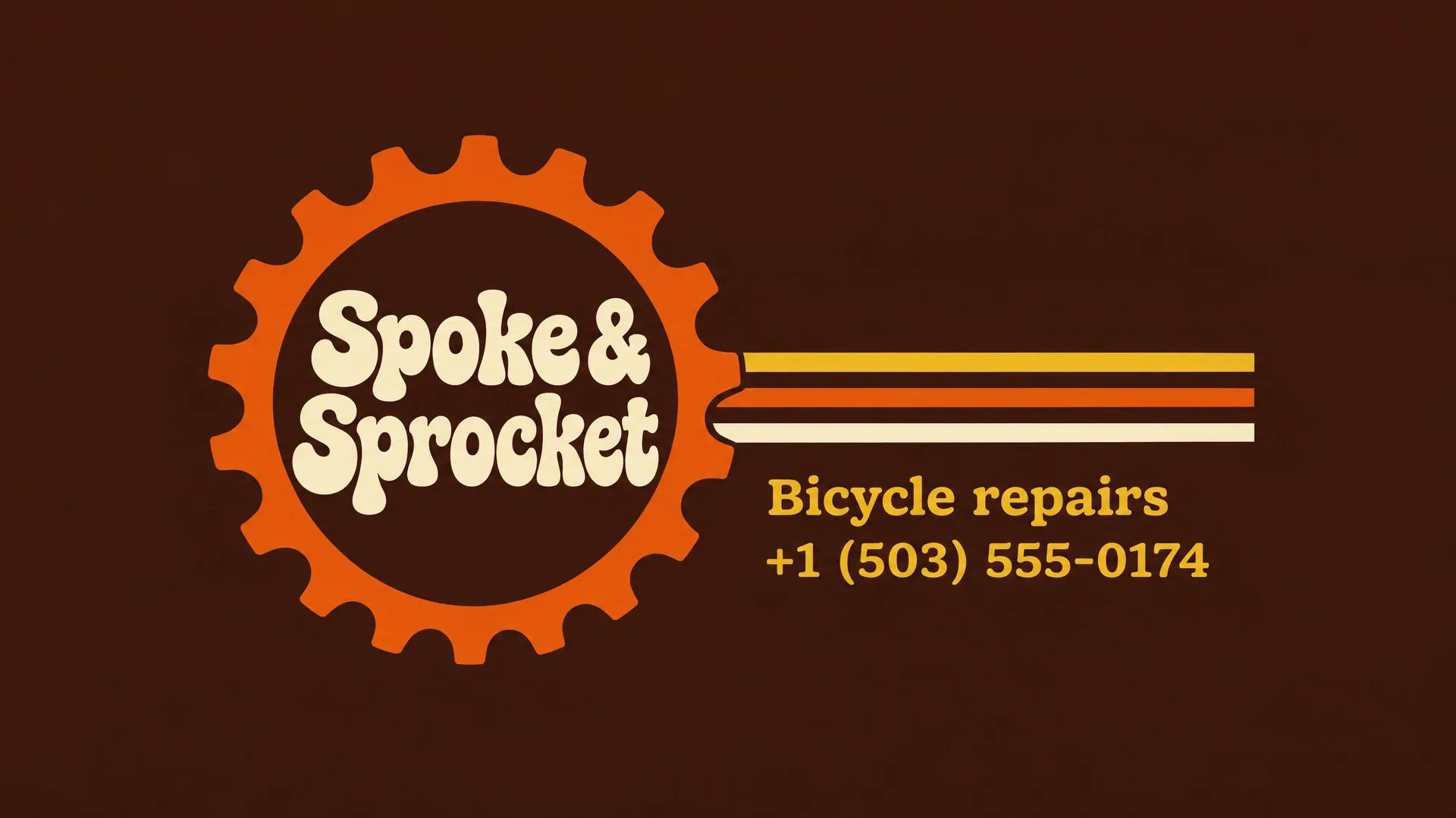
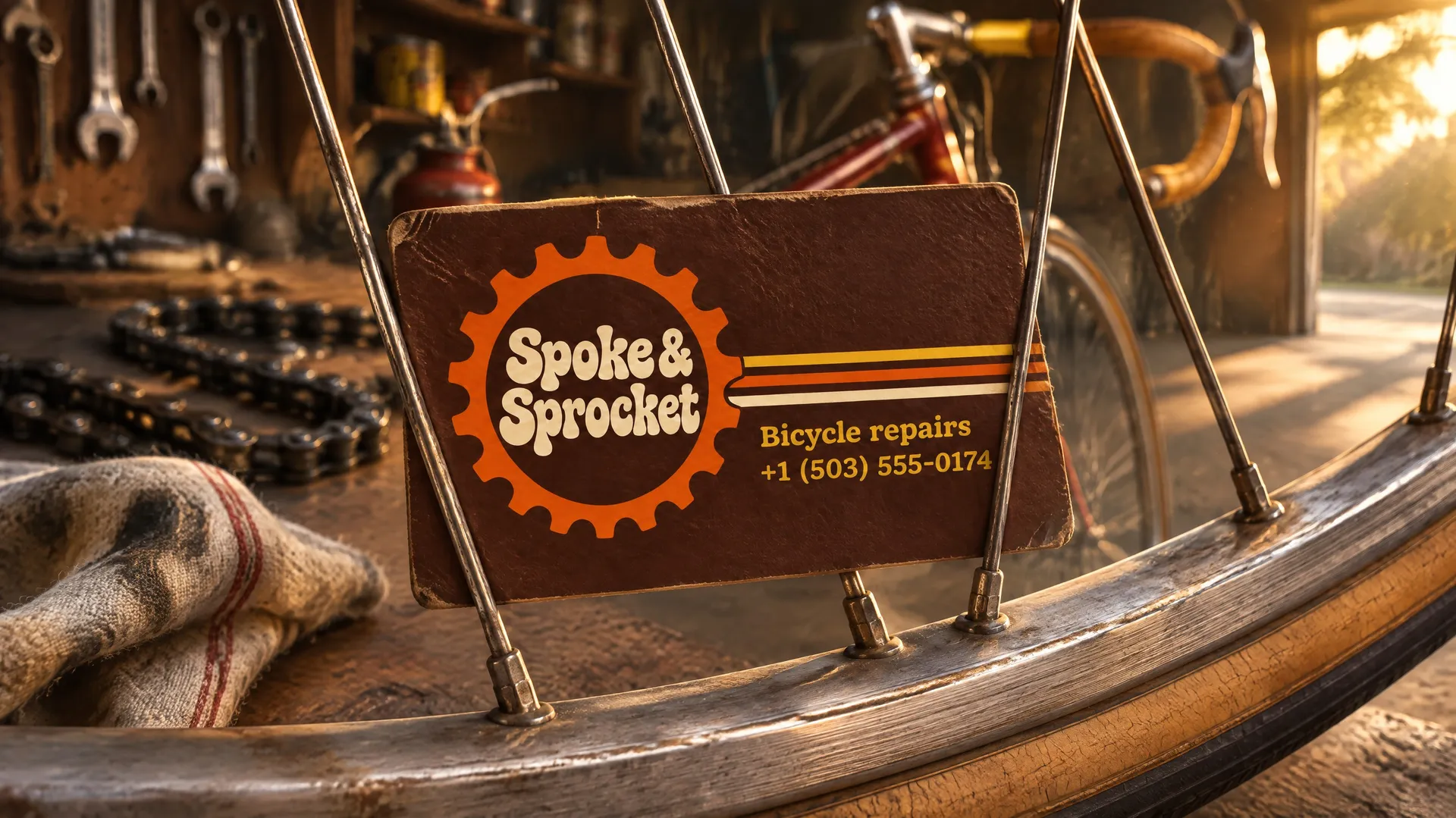
Borrow from a decade that fits the business: 1970s decals and rounded display type for a bike shop or record store, 1950s script for a diner, 1920s geometric lettering for a cocktail bar. For a bike repair shop, the name sits inside a chunky chainring, and three stripes run out from it like the decal on an old racing frame.
Name the decade, the object the design is built on ("a chainring drawn as a bold flat gear") and the three colors, then describe the typeface as "a rounded 1970s display face".
8. Two colors, two sides
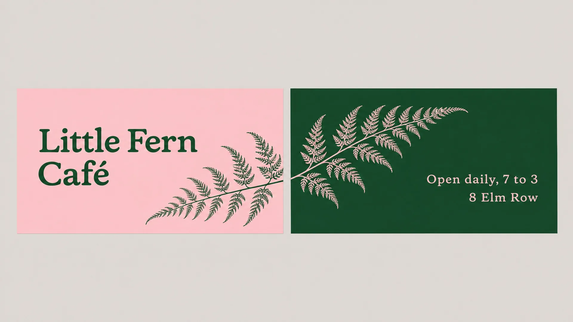
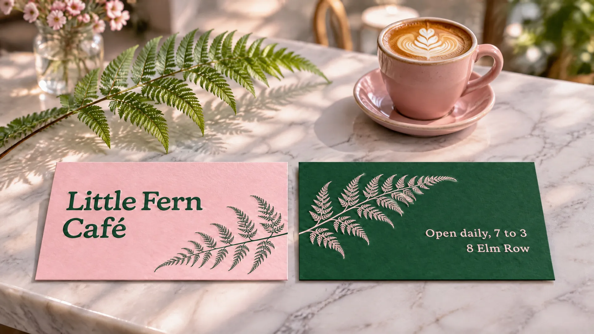
Use the front for the brand and the back for the details, each in the other's color. A shared element that crosses from one side to the other makes the two sides feel like one designed object. On this café card, a single fern frond starts on the pink front and continues onto the green back.
Generate both sides in one image, side by side on a plain background, and describe the element that connects them: "one fern frond starts on the right edge of the front card and continues onto the back card". Then add the result as a reference to export each side on its own.
9. Letterpress texture
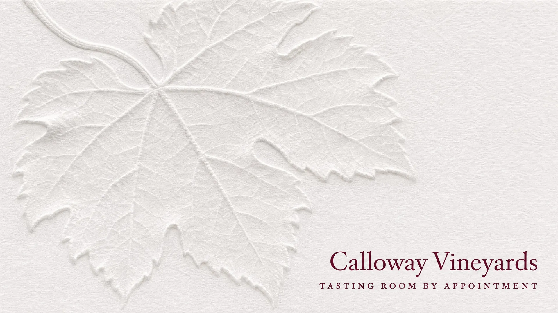
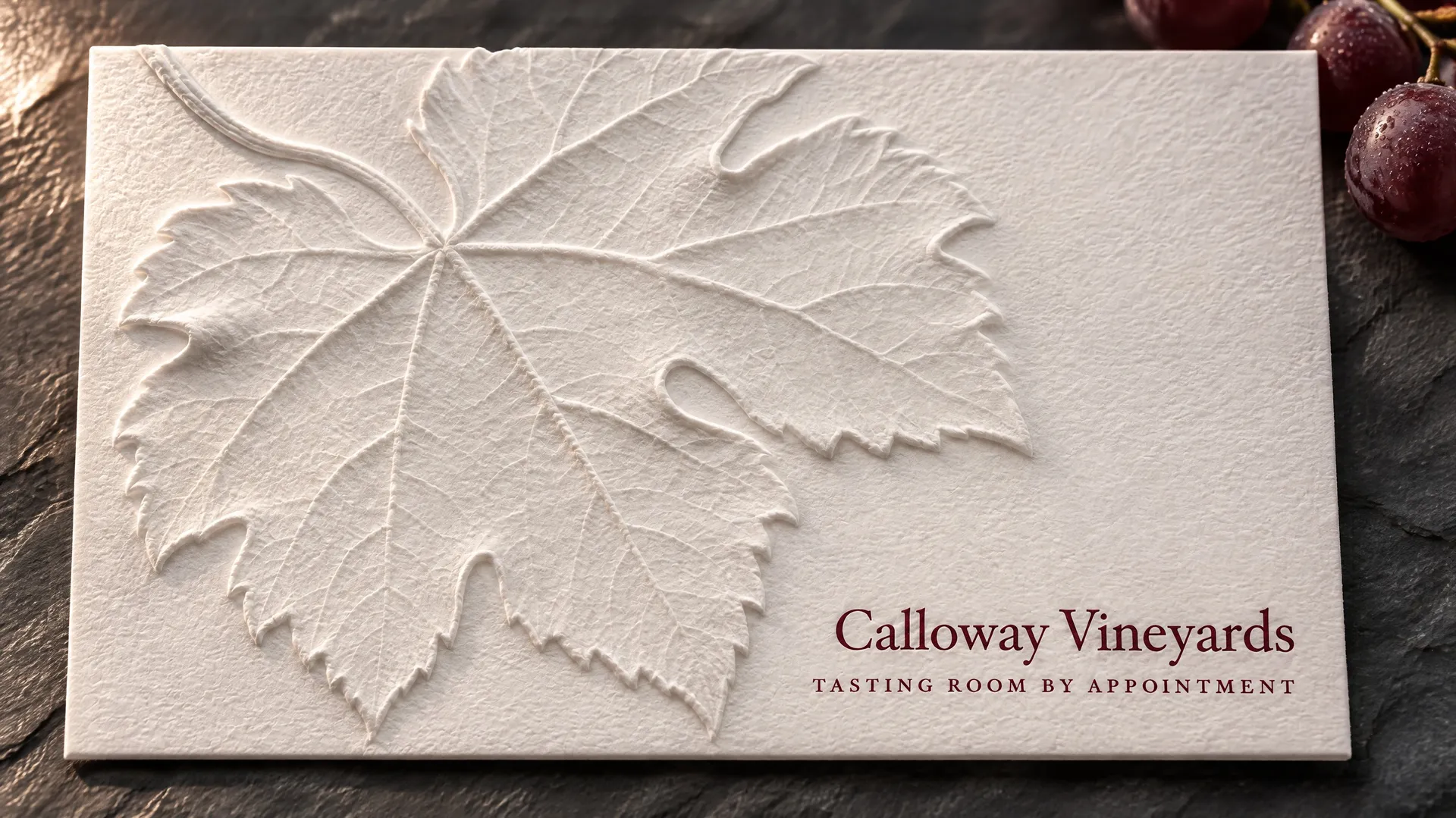
Letterpress presses the design into thick cotton card, so it has depth you can feel. The most striking version is blind letterpress, pressed with no ink at all. On this card for a vineyard, a large vine leaf exists only as a relief in the paper, and the only ink on the card is the name in burgundy.
Ask for "deeply pressed into the paper with no ink at all, visible only as a soft relief" and keep the printed text small, so the texture carries the card. Ask your printer for a proof, since the depth of a blind impression depends on the paper.
How to make a business card with AI
The steps below use Create image on getimg.ai, where the AI business card generator workflow lives. Auto model selection picks a model that handles small text well, and you can switch to a model like GPT Image or Nano Banana when you want to compare the same prompt.
- Write your details exactly as they should appear, each in quotation marks, and say where each one goes on the card.
- Set the aspect ratio for your card size: 16:9 for a US card, 3:2 for a European card, 9:16 for a vertical card.
- Describe one direction: the print finish, the typeface style, two or three colors and the one image or mark the card is built on.
- If you already have a logo, add it as a reference image and describe the card around it. If you don't, our guide on how to design a logo with AI covers that step first.
- Pick the strongest version, then add it as a reference to make the back, the letterhead or a card for each person on the team with only the name and title swapped.
Turn on prompt enhancement if you want the model to add detail about paper, ink and layout to a short description. The quoted lines stay as you wrote them. For more prompt patterns that keep small text sharp, see how to generate images with readable text.
What to check and finish before you print
An image model designs the card. A few last steps still happen outside the generator, and they decide whether the printed card matches the one on screen.
Read every character
Models are good at short text and keep getting better, but they can still swap a digit in a phone number or a letter in an email address. Compare each line against your notes, and if one is wrong, regenerate or open the card in the image editor with a prompt that names only the fix, for example "change the phone number to +1 (212) 555-0147".
Add QR codes yourself
A QR code drawn by an image model looks convincing and doesn't scan. Generate the card with an empty space for the code, then place a real code from a QR generator in a design tool.
Set up the print file
Most printers want a PDF in CMYK with bleed. Place your image in the printer's business card template so it fills the bleed area, check that nothing important sits in the trim, and let the printer's preview convert the colors. Bright screen colors like electric blue or neon green can print duller, so order a single proof before a full run.
Keep the system
Save the final card and use it as the reference for everything that follows, from email signatures to the shop sign. Our guide to building a brand visual identity with AI covers that next step.
Bottom Line
The best business card design idea is the one that looks like your business: minimal for precise work, illustrated for trades, foil for discreet luxury, retro for a shop with personality. Keep the content to four or five lines, generate at the right aspect ratio, check every character and finish the print file before you order. To try any of the nine styles with your own details, create your business card on getimg.ai and start from one of the prompts above.
Frequently Asked Questions
Your name, your role or trade, one or two ways to contact you and your website. Add a logo if you have one and an address only if people visit you. Everything else belongs on your website.
In the US and Canada it's 3.5 x 2 inches, or 3.75 x 2.25 inches with bleed. In most of Europe it's 85 x 55 mm, or 91 x 61 mm with bleed. Japan uses 91 x 55 mm.
Yes. Write the details into the prompt in quotation marks, describe a style and generate. Current models set names, phone numbers and emails in clean type and follow named styles such as letterpress, foil or Swiss typography. Check every character before printing.
Use 16:9 for a standard US card, 3:2 for a European card and 9:16 for a vertical card. Keep text away from the edges so nothing important falls in the trim area.
Yes. Add the logo as a reference image and describe the card around it, including the colors, paper and what goes on the back. The model keeps the mark and designs the layout to match.
Leave a space for it in the prompt and place a real QR code in a design tool afterwards. Codes drawn by an image model don't scan.
Images created on paid getimg.ai plans come with commercial usage rights, subject to our terms and applicable third-party rights. The rules for commercial use of AI-generated images still apply, so don't copy another company's logo or trademark.
Related Articles