How to Make a Flyer With AI (Without the AI Slop Look)
To make a flyer with AI, write the event details exactly as they should appear, then describe a design direction: one clear idea, a named print style such as woodcut, risograph or Swiss typography, one or two typefaces and two or three colors. That direction is what separates a designed flyer from the glossy, emoji-covered look a one-line prompt in a chat app tends to return. On getimg.ai, Create image picks a model that sets text cleanly, follows the style you name and can build the flyer around a photo of your own product or venue.
What to prepare before you prompt
The model handles layout, type and illustration. The content and the decisions still come from you, and settling them first saves most of the regenerating later.
What to prepare | Why it matters |
Final wording for name, date, time and venue | The model sets what you write, so a typo in the prompt ends up on the wall |
One idea for the image | A single strong image beats five small ones competing for attention |
A print style or photo look | Gives the model a real reference instead of an average of every flyer it has seen |
Two or three colors | A short palette is the fastest way to look printed rather than generated |
The formats you need | A street poster, a story and a handout need different shapes |
Optional: a photo of your product, room or performer | Only if the real thing should be on the flyer |
Keep the text short. Four or five lines of details is plenty for a poster that people read from a few meters away, and it's also where text rendering is most reliable.
How to make a flyer with AI, step by step
The steps below use Create image on getimg.ai, where the AI flyer generator workflow lives. Auto model selection is on by default and picks a model that handles text well. You can switch to a specific model whenever you want to compare the same prompt.
1. Write the details first
Start from the facts, not the design. Write the event name, the date, the time and the venue exactly as they should appear, and cut everything a passerby doesn't need to show up. Ticket links, sponsor lists and long descriptions belong on the event page.
Put each line in quotation marks in the prompt and say where it goes: the name large at the top, the details small at the bottom right, the venue on its own line. The guide on how to generate images with readable text covers more prompt patterns for typography.
2. Pick the format and aspect ratio
Choose the shape before you generate, because the layout changes with it.
Flyer format | Aspect ratio | Typical use |
Street or window poster | 2:3 | Venues, shops, markets, cultural events |
Handout or A5 leaflet | 2:3 | Counters, stalls, door-to-door |
Feed post | 4:5 or 1:1 | Weekly lineups, announcements, specials |
Story or vertical screen | 9:16 | Stories, in-venue screens |
Wide banner or screen | 16:9 | Event pages, newsletter headers, TV screens |
3. Describe one design direction
This is the step that decides whether the flyer looks designed or generated. Name a print technique or a design period, the type and the colors, then the one image or idea the flyer is built on.
A prompt like "Pub quiz poster designed as a crossword grid, black and pillar-box red on off-white newsprint, QUIZ across and NIGHT down sharing the letter I, the details small in a bold grotesk below" gives the model a whole visual system and a joke in one sentence.
Turn on prompt enhancement if you want the model to add detail about paper, ink and composition to a short description. Your text lines stay the same.
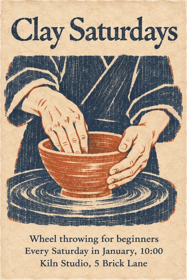
The same pottery class with two directions: a Bauhaus screen print built from geometric pots, and a woodblock print of hands at the wheel. The details are identical, and the posters have nothing in common.
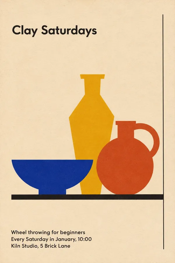
Direction one: a 1920s Bauhaus screen print of three geometric pots.
Direction two: a Japanese woodblock print of hands at the wheel.
4. Optional: build it around your own photo
If the flyer should show the real thing, upload a photo as a reference image and say where it goes: large and centered, cut out on a flat color, or as a halftone across the top. A phone photo in daylight or warm bar light is enough. The model keeps the label, the plate or the room, so the flyer promises what people will actually find.
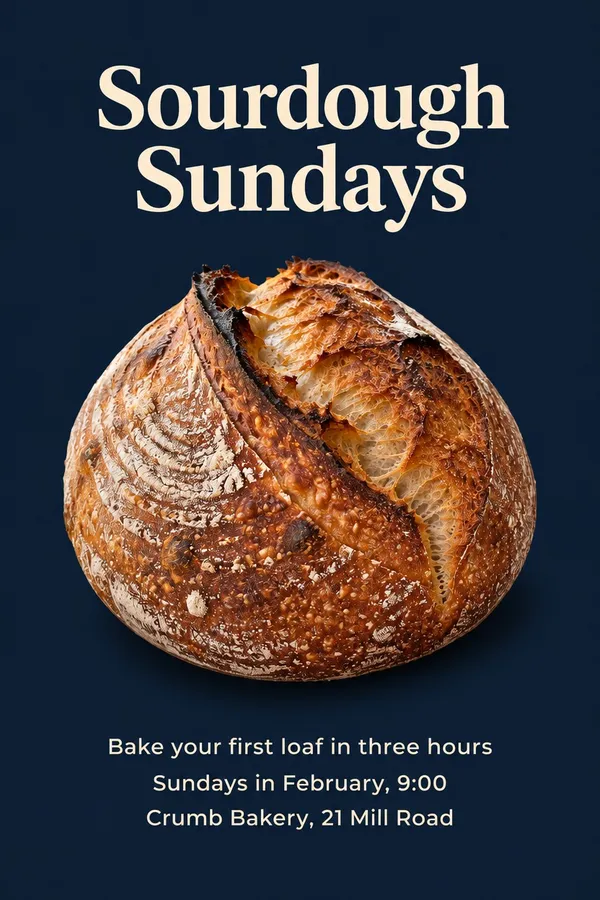
A baker's quick phone photo of a sourdough loaf, and the class poster built around that same loaf.
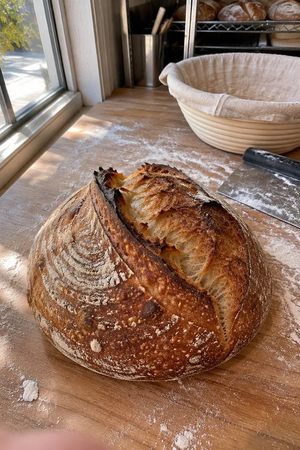
The input: a quick phone photo of the loaf, uploaded as a reference image.
Made on getimg.ai from the photo: the same loaf, cut out on deep navy with a cream serif.
5. Make the other formats from the first one
Once one flyer works, add it as a reference image and describe the next format: "the same poster as a 9:16 story", "an A5 handout with only the date and venue", "a square post announcing this week's lineup in the same style". The type, colors and illustration style carry over, which is how a venue ends up with a look regulars recognize across a whole season instead of a different style every week.
The same works for the next event in a series. A bakery's first class poster went in as the reference, and the next two months came out in the same layout, type and colors.
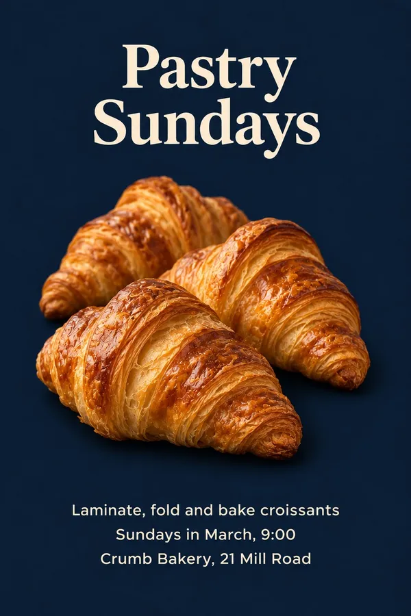
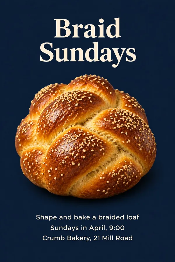
The March class, generated with the first poster as a reference: same layout, type and colors.
The April class from the same reference. Three months, one recognizable look.
6. Check every line before it goes out
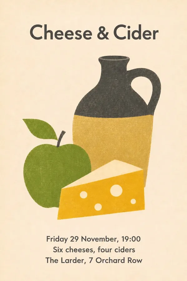
Read the date, time, address and every name against your notes. Models keep improving at text, but they can still swap a digit, drop a letter or change a weekday, especially in small type. Regenerate if a line is wrong, or open the flyer in the image editor and write a prompt that names only the change, for example "change the date to Friday 29 November".
Here a tasting moved by one day. The edit prompt named only the new date, and the illustration, type and layout stayed as they were.
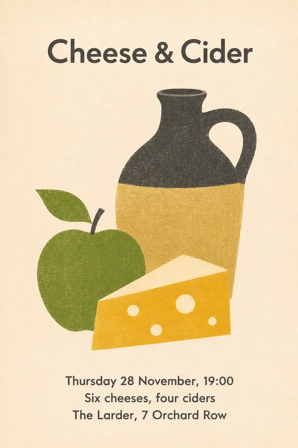
First version, with the old date: Thursday 28 November.
Edited on getimg.ai with a prompt that names only the new date. Everything else stays the same.
Why so many AI flyers look the same
Ask a chat app for "a flyer for our quiz night" and you'll often get the same picture: a purple to orange gradient, a chrome headline with a glow, a cartoon mascot, confetti, a red starburst promising prizes, an emoji next to every line and four different fonts. Through 2026 this look has been mocked online often enough that some venues now refuse to share AI-made flyers at all, and some bars answer with hand-lettered signs instead.
None of that is a bug. When a prompt doesn't say what the flyer should look like, the model fills the gaps with the most common choices it has seen, and the result is the visual average of a million flyers. That average is what people now recognize as AI slop: technically fine, and still cheap-looking, because nobody made a single decision about it.
The common tells:
- Glow, chrome, glitter and 3D lettering on the headline
- A mascot or a smiling cartoon object
- An emoji or icon in front of every line of details
- Starbursts, ribbons and badges ("Don't miss out!", "Limited spots!")
- Three or four fonts on one page, often including a script
- Every gap filled with sparkles, confetti or music notes
- Fake QR codes and invented extra details nobody asked for
Generic AI look vs. a design direction: four examples
Each pair below is for the same fictional event, with the same details. The left flyers are examples of the generic AI slop look, so the tells are easy to see. The right flyers were made on getimg.ai with a prompt that named one idea, a print style, the type and a short palette.
Pub quiz: The Crown & Anchor
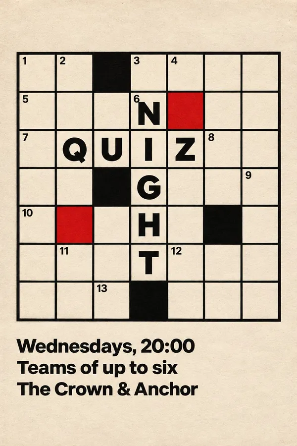
The generic version piles a chrome headline, a brain mascot, a prize starburst, a fake QR code and an emoji on every line into one gradient. The redesign has one joke and commits to it: the poster is a crossword, with QUIZ across and NIGHT down sharing a letter, two red squares for color and the details set small underneath. It's quieter, and it's the one people stop to look at.
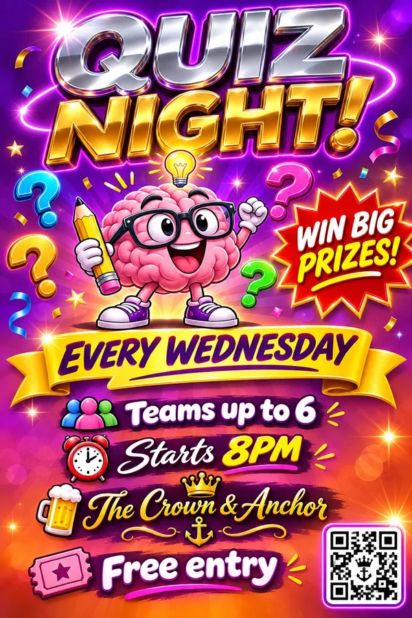
An example of an AI slop flyer: chrome headline, brain mascot, prize starburst, fake QR code and an emoji on every line.
The redesign, made on getimg.ai: one joke, a crossword where QUIZ and NIGHT share a letter.
Yoga workshop: Still Water Studio
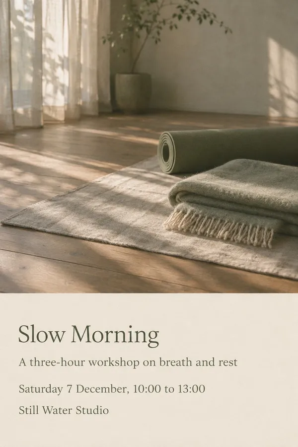
The generic version reaches for every wellness cliché at once: a sunset beach, glowing chakras, dreamcatchers, lotus clip-art and a ribbon saying "Special workshop!". The redesign sells the feeling of the room instead. A soft film photograph of morning light on a studio floor, a rolled mat, a folded blanket and a light serif with plenty of space say "slow morning" without a single symbol.
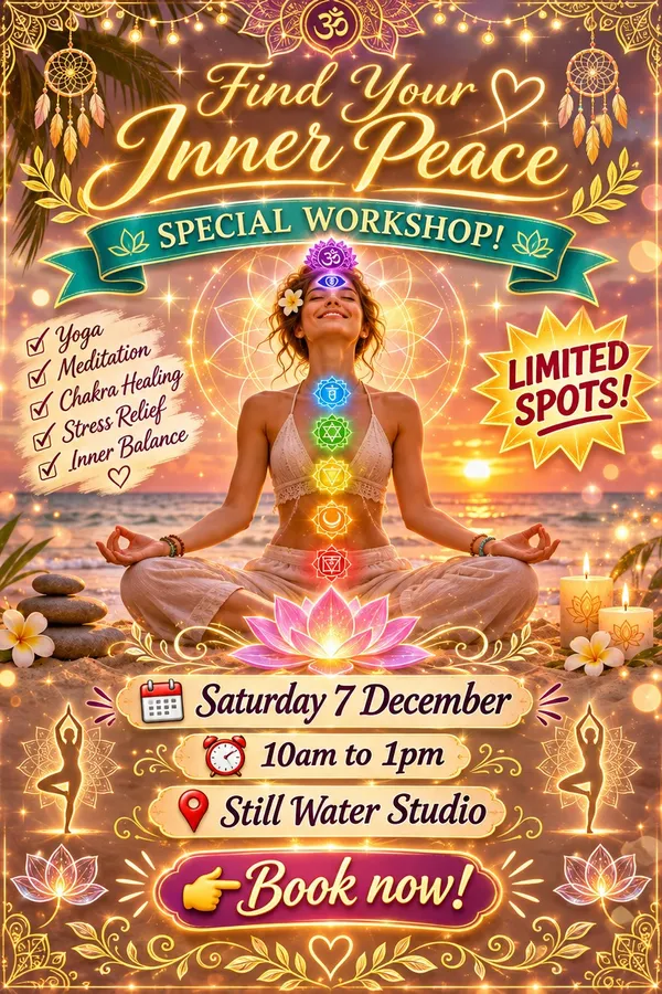
An example of an AI slop flyer: sunset beach, glowing chakras, lotus clip-art and a ribbon badge.
The same workshop sold through the room: a soft film photo of morning light and a quiet serif.
New Year's Eve dinner: Bistro Lumiere
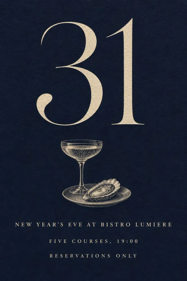
Gold glitter, fireworks, balloons, clinking glasses and a plate of steak all fight for the same page in the generic version. The redesign uses the date as the image. A large "31" in an elegant high-contrast serif, one small engraved coupe and oyster and three lines in spaced capitals, all in cream on midnight blue, read like a letterpress invitation to a dinner worth booking.
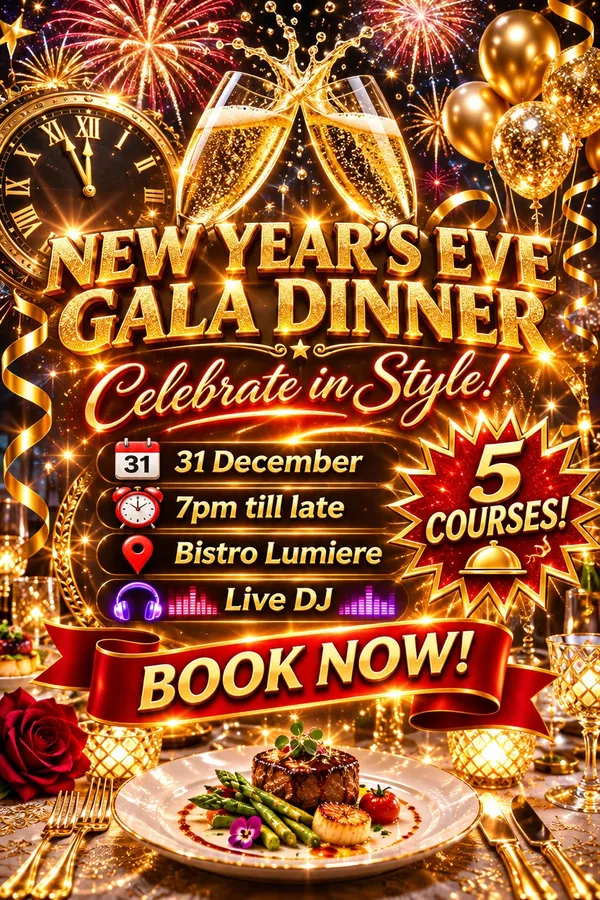
An example of an AI slop flyer: gold glitter, fireworks, balloons and 3D type all fighting for space.
Redesigned on getimg.ai as a letterpress invitation, with a large 31 and an engraved coupe.
Record fair: Old Corn Exchange
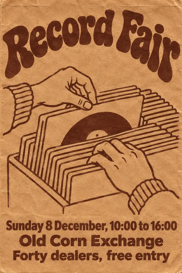
The generic version is neon cyberpunk with exploding vinyl, cartoon headphones and three exclamation marks in the title, a look that has nothing to do with people who flick through crates on a Sunday. The redesign borrows from the record shop itself: one brown ink on kraft paper like a 1970s record bag, a line drawing of hands in a crate and warm rounded lettering.
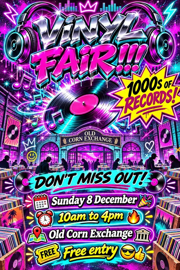
An example of an AI slop flyer: neon glow, exploding vinyl, cartoon headphones and starbursts.
One brown ink on kraft paper, borrowed from a 1970s record bag.
Side by side, the difference isn't the model or the resolution. It's whether someone made decisions about the idea, the type, the color and what to leave out.
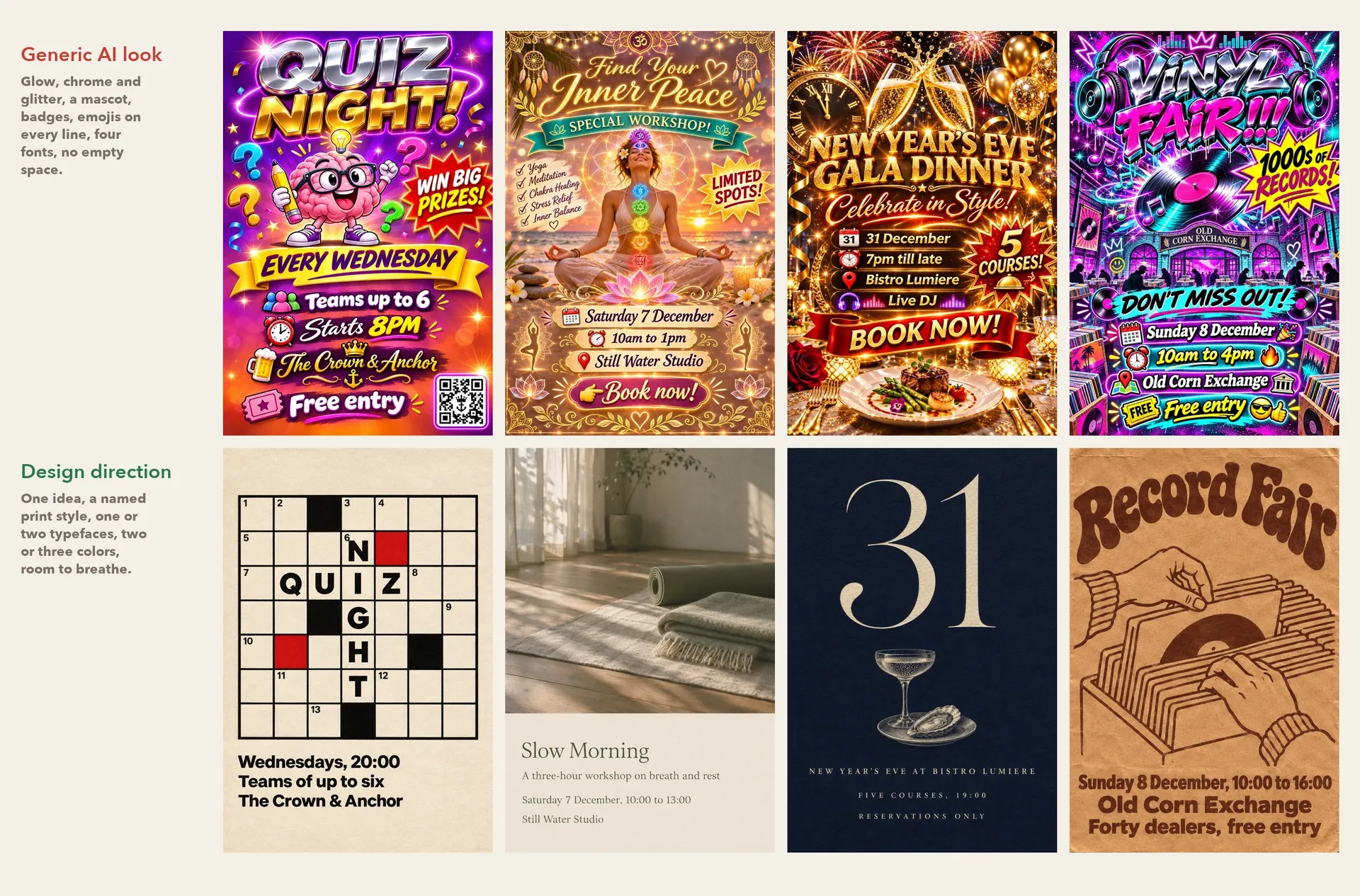
Top row: examples of AI slop flyers. Bottom row: the same events made on getimg.ai, each built on one idea and a named print style.
What makes a flyer read from across the street
A flyer usually gets two or three seconds from someone walking past. These principles come from poster design and are simple to put into a prompt:
Principle | What it means | What to ask for |
One dominant element | A single image, word or number carries the poster | "One large...", "dominates the top half" |
Clear hierarchy | Name first, then date, then venue, in falling sizes | Say which line is large and which are small |
Grouped details | Date, time and place sit together in one block | "Details in one block at the bottom left" |
Few typefaces | One family, or one display face plus one text face | Name the type: grotesk, wide serif, typewriter |
Contrast | Dark on light or light on dark, never mid-tone on mid-tone | Name the ink and the paper color |
Empty space | Space around the main element makes it visible | "Generous margins", "lots of empty space" |
Flyer design ideas by type of business
Each kind of business has a visual tradition to borrow from. Naming it in the prompt gives the model a look with a real history instead of a generic one:
Business or event | Direction that works | What to name in the prompt |
Live music and jazz | Swiss typography or a 1950s record sleeve | Heavy grotesk, one geometric shape, a cropped instrument photo |
Club nights | Photocopied halftone flyer | Grainy black and white photo, one fluorescent spot color |
Markets and food | Woodcut or screen print | Two inks, carved lines, a wide old-style serif |
Theatre and comedy | Polish poster school | One surreal painted image, hand-painted lettering |
Wine bars and tastings | Mid-century travel poster | Flat gouache shapes, a Didone serif |
Bookshops and talks | Editorial collage | Cut-out photo, torn paper, typewriter type |
Fitness and running clubs | Athletic campaign photo | Motion, blue hour light, ultra condensed italic type |
Shops and sales | Product still life | One product, a plain color backdrop, a light sans |
A running club and a bookshop need very different flyers, and both can come from a two-sentence prompt.
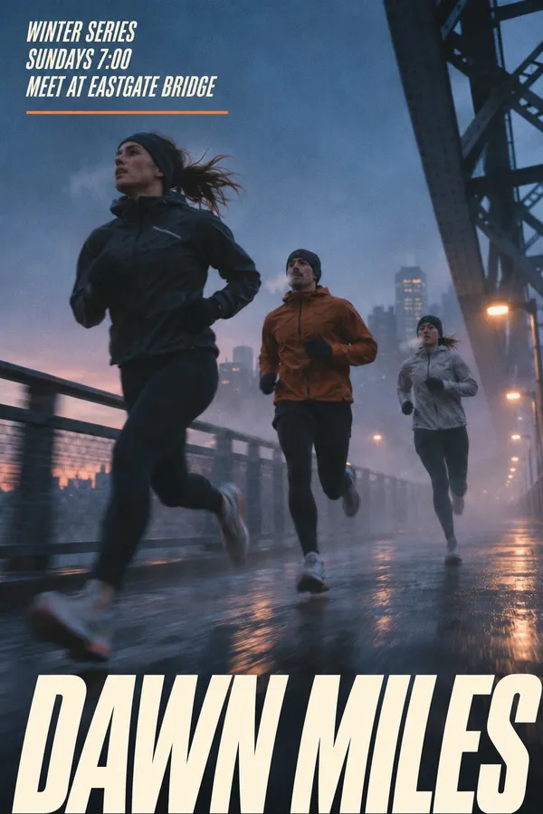
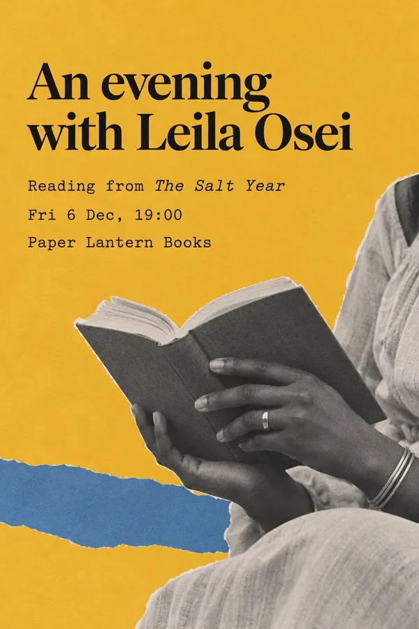
Running club poster: a blue hour photo of runners and ultra condensed italic type.
Bookshop talk as an editorial collage of torn paper and typewriter type on mustard yellow.
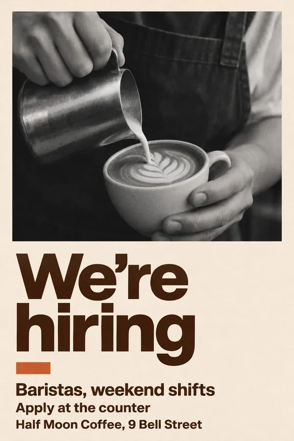
The same applies to flyers that aren't about events. A sample sale works as a calm product photograph with a light sans, and a hiring poster can be one honest photo of the job and three lines of bold type.
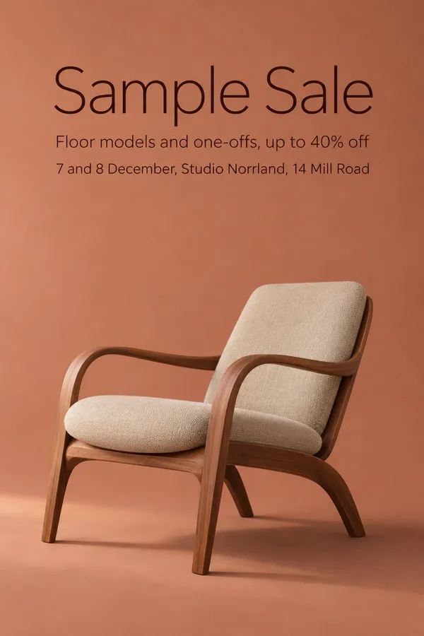
Sample sale poster: one walnut lounge chair on terracotta and a light sans.
Hiring poster: one honest photo of the job and three lines of bold type.
Printing your AI flyer
Generate at the highest resolution the model offers. For posters printed larger than A4, run the file through the AI image upscaler first so the type stays crisp. Print one test copy and read it from the distance people will see it at, on the street or across the bar.
Print size | Typical use | Before printing |
A5 | Handouts, counters, table cards | Check the smallest line is still readable |
A4 | Windows, noticeboards | Print a test copy at full size |
A3 and larger | Street posters, venue walls | Upscale first, check from a few meters away |
Restaurants get the same treatment for their menus. The guide on how to make a restaurant menu with AI applies these ideas to dishes and prices.
Bottom Line
A good AI flyer comes from decisions, not from a better model. Write the final details first, pick one idea and a real print style with two or three colors, and leave out glow, mascots and emojis. Check every line before it goes to print, because dates and digits in small type are where models still slip. Open Create image and design your flyer.
Frequently Asked Questions
Yes. Image models with strong text rendering can produce a complete flyer design with your event name, date, time and venue from a text prompt alone. Put the exact text in the prompt, describe the design direction and the format, and check every line before printing or posting.
Models that render text well give the most reliable flyers, such as GPT Image 2.6 and Nano Banana 2.1. On getimg.ai, Auto model selection picks a suitable model by default, and you can switch models to compare the same prompt.
When a prompt doesn't describe the design, the model fills in the most common choices: gradients, glowing 3D headlines, mascots, badges and an emoji on every line. Naming one idea, a print style, the type and a short palette makes the result look designed instead of averaged.
Upload the photo as a reference image and describe where it should go in the layout, for example large and centered on a flat color or as a halftone at the top. The model keeps the product, room or person from the photo and builds the flyer around it.
Generate the main poster first, then add it as a reference image and ask for the new format in the same style, such as a 9:16 story or a square post. The type, colors and illustration style carry over, so the whole campaign looks consistent.
Images you create on getimg.ai's paid plans come with commercial usage rights, subject to our terms and applicable third-party rights. Don't copy another business's logo, artwork or branding.
Related Articles