How to Make a Restaurant Menu With AI (Without the AI Look)
To make a restaurant menu with AI, write out your dishes and prices and describe a real print style, such as letterpress, risograph or hand-painted sign lettering, with two or three colors. On getimg.ai, Create image picks a model that renders text well, sets your items in clean type and can build the menu around a photo of your own food if you add one. The step most AI menus skip is the design direction: without it, you get the cartoon fonts, mascots and badges that now fill social feeds.
What you need before you start
The AI does the layout, the type and the illustration. The content still comes from you, and preparing it first saves most of the regenerating later.
What to prepare | Why it matters |
The final list of dishes and prices | The model sets exactly what you write, so typos in the prompt end up on the menu |
Optional: a photo of a signature dish | Only if you want your real food on the menu; most menus work without one |
The format | A table card, a wall board and a social post need different shapes |
Two or three colors | A short palette is the fastest way to look designed |
A print style to aim for | Gives the model a real reference instead of a guess |
Keep each menu image to roughly five to ten items. Longer menus work better split into sections, one image per section or page, than squeezed into one picture.
How to make a menu with AI, step by step
The steps below use Create image on getimg.ai, where the AI menu maker workflow lives. Auto model selection is on by default and picks a model that handles text well, and you can switch to a specific model whenever you want to compare.
1. Write the menu text first
Start from the list, not the design. Write every dish exactly as it should appear, with the price, and decide on short descriptions now. A handwritten list on the pass works as well as a spreadsheet, as long as the final spelling is settled before you prompt.
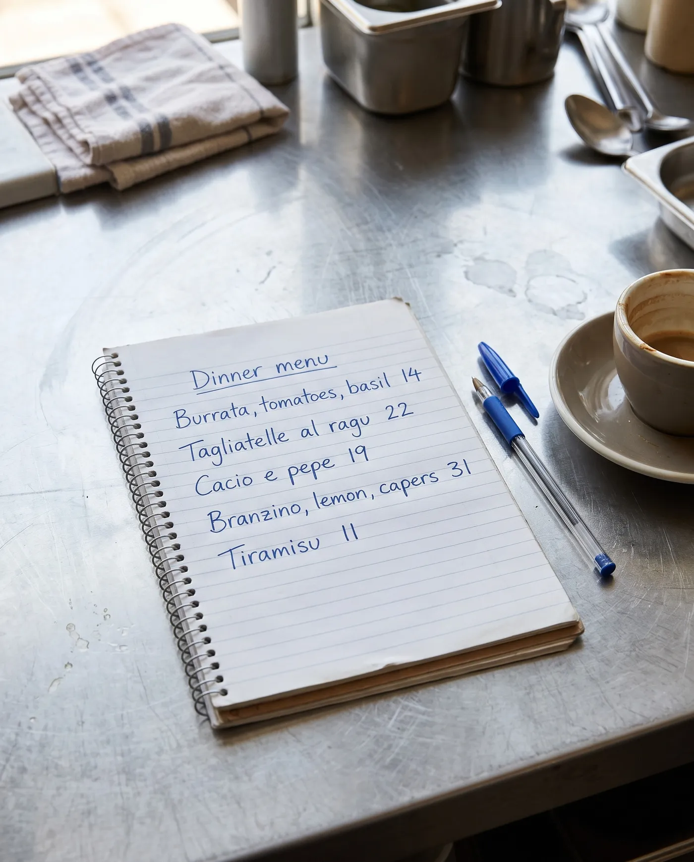
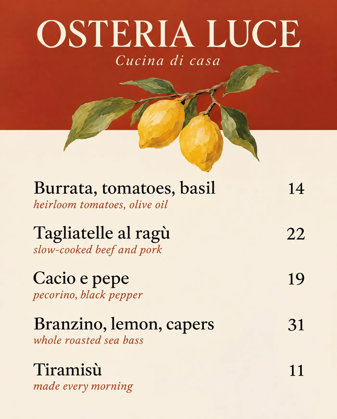
Put the items in the prompt one per line, in quotation marks or after a colon, with the price next to each. Ask for the header, the subtitle and every item by its exact wording. The guide on how to generate images with readable text covers more prompt patterns for typography.
2. Pick the format and aspect ratio
Choose the shape before you generate, because the layout changes with it.
Menu format | Aspect ratio | Typical use |
Table menu or menu card | 4:5 or 2:3 | Dinner menus, set menus, cafés |
Wall board or TV screen | 16:9 | Counter menus, digital menu boards |
Social post | 4:5 or 1:1 | Specials, new dishes, weekend menus |
Story or vertical screen | 9:16 | Stories, vertical displays |
Leaflet panel | 2:3 | Takeaway and delivery menus |
3. Describe a design direction
This is the step that decides whether the menu looks designed or generated. Name a print technique or a design period, the colors and the type, then the content:
A prompt like "Menu for Sakana, a small sushi bar, as a two-color linocut print in indigo and vermilion on off-white paper, a carved sea bream across the bottom, items in a tall serif with thin rules between them" gives the model a whole visual system in one sentence.
Turn on prompt enhancement if you want the model to add layout and texture detail to a short description. It expands the prompt with details about paper, ink and composition, while your item list stays the same.
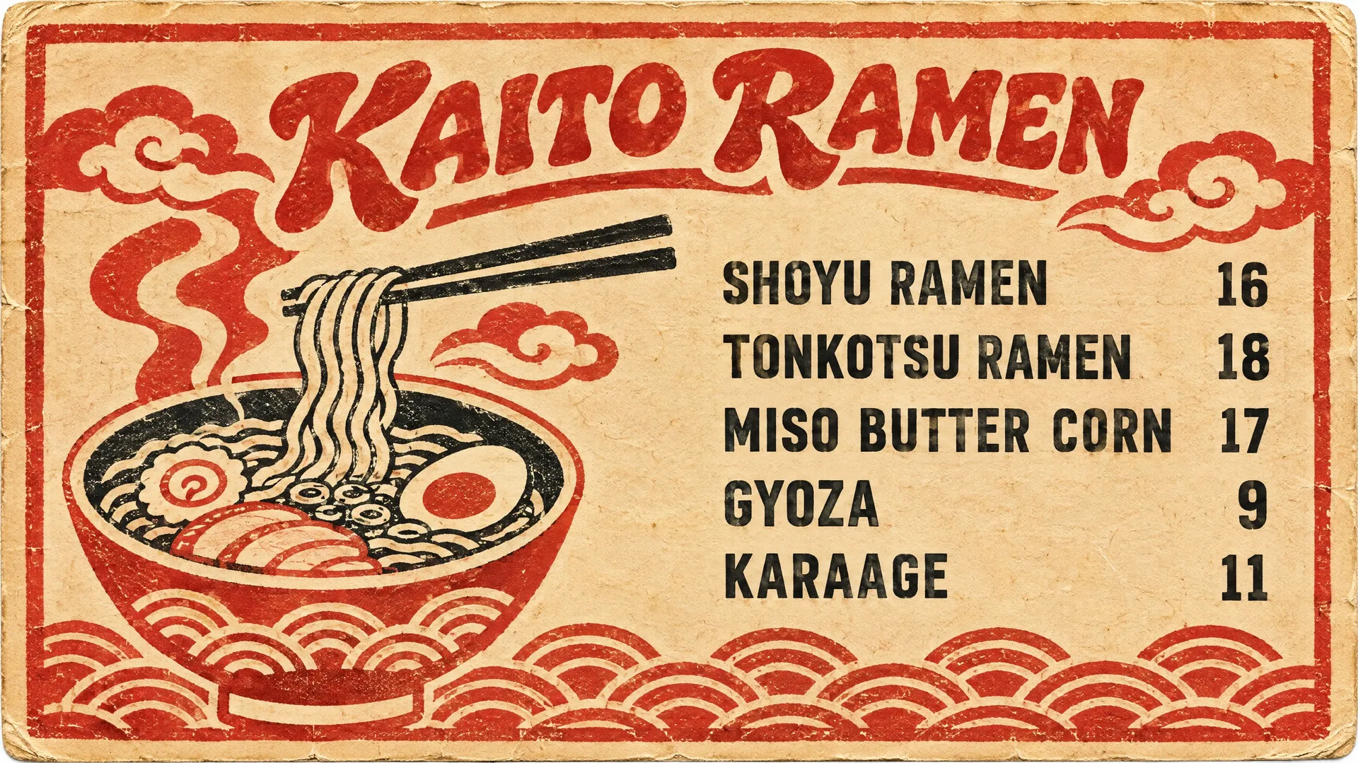
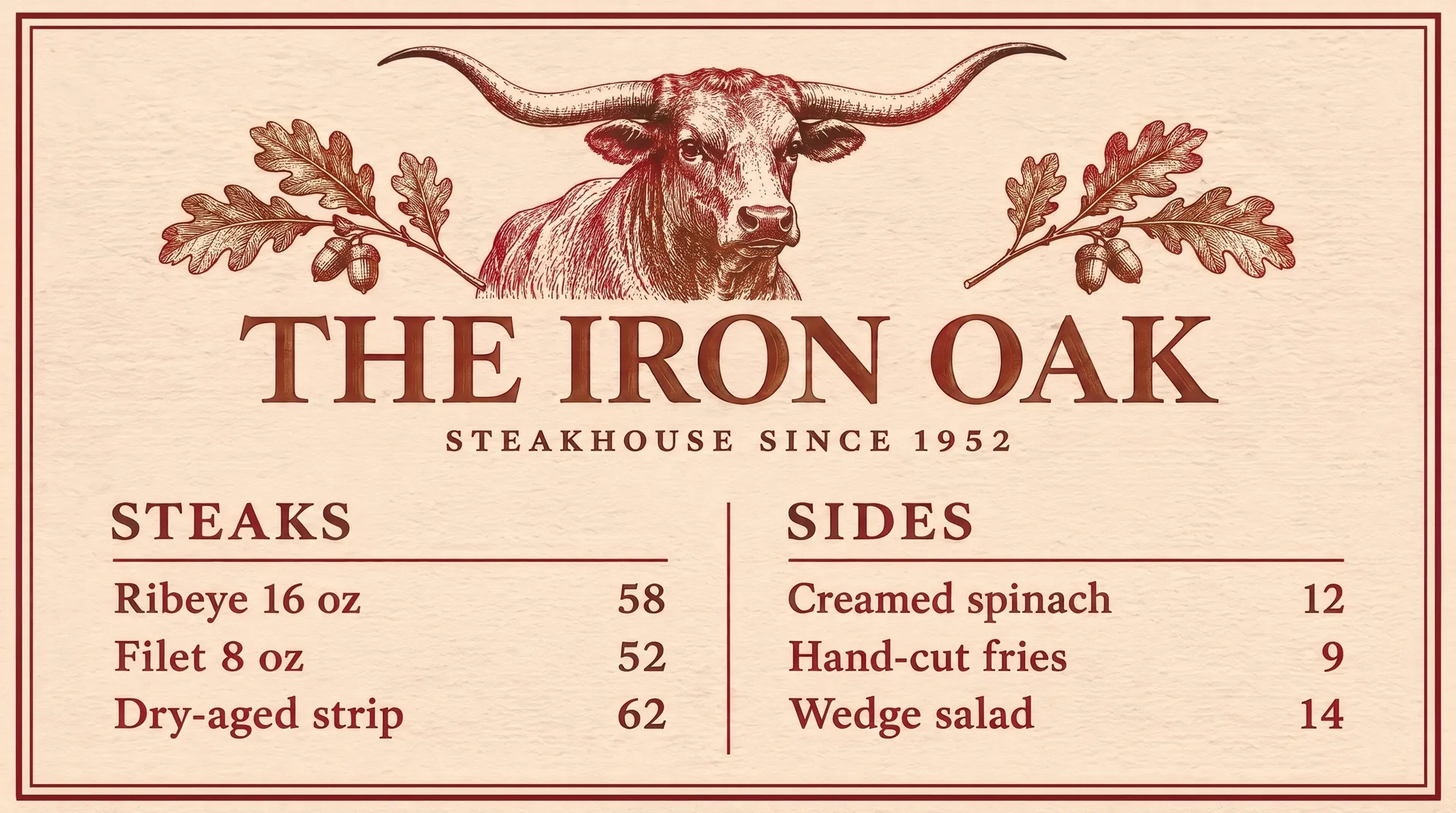
Neither of these menus uses a reference image. Everything on them, from the illustration to the type, came from the prompt.
4. Optional: add a photo of your food
Many menus have no photos at all, and a text prompt is enough. If you do want your own food on the menu, upload a photo of a dish as a reference image and say where it goes: on the left, at the top, inside a circle, printed as a halftone. A daylight phone photo is enough. The model keeps the plate, the garnish and the colors, so the menu shows food guests will recognize when it arrives.
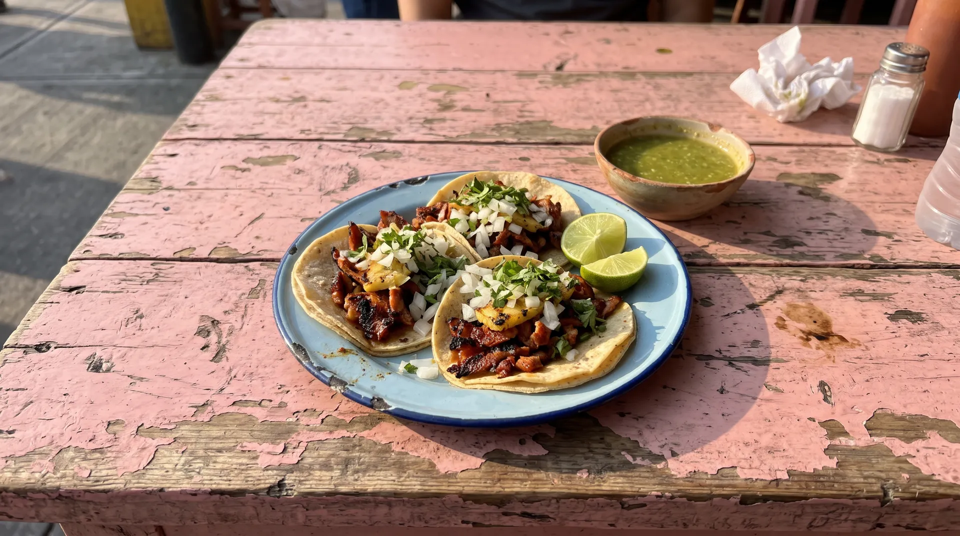
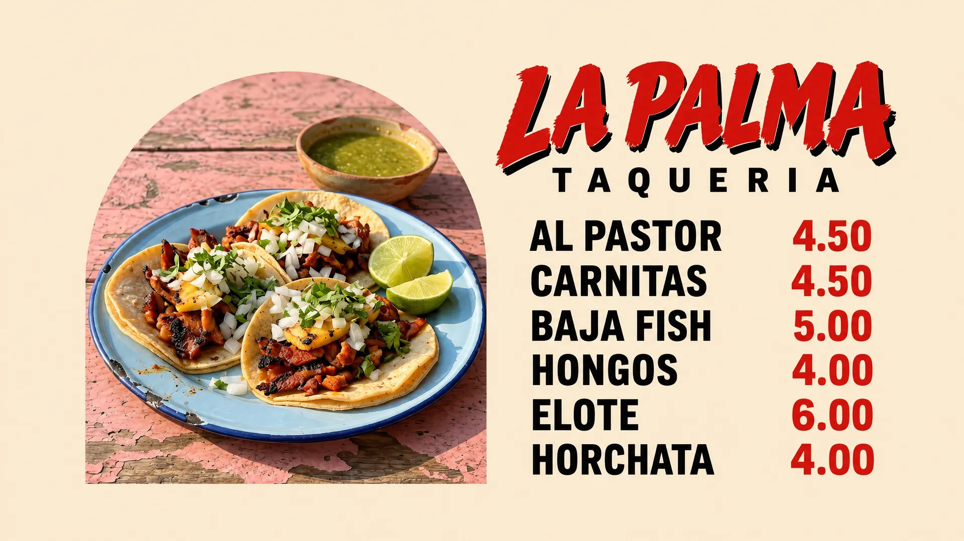
If you want a picture but have no photos yet, the AI food generator can create dish images for a draft. Replace them with photos of your real dishes before you print, so the menu doesn't promise a plate the kitchen doesn't make.
5. Check every line before you print
Read every dish name, price and accent letter against your list. Models keep improving at text, but they can still swap a letter, drop an accent or change a digit, especially in long lists and small type. Regenerate the image if one line is wrong, or fix that line in the image editor with a prompt that names only the change.
Why so many AI menus look the same
Ask an AI chat app for "a nice menu for my Italian restaurant" and you'll often get the same picture: a beige background, a teal and orange palette, a bubbly rounded font close to Comic Sans, a cartoon mascot with a chef's hat, a smiling icon next to every dish, a red starburst that says "Chef's Special!", glossy food that looks plastic, plus sparkles and swirls in every gap.
None of that is a bug. When a prompt doesn't say what the menu should look like, the model fills the gaps with the most common choices it has seen, and the result is the visual average of a million menus. That average is what people now recognize as AI slop: the image is technically fine and still looks cheap, because nobody made a single decision about it.
The common tells:
- Cartoon or "fun" rounded fonts used for everything, including prices
- A mascot or smiling food characters
- An icon or emoji next to every line
- Starbursts, ribbons and badges ("Chef's Special!", "Best in Town!", "Fresh Daily!")
- Teal, orange and beige, whatever the cuisine
- Glossy, oversaturated food with no real plate or table
- Decoration filling every empty space
Generic AI look vs. a design direction: four examples
We made each pair for the same fictional place, with the same dishes and prices. For the left menus, we described the generic look on purpose, so the tells are easy to see. For the right menus, the prompt named a print style, a short palette and the type, with prompt enhancement on.
Neighborhood café: Little Fern Cafe
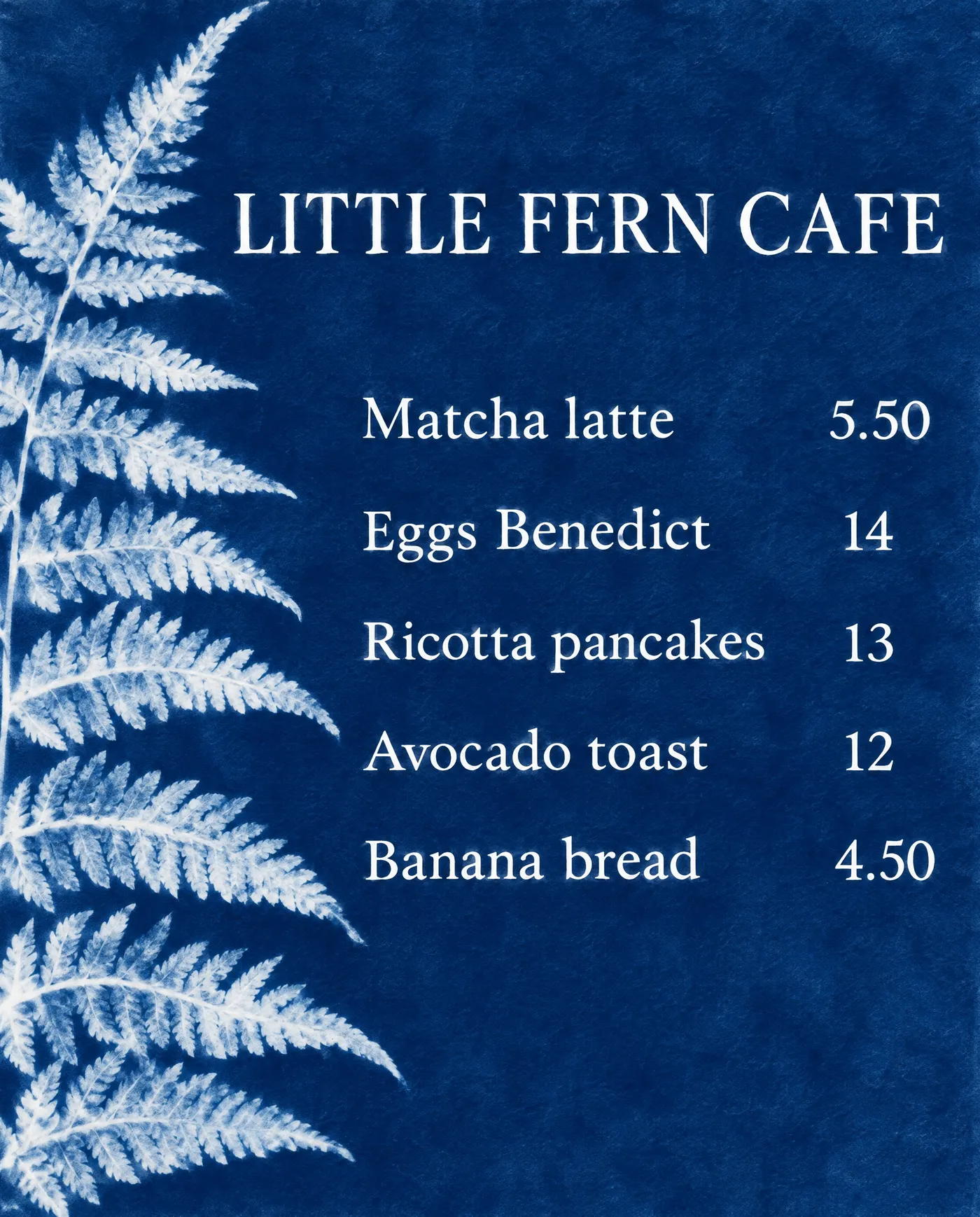
The generic version adds a coffee cup mascot and an icon to every line, and it hides the café's name, which is its only real idea. The redesign takes the name literally and borrows an old botanical technique: a cyanotype sun print, with one white fern on Prussian blue and crisp white type. It's calm, high-contrast and easy to read across a counter.
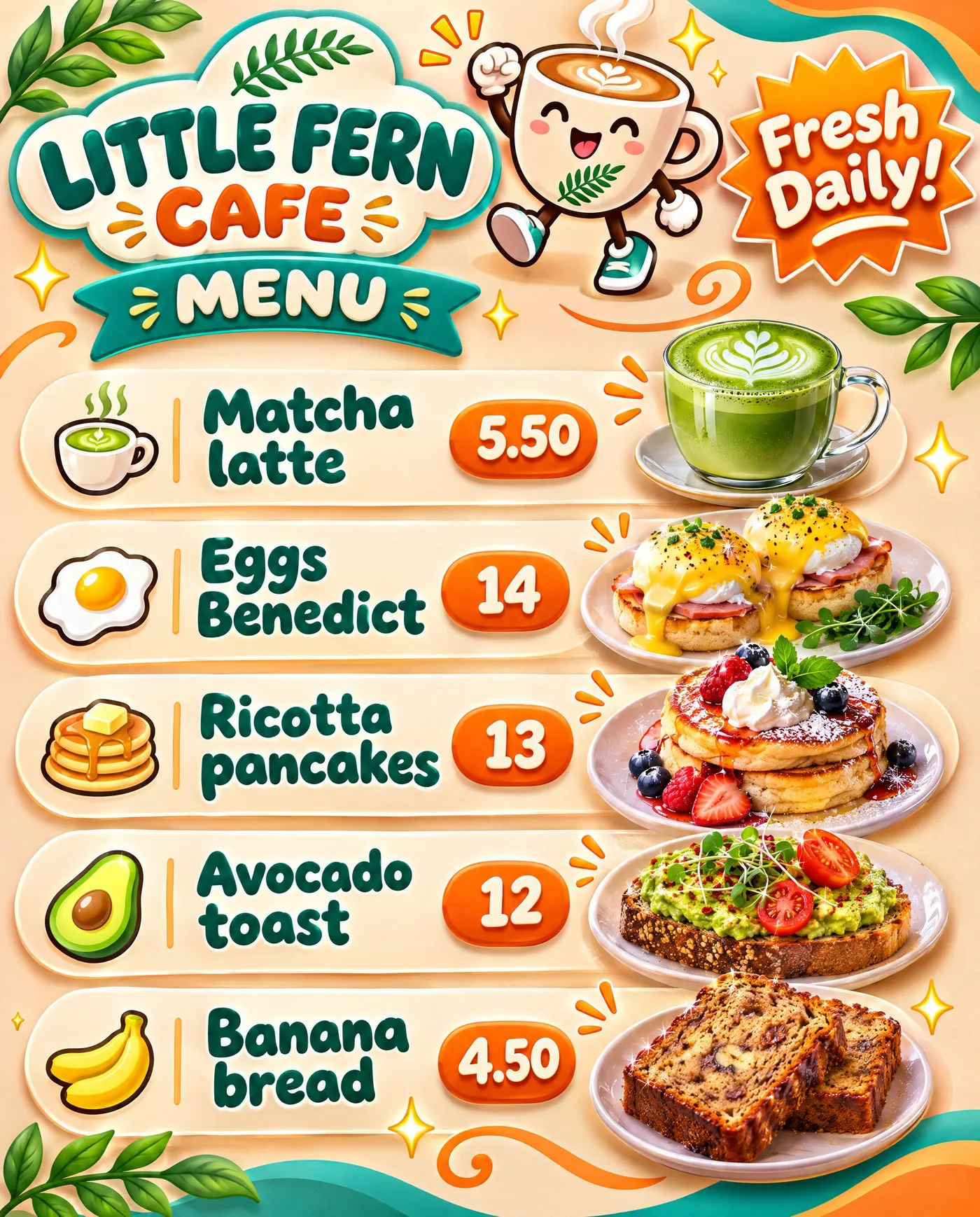
Typical AI slop: a smiling coffee cup mascot, an icon on every line and glossy food.
AI-generated with a clear creative direction: a cyanotype sun print with one white fern and crisp white type.
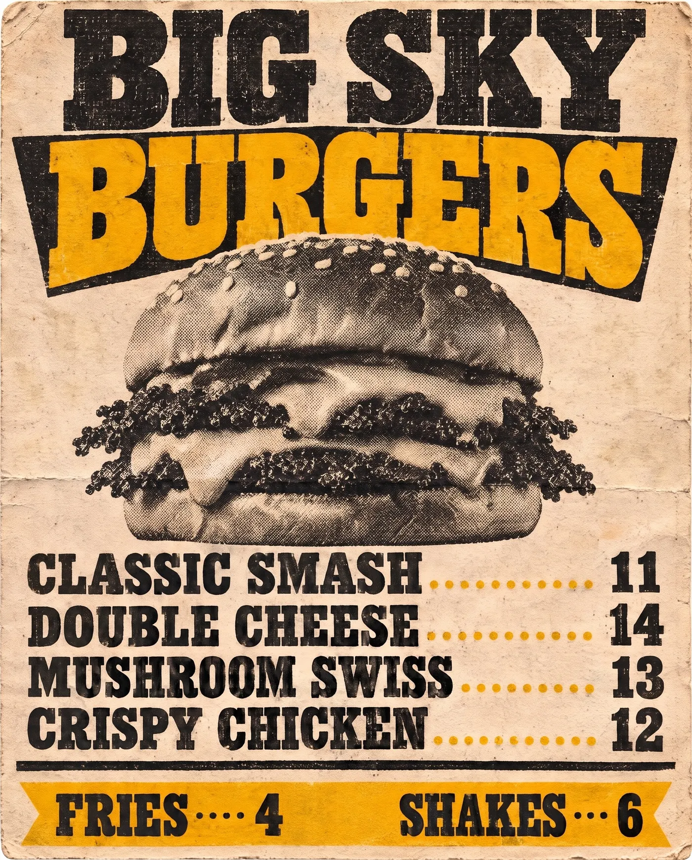
Burger joint: Big Sky Burgers
Burgers are allowed to be loud, and the generic version is loud in the wrong way: a burger mascot, a "Best in Town!" burst and six glossy photos stacked in pill-shaped rows. The redesign keeps the energy and changes the source. Bold condensed wood type, mustard and black on newsprint, and one halftone smash burger on plain paper look like a roadside poster from a real print shop.
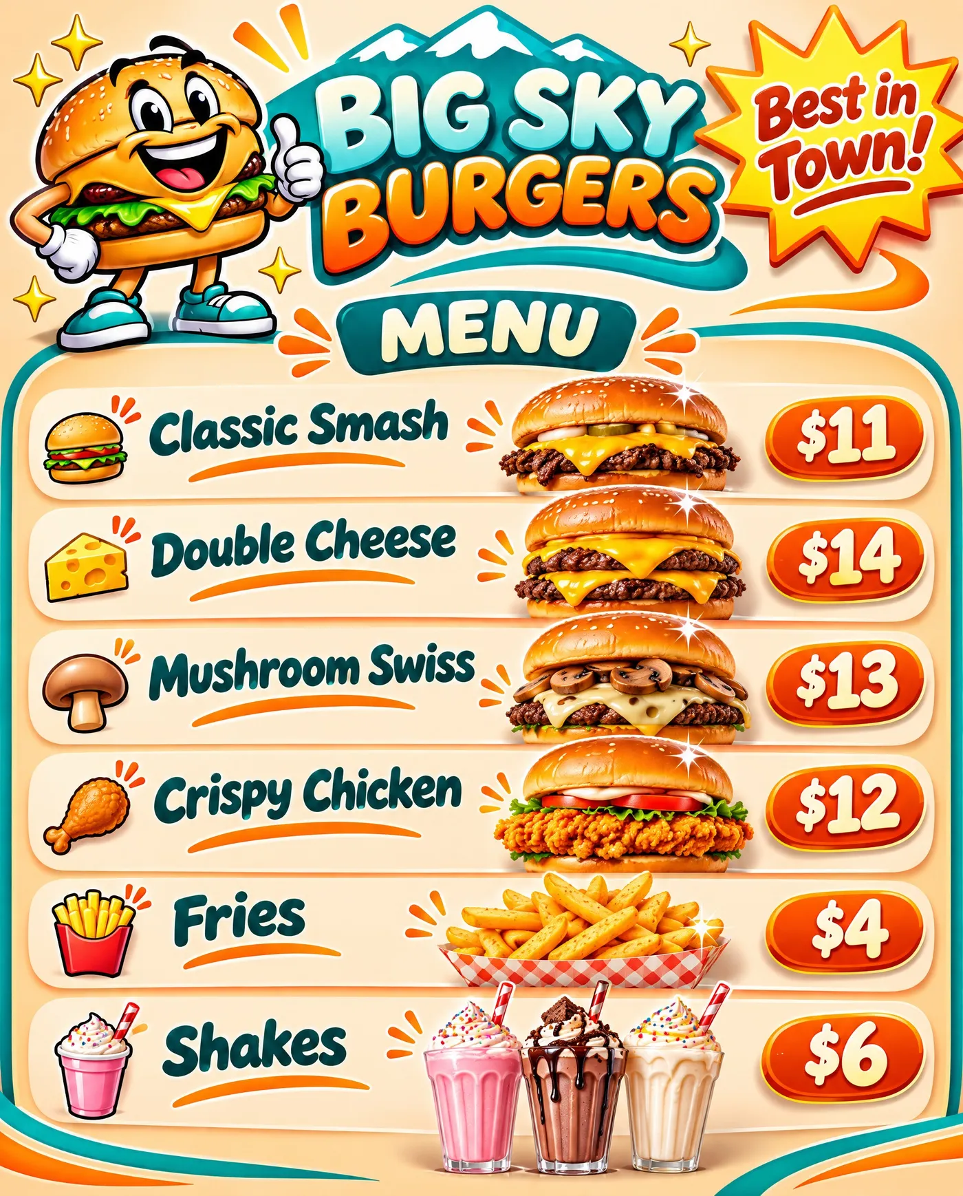
Typical AI slop: a burger mascot, a starburst badge and stacked glossy burger photos.
AI-generated with a clear creative direction: an American letterpress poster with one halftone burger.
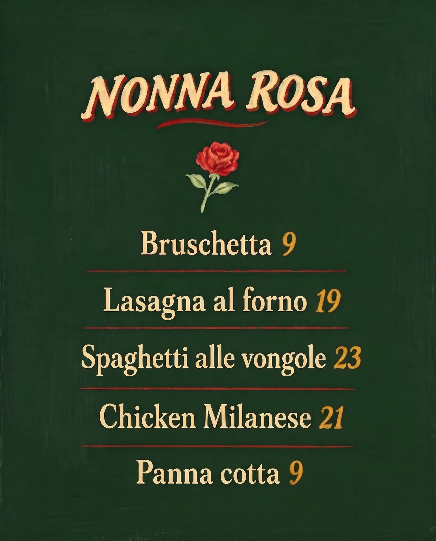
Italian trattoria: Nonna Rosa
The generic version puts a cartoon grandmother, five smiling food characters, a Colosseum, an Italian flag ribbon and a starburst on one page. Every element competes, and the prices sit in orange bubbles that look like game buttons. The redesign uses hand-painted Italian sign lettering in cream, red and gold on a deep green board: a lively script for the name, an upright roman for the dishes so they stay easy to read, one small painted rose and plenty of empty space. The dish names are the decoration.
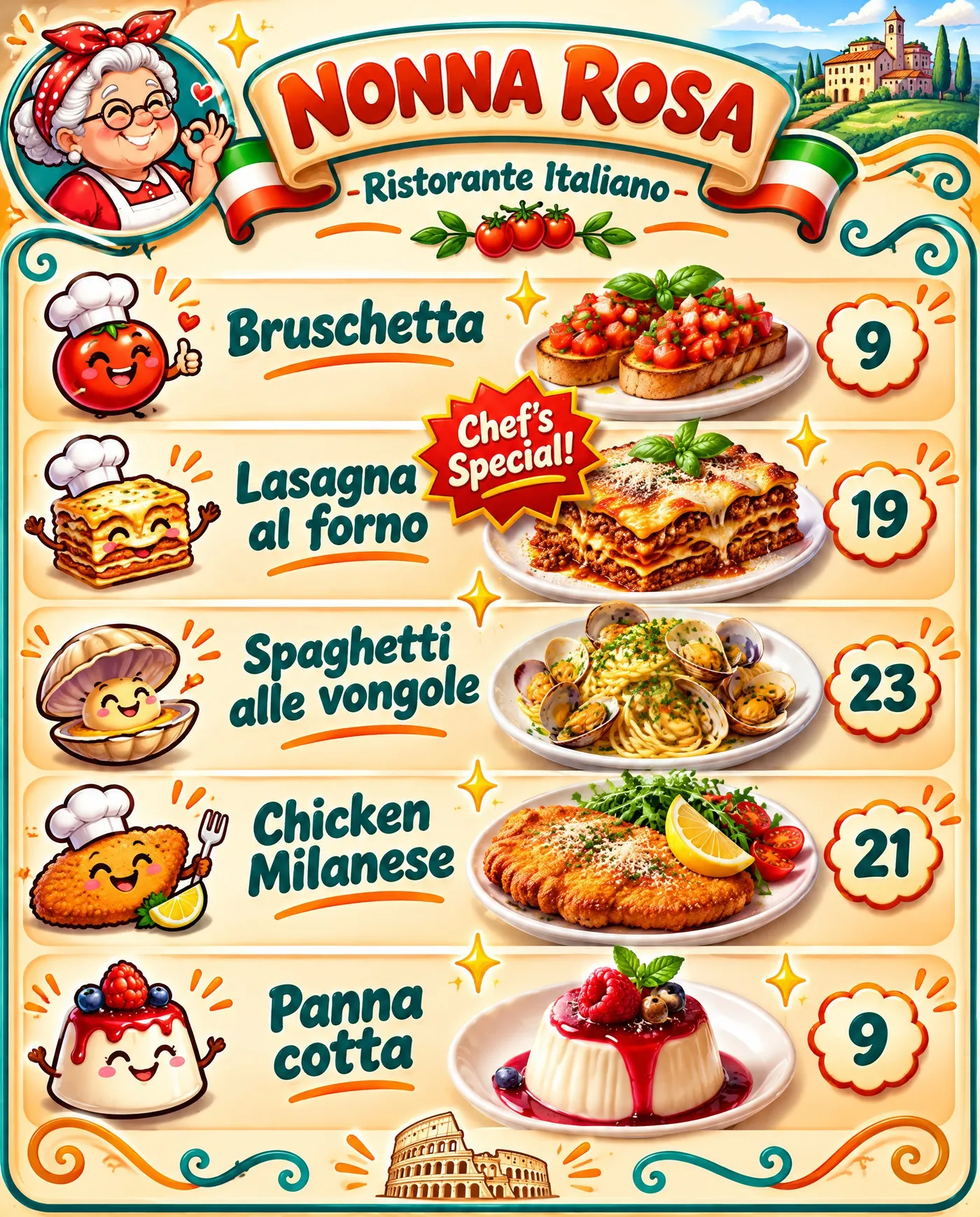
Typical AI slop: cartoon mascots, a bubbly font, badges and a teal and orange palette.
AI-generated with a clear creative direction: Italian sign-writing on a deep green board, readable roman lettering, golden prices.
Sushi bar: Sakana
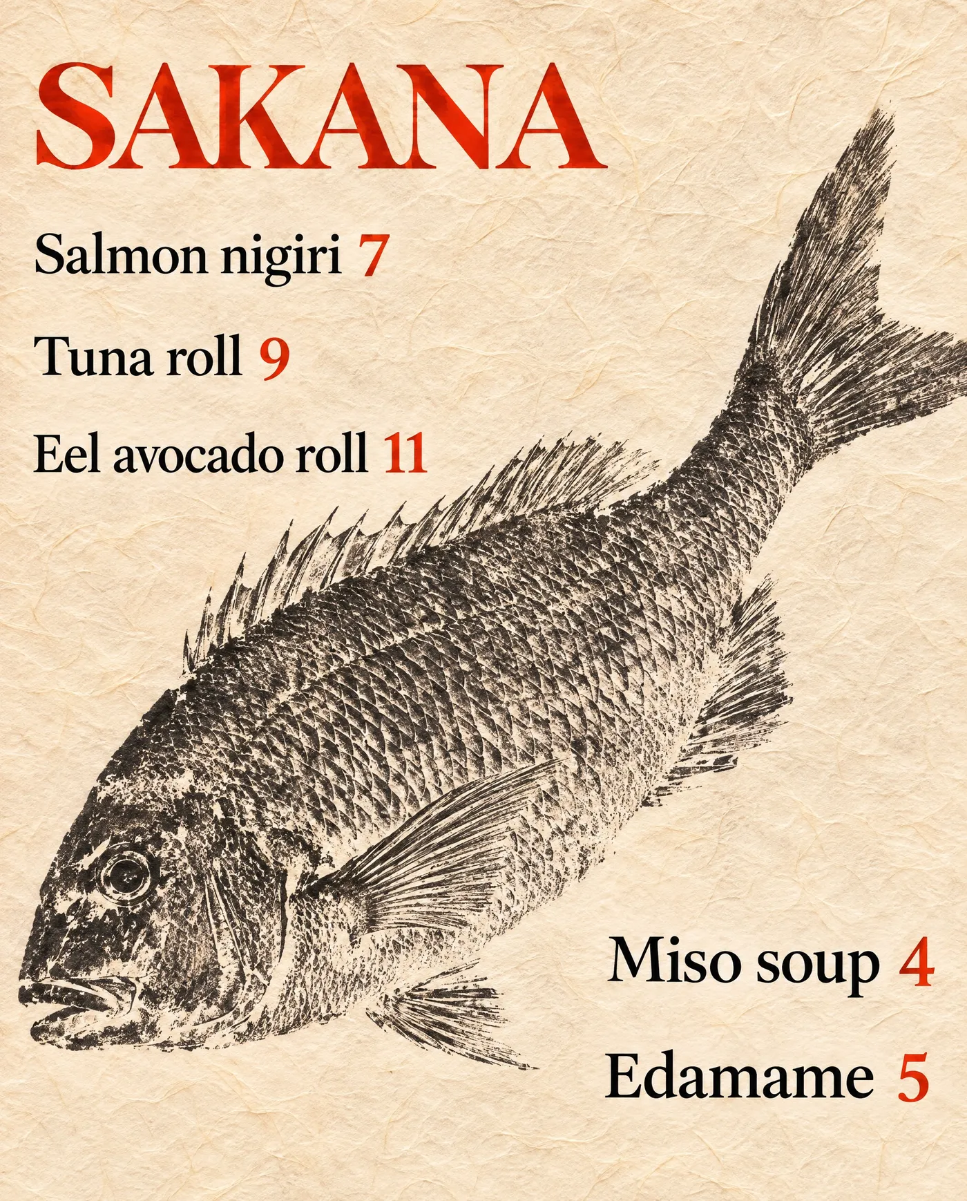
The generic sushi menu stacks every Japanese cliché at once: cherry blossoms, a wave border, Mount Fuji, a smiling sushi character and a "Chef's Pick!" badge. The redesign is built around a gyotaku, the Japanese technique of printing a real fish in sumi ink. The sea bream runs diagonally across washi paper, and the dishes sit in the open space around it in black with vermilion prices, instead of in a centered list.
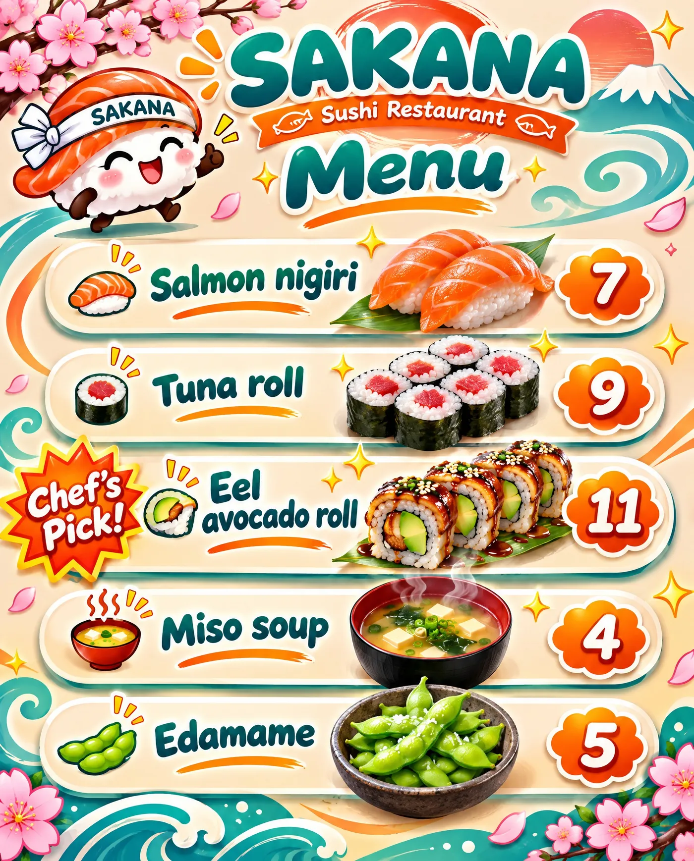
Typical AI slop: a sushi mascot, cherry blossoms, waves and a Chef's Pick badge.
AI-generated with a clear creative direction: a gyotaku fish print with the menu set around it, not a centered list.
Side by side, the difference isn't the model or the resolution. It's whether someone made decisions about type, color and what to leave out.
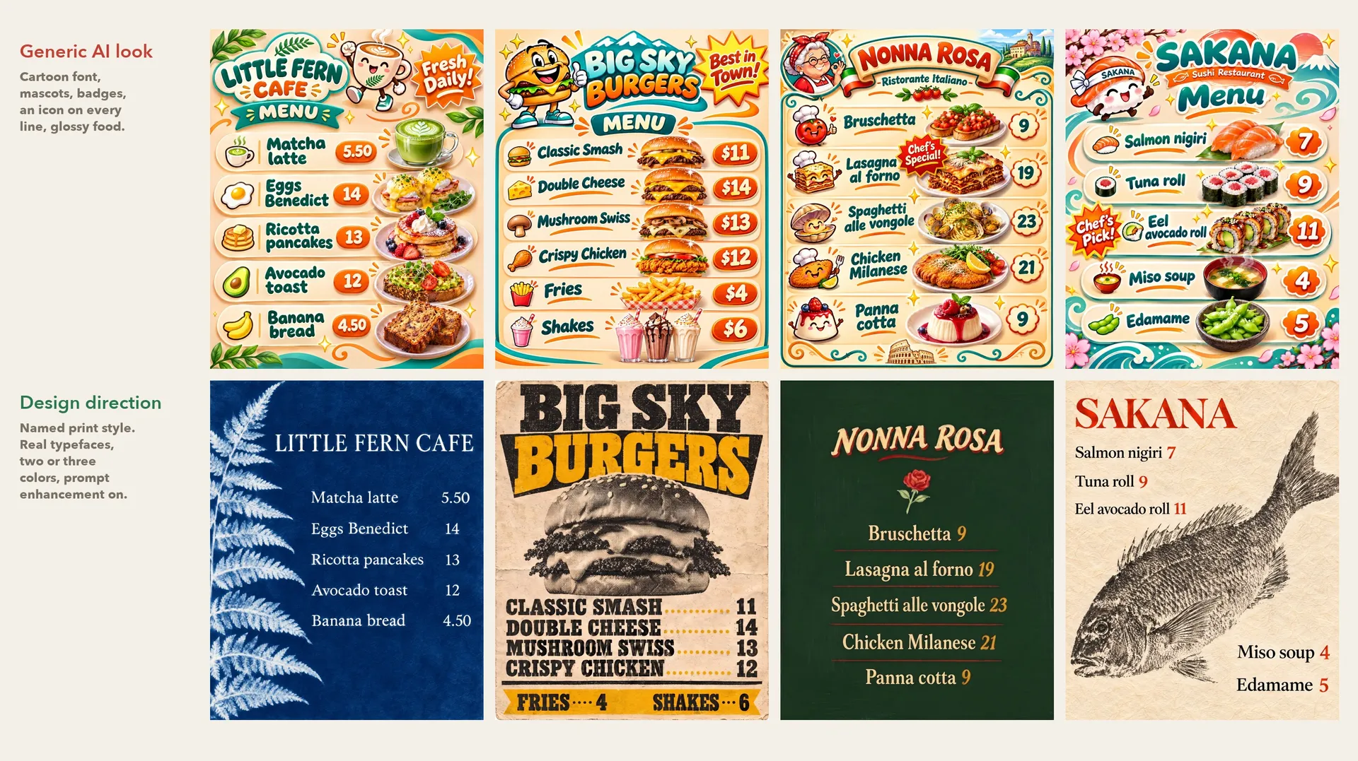
Top row: typical AI slop. Bottom row: the same menus generated with a clear creative direction.
Menu layout ideas that work
A good layout makes the menu easy to scan in the few seconds a guest gives it. These layouts are simple to describe in a prompt:
Layout | Best for | What to ask for |
Single column list | Short menus, cafés, bars | Centered header, items left, prices right, thin rules between items |
Photo plus list | Menus built around one signature dish | The dish photo on one side or at the top, the list next to it |
Two columns by section | Dinner menus with starters, mains and desserts | Section headings in caps, two columns, generous margins |
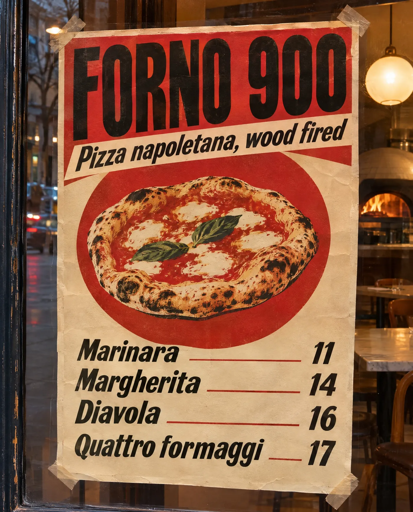
Poster | Pizzerias, taquerias, window menus | Huge header, one illustration or photo, a short list at the bottom |
Board | Counters, food trucks, specials | Large type, few items, high contrast, readable from a distance |
Menu psychology in one minute
Menu design has its own research field, and a few findings are easy to apply in a prompt:
- Fewer choices per section help guests decide. Five to seven items per category is a common target.
- Prices without currency symbols feel softer. In a study from Cornell's School of Hotel Administration, diners spent more when prices were shown as plain numbers without the dollar sign.
- Many menu designers avoid dotted leader lines from the dish to the price, because they pull the eye straight to the number. Prices set right after the description, in the same size, draw less attention to cost.
- If you use photos, one photo of a signature dish does more than a photo next to every item, which can make a menu look like a fast food board.
- Short, specific descriptions ("Branzino, lemon, capers") read better than adjectives ("our delicious, mouthwatering sea bass").
Restaurant menu design ideas by type of place
Each kind of place has a print tradition to borrow from. Naming it in the prompt gives the model a look with a real history behind it:
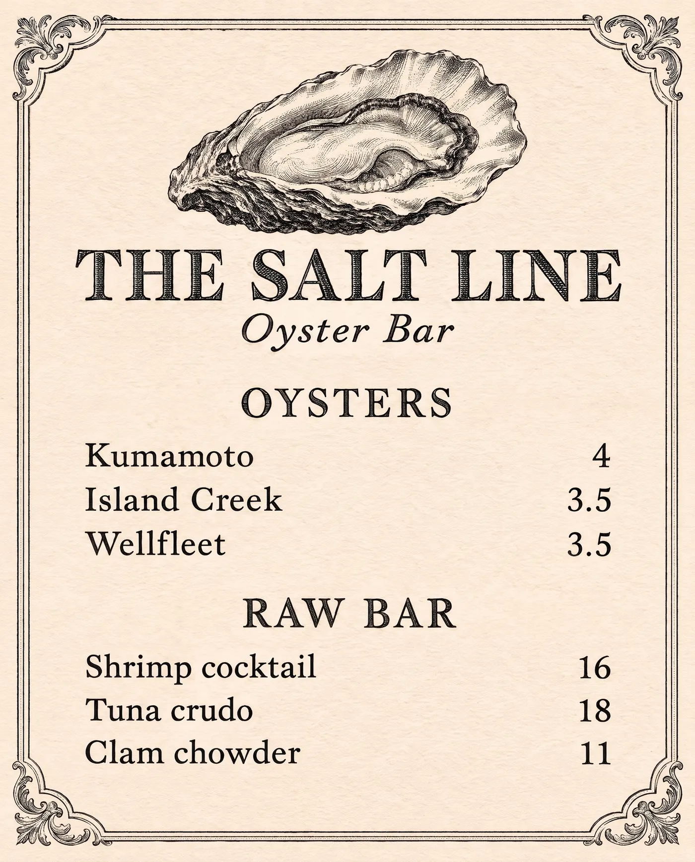
- Oyster bars and seafood: Victorian engraving, black ink on ivory, a single engraved shell
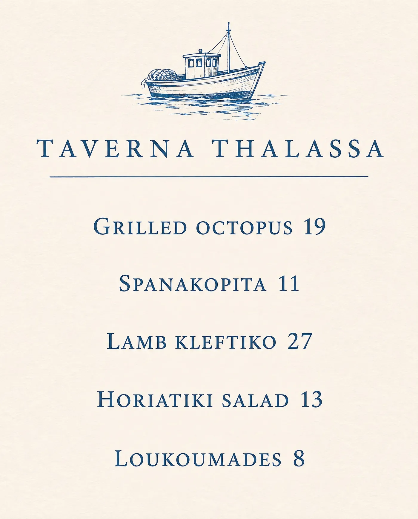
- Greek and seaside tavernas: one ink in Aegean blue, a small hand-inked boat, a classical serif
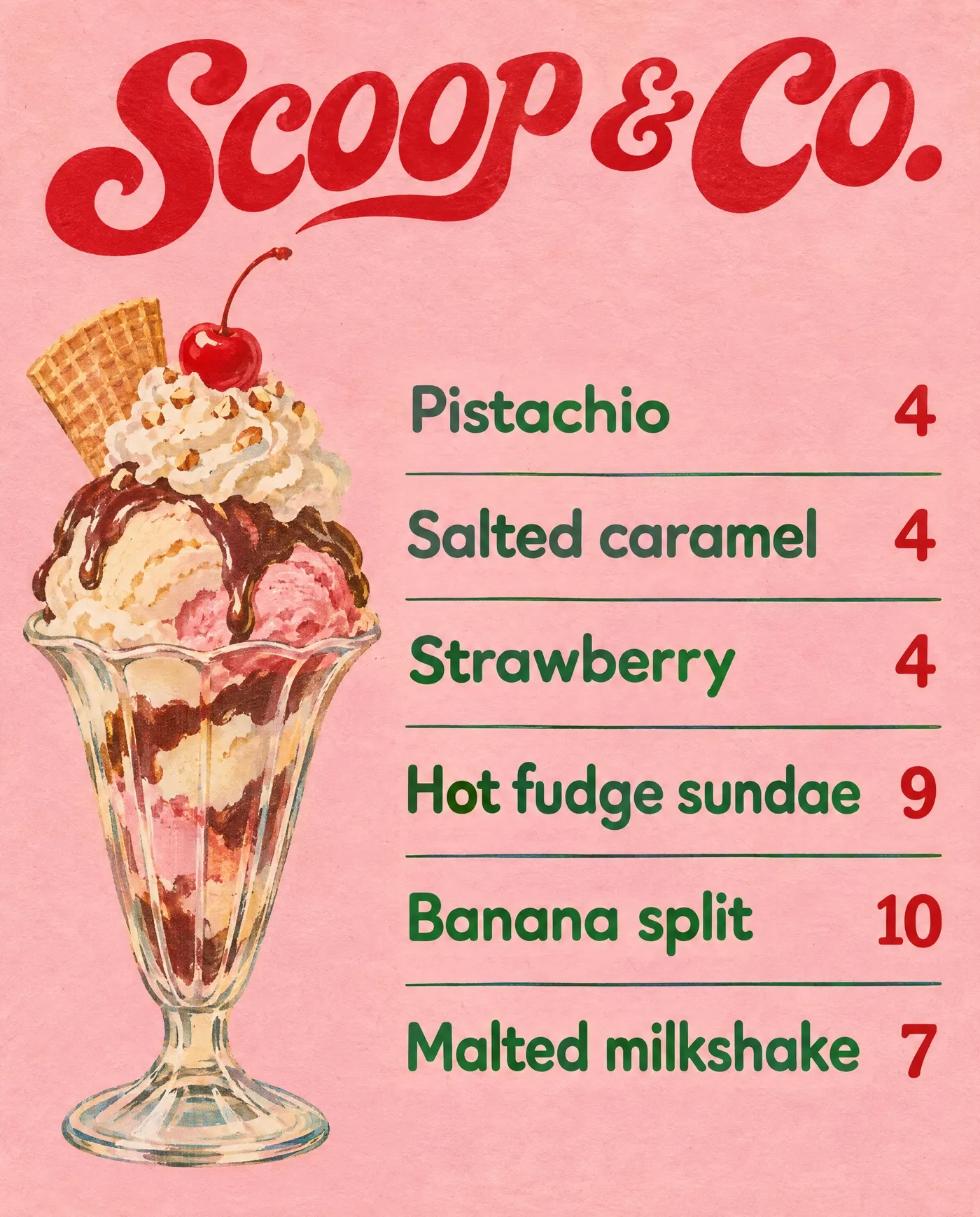
- Ice cream parlors and dessert bars: 1960s script lettering, pastel paper, one detailed illustration
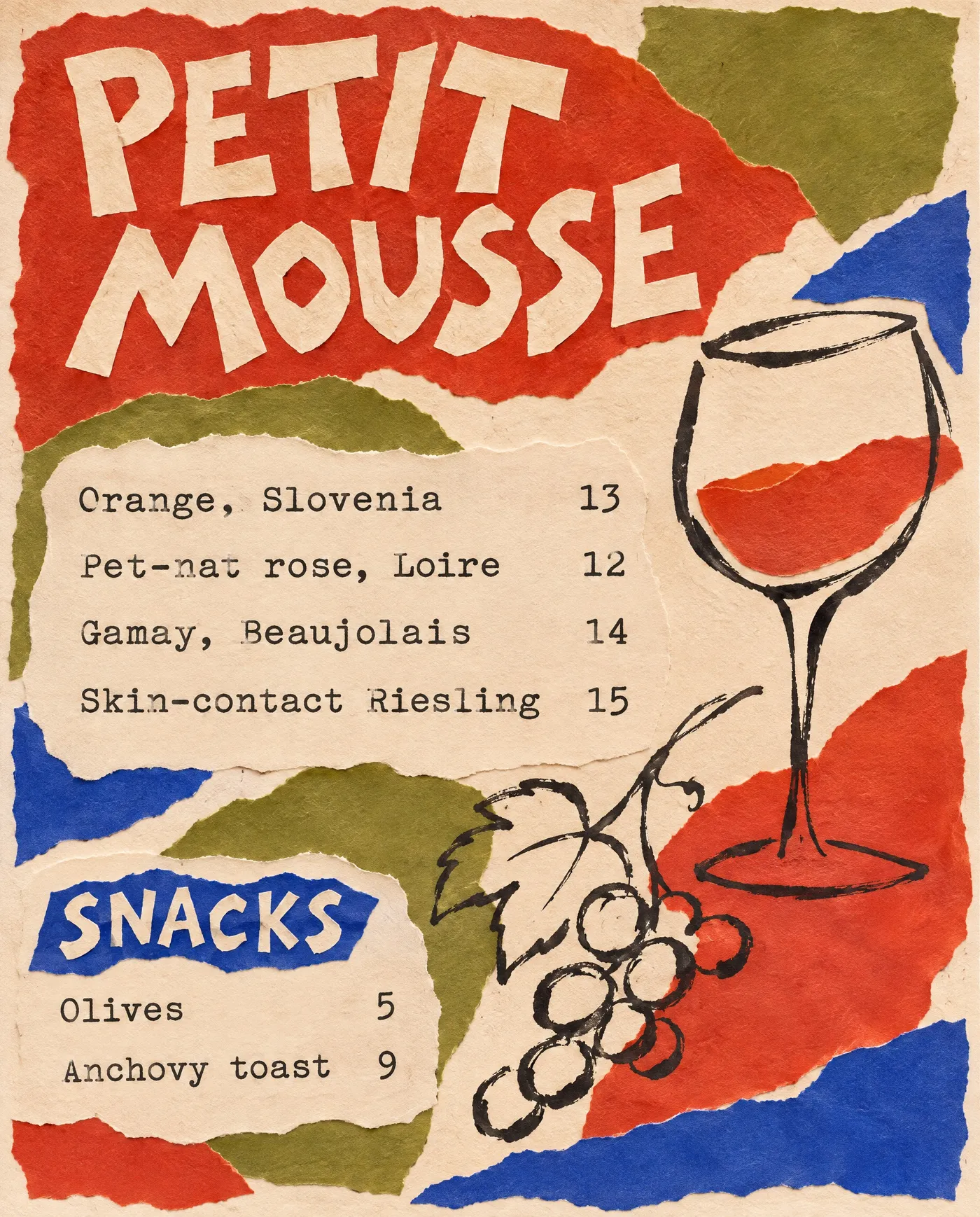
- Natural wine bars: torn-paper collage, a loose ink drawing, typewriter type for the list
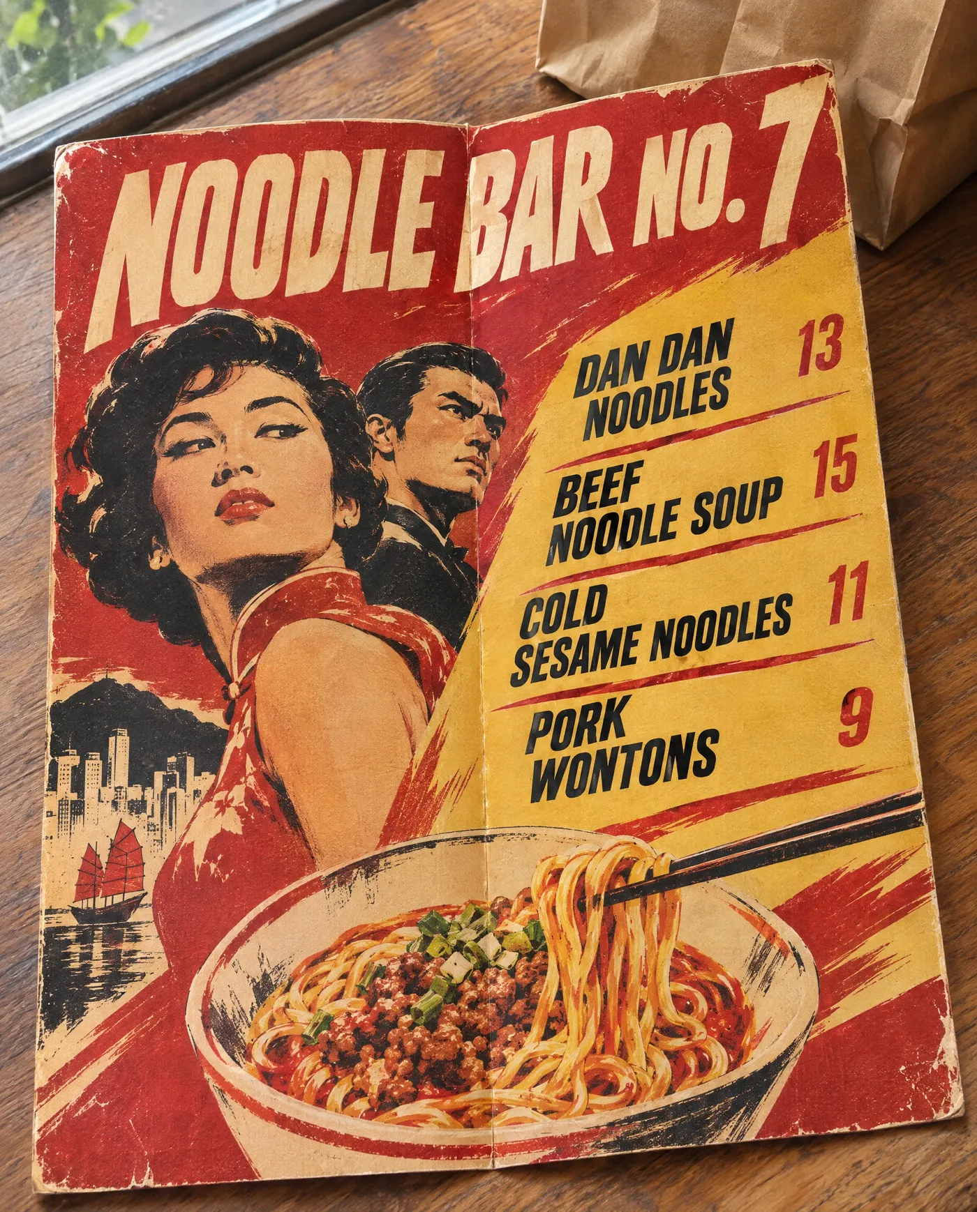
- Noodle bars and takeaway: 1960s Hong Kong film poster, red and mustard, bold condensed type
- Pizzerias: 1960s Italian poster, a big red circle, bold condensed type
Printing your AI menu
Generate at the highest resolution the model offers. For large boards, posters and anything printed bigger than a letter-size page, run the file through the AI image upscaler first so the type stays crisp. Print a test copy, read it at table distance and check it under the restaurant's evening light, which changes how colors look.
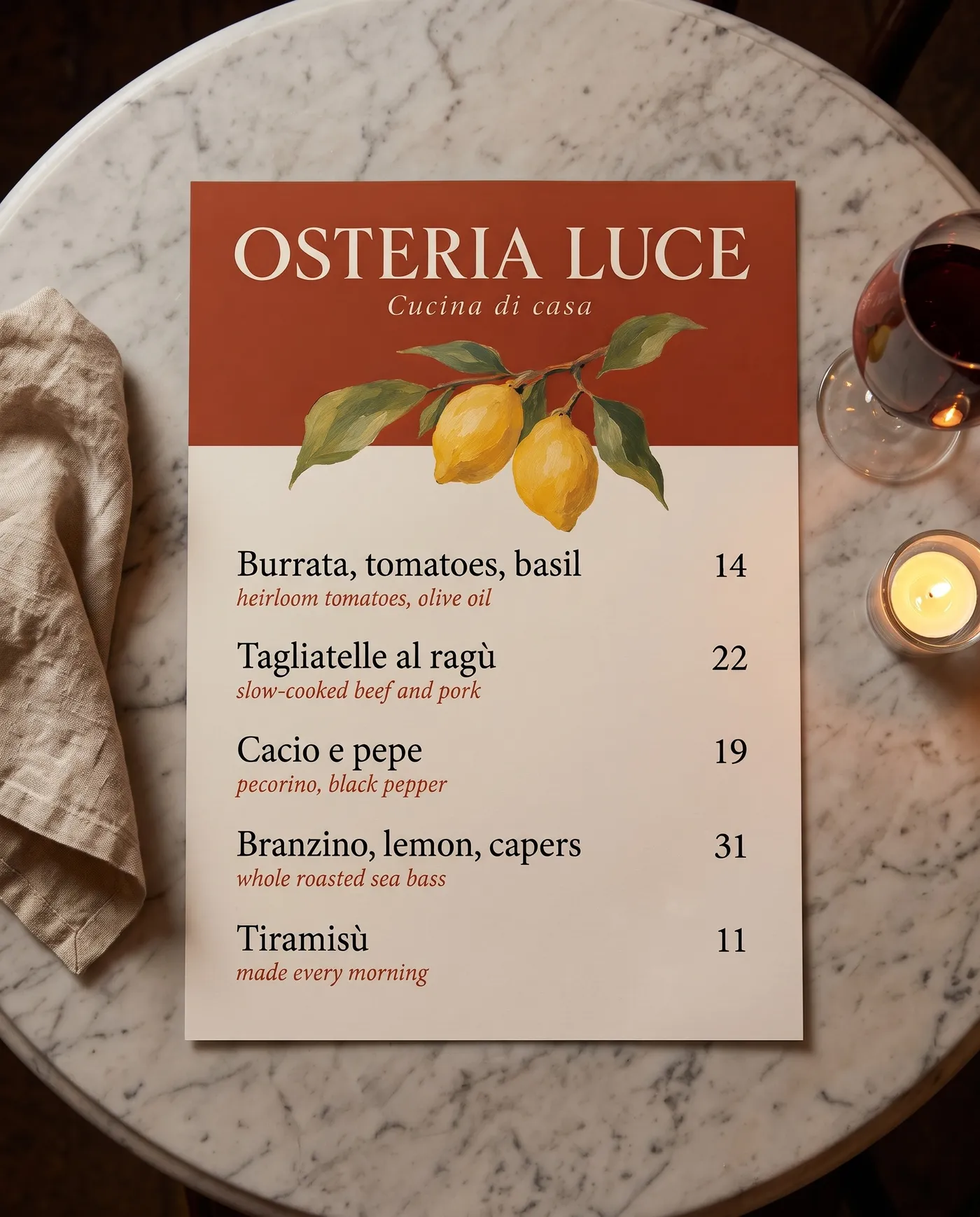
When a price or a dish changes, don't start from scratch. Open the finished menu in the image editor and write a prompt that names only the change, for example "change the Tiramisù price to 12" or "replace Cacio e pepe with Carbonara 20". Editing the original keeps the layout, type and illustration close to what you already have, so the menu stays consistent with everything else you've printed. Check the changed lines before you print, as you would with a new menu.
Bottom Line
An AI menu is only as good as the decisions behind it. Write the final dishes and prices first and name a real print style with two or three colors instead of asking for something "modern" or "nice." Check every line before it goes to print, because small type is where models still slip. Open Create image and design your menu.
Frequently Asked Questions
Yes. Image models with strong text rendering can produce a complete menu design with your dish names and prices, from a text prompt alone. Put the exact text in the prompt, describe the style and the format, and check every line before printing.
Models that render text well give the most reliable menus, such as GPT Image 2.6 and Nano Banana 2.1. On getimg.ai, Auto model selection picks a suitable model by default, and you can switch models to compare the same prompt.
When a prompt doesn't describe the design, the model fills in the most common choices: rounded cartoon fonts, mascots, icons, badges and a teal and orange palette. Naming a print style, a short palette and the type makes the result look designed instead of averaged.
No. A text prompt with your dishes, prices and a print style is enough for most menus. If you want your own food on it, add the photos as reference images and say where they should appear in the layout. The model keeps the look of the dish, so the menu shows the food guests will actually receive.
Short lists are the most reliable, roughly five to ten items per image. For a longer menu, generate each section or page separately with the same style description so they match.
Images you create on getimg.ai's paid plans come with commercial usage rights, subject to our terms and applicable third-party rights. Don't copy another restaurant's logo or branding.
Related Articles