How to Color Grade Photos with AI

Colour grading a photo with AI means applying a finished colour look to an image: the palette, contrast, and tonal character of a specific film stock or cinema style. A plain digital photo takes on the warm skin tones of Portra 400, the punchy saturation of Velvia, or the moody split of teal and orange. You add the photo, choose a look, and the model grades the whole image to match. On getimg.ai the Color grading Action offers a set of named film and cinema looks, so you get a considered grade without touching a single curve or LUT.
TL;DR
- AI colour grading applies a finished film or cinema colour look to a photo in one step.
- In getimg.ai, open the Color grading Action, add a photo, and choose a look.
- There are 23 looks, from film stocks (Portra 400, Kodachrome 64, Velvia 50, CineStill 800T, Tri-X 400) to cinema styles (teal and orange, hollywood, technicolor, moody aqua).
- A grade sets mood and consistency; pick the look for the feeling you want, not at random.
- It leaves your original untouched.
What Colour Grading Is
Colour grading is the step that gives a photo or film its signature feeling. It is not about correcting a white balance or fixing an exposure, which is colour correction; it is the creative pass on top, where the palette, contrast, and tones are shaped to carry a mood. It is the reason a film looks like that film and a photographer's work looks like theirs. Done by hand, it means building a look with curves, colour wheels, and split toning, or buying and tuning LUTs, then applying them consistently across a set.
AI colour grading packages that into a choice. Each look encodes the colour behaviour of a real film stock or a recognisable cinema style: how it renders skin, how it rolls off highlights, how it treats shadows and saturation. The model applies that behaviour to your photo as a whole grade, not a flat filter, so the result reads as graded rather than tinted.

When to Use It (and When to Grade by Hand)
Colour grading with presets fits most situations where you want a look, fast:
- A consistent feed or portfolio, where one grade across every image makes a set feel intentional and unified.
- Mood for a campaign or story, where warm film tones or a cool cinematic split set the emotional tone.
- Reviving flat digital photos, where a good grade adds the character a straight camera file lacks.
- Matching a reference aesthetic, where you want the feel of a particular film stock without owning or scanning it.
Grading by hand still wins when the look is bespoke and central to the work: a colourist shaping a brand's exact signature, or a project where each shot needs individual attention to match perfectly. Presets give you a strong, coherent look in one step; hand grading gives you total control at the cost of time and skill. For most photos, a named look is the faster route to a result that feels finished.
How to Colour Grade a Photo with AI, Step by Step
Here is the workflow in getimg.ai. Open the Color grading Action to follow along.
1. Add the photo
Upload the photo you want to grade, or pick one from your library. A well-exposed, neutral starting image gives a grade the cleanest foundation, since the look builds on the tones already there.
2. Choose the look
Pick the colour look you want. The options include film stocks and cinema styles:
- Warm, natural film: Portra 400 and Portra 800 for flattering skin, Kodachrome 64 for rich, classic colour, Eterna for soft, low-contrast tones.
- Punchy and saturated: Velvia 50 for vivid landscape colour, Elite Chrome and Classic Chrome for crisp slide-film contrast.
- Cinematic: CineStill 800T for tungsten night looks, teal and orange and hollywood for blockbuster contrast, fashion film and nomad for editorial palettes, technicolor for rich vintage-cinema colour, and bleach bypass for gritty, desaturated contrast.
- Mood pieces: moody aqua, golden, dusk, neon night, bright and airy, vintage fox, and lomography for stylised, atmospheric grades.
- Black and white: Tri-X 400 and HP5 for classic monochrome film grain.
Choose by the feeling you want the photo to carry, since that is what a grade delivers.
3. Set the quality and generate
Choose an output resolution of 1K, 2K, or 4K, then run the Action. The graded version appears in the gallery to the right of the controls. Your original is untouched, so trying several looks on the same photo and comparing them is the fastest way to find the right one.
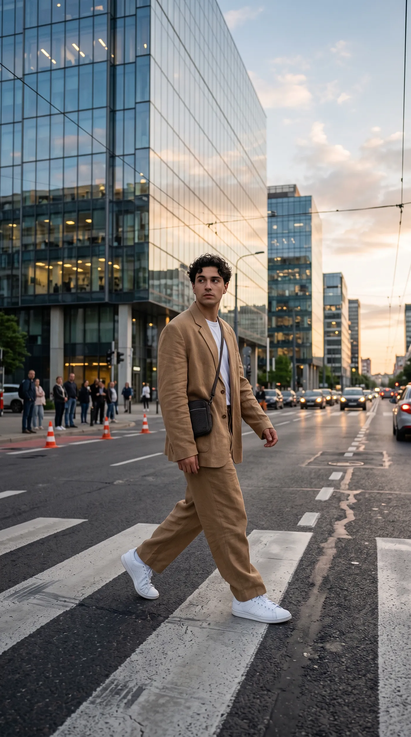
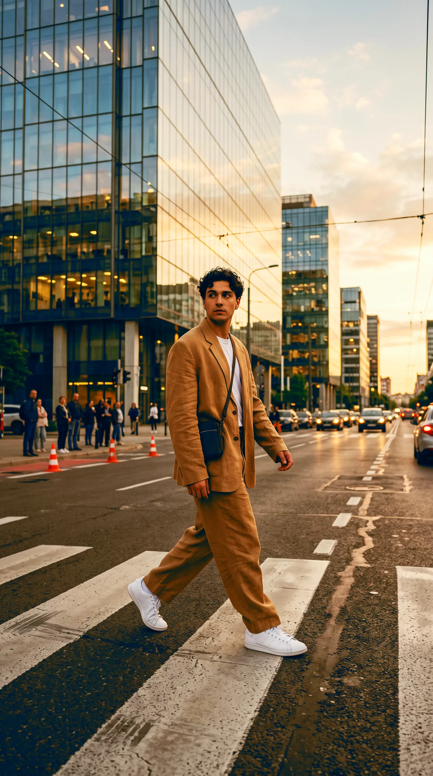
How to Get a Grade That Looks Intentional
- Start from a clean, neutral photo. A grade builds on the tones already in the image. A well-exposed, correctly white-balanced starting point lets the look land the way it should; a photo with a strong existing colour cast can fight the grade.
- Pick the look for the mood, not the name. Warm film stocks flatter people and feel nostalgic; teal and orange feels cinematic and bold; muted looks feel calm and editorial. Match the look to the story the photo tells.
- Grade a set with one look. The strongest use of grading is consistency. Running the same look across a feed, a shoot, or a campaign is what makes the images read as a body of work.
- Mind skin tones. For portraits, the Portra stocks and other warm film looks tend to keep skin flattering. Heavy, high-contrast cinematic grades can push skin in directions you may not want.
- Generate at the right quality. Use 4K when the graded image will print or appear large, so the tones hold up at full size.
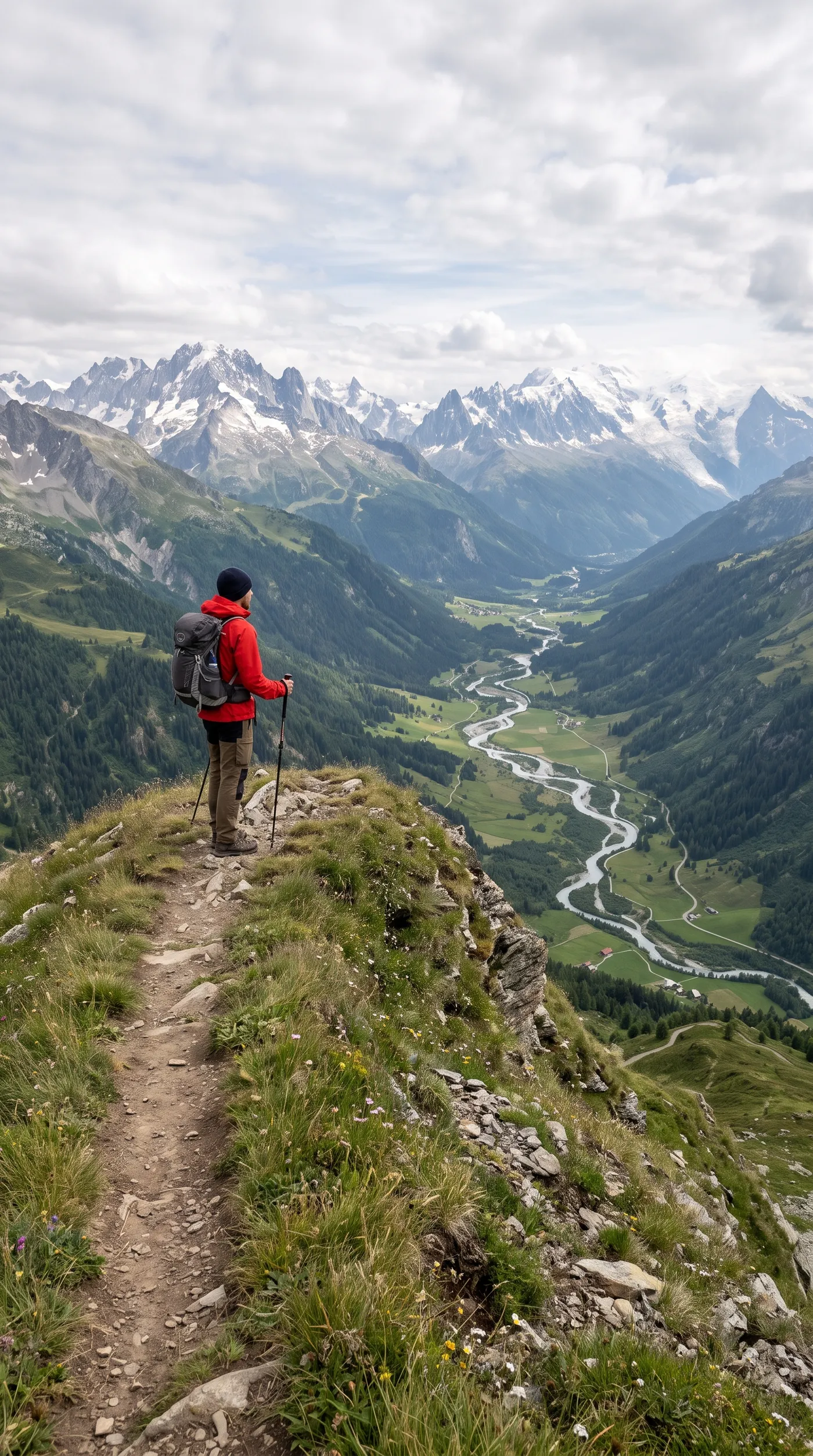
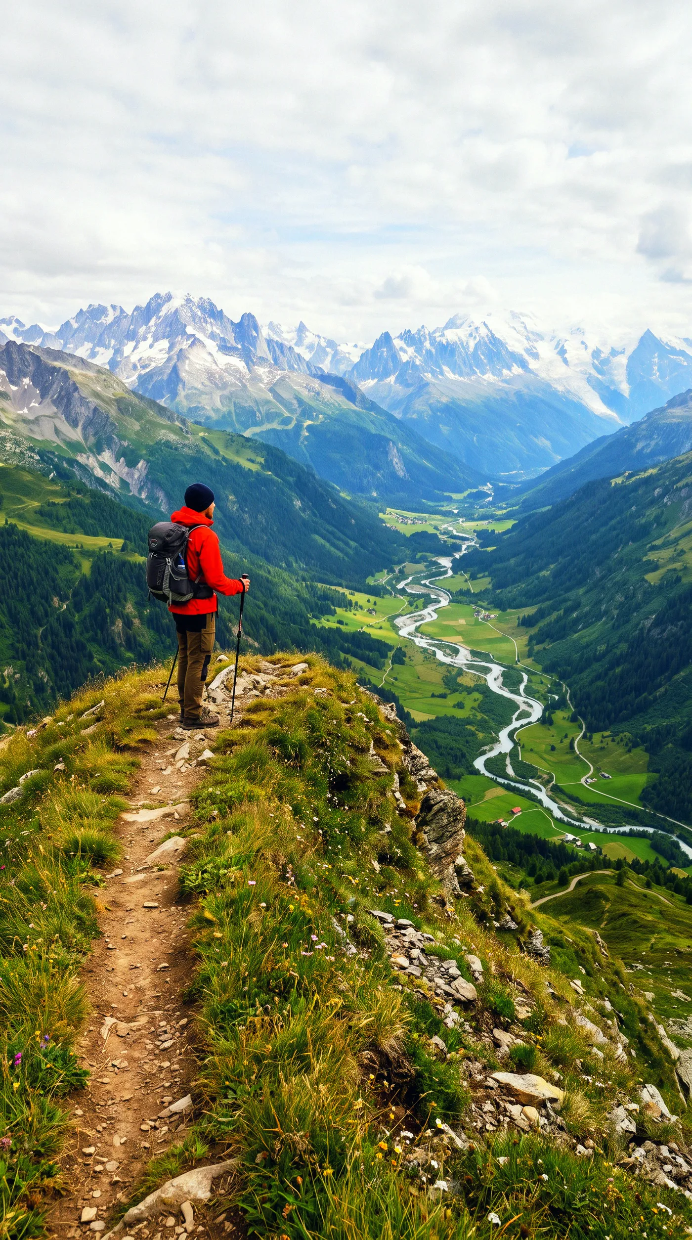
Grading as the Final Step
Colour grading usually comes last, once the content of the photo is settled. That makes it a natural finish for work done in the other Actions: grade a portrait after a relight, or grade a set of product photos so a whole catalogue shares one consistent look. When you want a look built into an image as you generate it rather than applied afterward, you can describe the palette and film style directly in the open-ended Create image generator.
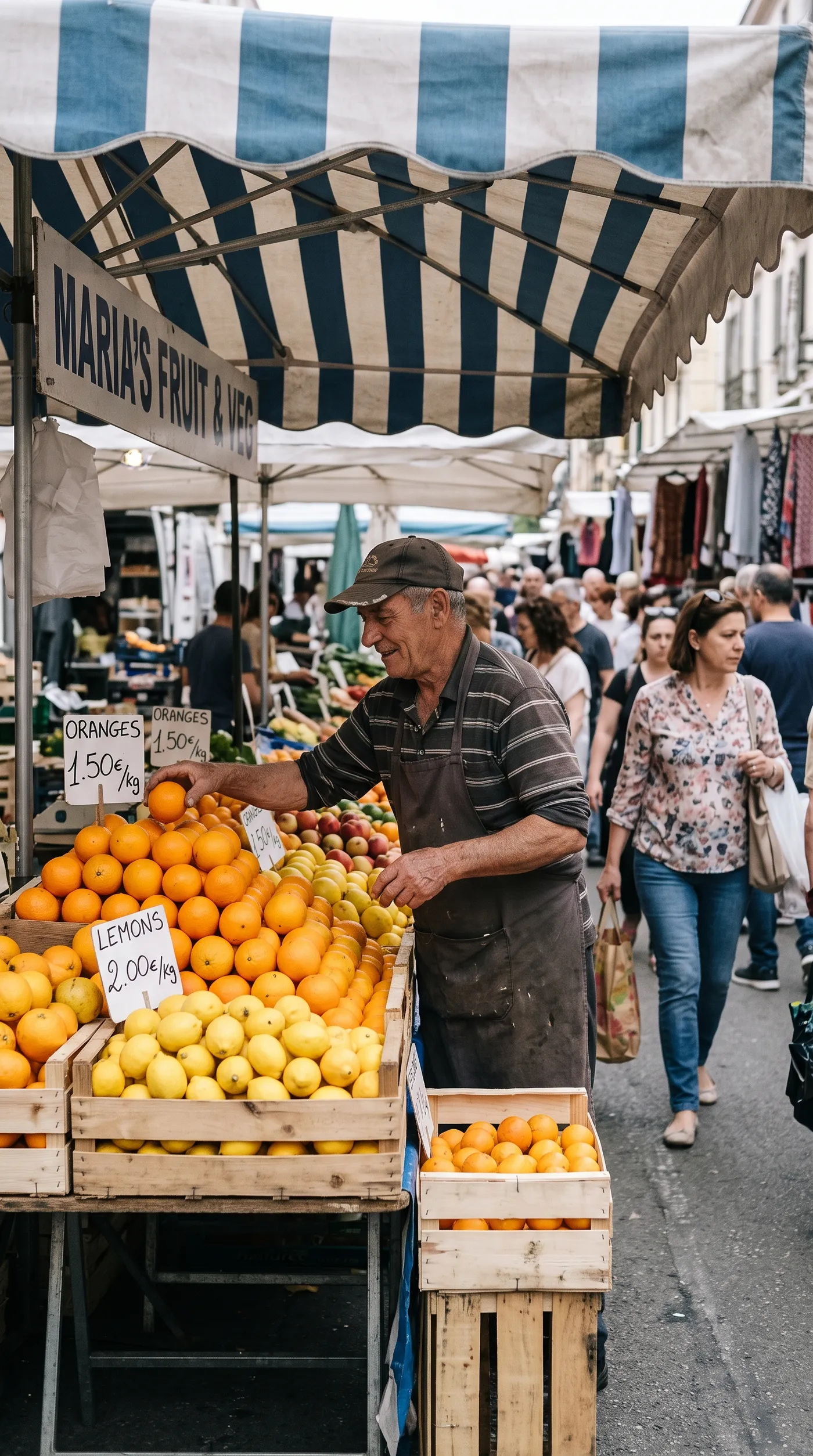
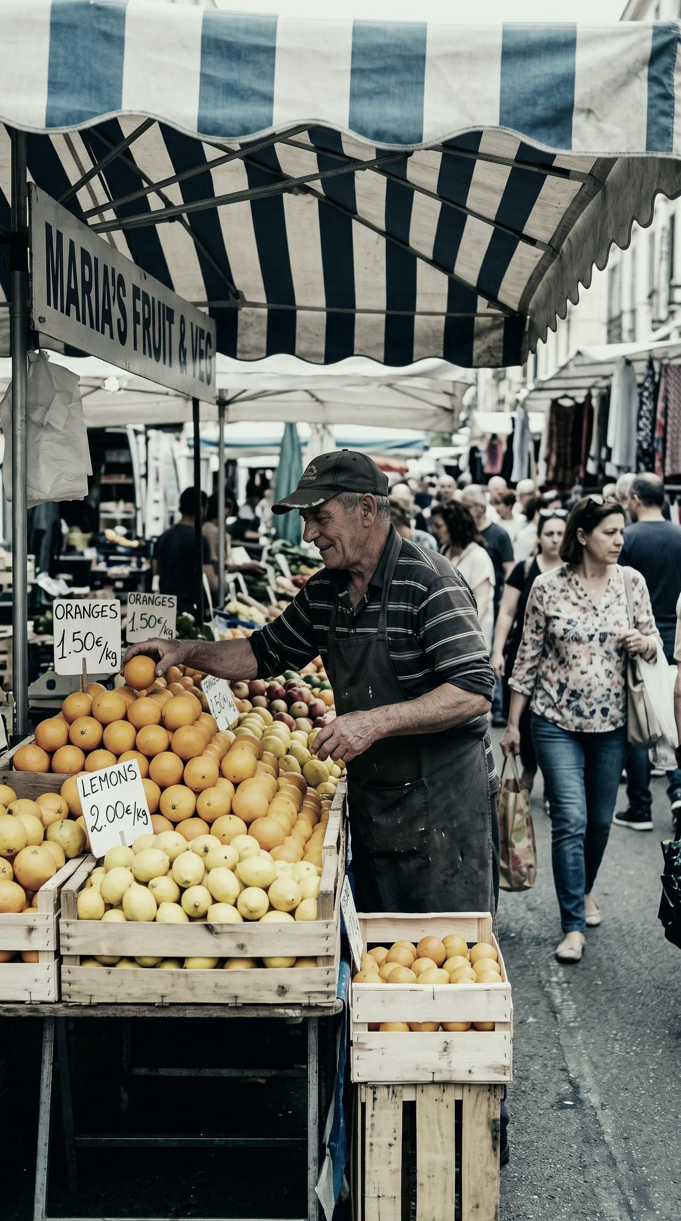
The Bottom Line
AI colour grading gives a photo the finished colour character of a real film stock or cinema style in a single choice. Add the photo, pick a look from Portra to teal and orange, and generate. Choose by the mood you want, use one look across a set for consistency, and keep your original safe while you compare. It is the fast route to images that feel graded, not merely filtered.
Open the Color grading Action in getimg.ai, bring a flat digital photo, and try a couple of film looks side by side. Commercial rights are included, subject to our terms and applicable third-party rights.
Frequently Asked Questions
The Color grading Action includes 23 looks: Kodachrome 64, Portra 400, Portra 800, Velvia 50, Elite Chrome, Classic Chrome, Eterna, CineStill 800T, Tri-X 400, HP5, teal and orange, hollywood, technicolor, bleach bypass, fashion film, nomad, moody aqua, golden, dusk, neon night, bright and airy, vintage fox, and lomography. They span warm film stocks, punchy slide films, black-and-white film, cinematic contrast looks, and stylised mood grades.
Colour correction fixes technical problems: white balance, exposure, and neutral, accurate colour. Colour grading is the creative pass on top, shaping the palette, contrast, and tones to carry a mood or match a style. Grading is what gives a photo the feel of a specific film or film-maker, rather than simply making it look correct.
It depends on the look. Warm film stocks like Portra 400 and Portra 800 are designed to flatter skin and are a safe choice for portraits. Heavy, high-contrast cinematic looks can push skin tones in stronger directions, so for people it is worth comparing a couple of looks and choosing the one that keeps skin natural.
Yes, and it is one of the best uses of the Action. Running one look across a feed, a shoot, or a campaign gives the whole set a consistent, intentional feel. Since your originals are never changed, you can grade each image in a set to the same look and keep them as a matched set.
Choose 1K for a quick on-screen copy, 2K for most web and social use, and 4K when the graded photo will print or appear at large size, so the tones stay smooth at full resolution.
Commercial rights are included, subject to our terms and applicable third-party rights. Make sure you hold the rights to the original photo you are grading.
Related Articles