Film Looks Explained: Portra 400, CineStill 800T, Kodachrome, Velvia and More


Each film stock has a recognizable look. Kodak Portra 400 gives soft contrast and warm, natural skin tones. CineStill 800T is cool and tungsten-balanced, with red halation around bright lights. Kodachrome has deep, saturated reds and dense shadows. Fujifilm Velvia 50 pushes greens and blues hard, and Kodak Tri-X is gritty, high-contrast black and white. You can apply all of these looks to your own digital photos with the Color grading Action on getimg.ai. Below, the same photo is graded with each one, side by side.
Why film looks are still everywhere
Most photos are taken on phones and digital cameras, yet the vocabulary of color still comes from film. Photographers ask for "a Portra look" for portraits, brands ask for a "Kodachrome feel" in a retro campaign, and colorists talk about "bleach bypass" for gritty drama. Each name is shorthand for a whole package: white balance, contrast curve, saturation, how highlights roll off, and how skin, greens and blues render.
Knowing what each stock does lets you pick a look on purpose instead of scrolling through filters until one feels right. It also gives you words that a photographer, a retoucher or an AI tool all understand. On getimg.ai, every look in this guide is available as an AI color grading option you can apply to your own photos.
The test: one photo, twelve looks
To compare stocks fairly, we used a single ungraded street photo: a woman in a red coat at a tram stop in late-afternoon light, with a green tram, yellow and pink tulips, lit shop windows and wet cobblestones. That mix of skin, saturated red, green, blue sky and warm artificial light shows how each look treats different colors.
Every version was made in Color grading, which applies the named look to the whole image while keeping the composition, the people and the details unchanged. Here is the ungraded original.

Original (no grade)
Film looks at a glance
Look | Type | Color and contrast | Best for |
Kodak Portra 400 | Color negative | Soft contrast, warm and natural skin, gentle saturation | Portraits, weddings, lifestyle |
Kodak Portra 800 | Color negative | Warmer and denser than Portra 400, richer color | Low light portraits, events, golden hour |
CineStill 800T | Color negative (tungsten) | Cool overall, red halation around bright lights | Night streets, neon, interiors under lamps |
Kodachrome 64 | Color slide | Deep reds, dense shadows, strong saturation | Retro travel, Americana, nostalgic campaigns |
Fujifilm Velvia 50 | Color slide | Very saturated greens and blues, high contrast | Landscapes, nature, travel |
Kodak Elite Chrome | Color slide | Punchy, clean, vibrant color | Bright product and travel shots |
Fujifilm Classic Chrome | Digital film simulation | Muted color, soft contrast, documentary feel | Street, reportage, editorial |
Fujifilm Eterna | Cinema film | Low contrast, low saturation, soft shadows | Cinematic stills, moody portraits |
Teal and orange | Cinema grade | Teal shadows and backgrounds, warm skin | Action, fashion, music artwork |
Bleach bypass | Lab process | Desaturated, silver tones, hard contrast | War, crime and gritty drama looks |
Kodak Tri-X 400 | Black and white | Gritty grain, strong contrast | Street, documentary, music |
Ilford HP5 Plus | Black and white | Smoother grey tones, flexible contrast | Portraits, everyday black and white |
Kodak Portra 400 and Portra 800
Portra is Kodak's professional color negative film, introduced in 1998 and built for skin. Portra 400 is the one most people mean when they say "film look" for portraits: lower contrast, warm but believable skin, pastel highlights and colors that never shout. It's forgiving with exposure, which is why wedding and lifestyle photographers love it.
On our test photo the Portra 400 grade is deliberately subtle: a slight warm shift and softer color, and the red coat stays red without glowing. Portra 800 is the faster version. Its look here is denser and warmer, with richer reds and deeper shadows, closer to a portrait shot as the sun goes down. If Portra 400 reads as "natural", Portra 800 reads as "evening".


Original (no grade)
Portra 400
Portra 800
CineStill 800T
CineStill 800T is Kodak's Vision3 500T motion picture film, respooled for still cameras with the remjet backing removed. Two things define it. It's tungsten-balanced (the T), so daylight scenes shift cool and lamp-lit scenes look neutral. And without the remjet layer, bright light sources bleed a red-orange glow, called halation, into the darkness around them.
That combination is why CineStill 800T owns night photography on social media: neon signs, street lamps and car lights glow, while shadows stay teal. On our daylight test the look cools the whole scene and makes the lit shop windows glow. It works best when there are light sources in the shot, and it shines after dark.

Original (no grade)
CineStill 800T
Kodachrome 64
Kodachrome was Kodak's color slide film from 1935 until 2009, and the last roll was processed at the end of 2010. Its look is tied to decades of National Geographic covers and family slideshows: dense shadows, deep reds, warm yellows and a slightly dark, rich overall rendering.
On the test photo, Kodachrome is the boldest color change: the coat turns a deep red, the tram a darker green, and the whole scene gains contrast. Use it when you want a photo to feel like a memory from the 1960s or 70s, for retro travel, heritage brands and nostalgic campaigns. It's too heavy for soft beauty or skincare work.

Original (no grade)
Kodachrome 64
Fujifilm Velvia 50 and Kodak Elite Chrome
Velvia 50 is Fujifilm's slide film from 1990, famous among landscape photographers for saturation. Greens become lush, skies turn deep blue, and contrast is high. On our photo it intensifies the coat, the tram and the tulips without changing the scene's warmth much.
Elite Chrome was Kodak's consumer slide film, discontinued in the early 2010s. As a look it is punchy and clean: vibrant color with raised contrast, less extreme than Velvia. Velvia suits landscapes and travel where nature is the hero. Elite Chrome suits bright product and lifestyle shots that need energy without looking over-processed.


Original (no grade)
Velvia 50
Elite Chrome
Fujifilm Eterna and Classic Chrome
Eterna is Fujifilm's motion picture film line, and Fujifilm cameras also offer it as a film simulation. It is the opposite of Velvia: low saturation, low contrast and soft, lifted shadows. On the test photo it pulls the color back and gives the scene the quiet, slightly flat look of a film still before final grading. It's a strong choice for moody portraits and cinematic stills.
Classic Chrome is a Fujifilm digital film simulation inspired by documentary slide film: muted color and soft contrast that keep attention on people rather than on bright colors. On our photo it's one of the subtlest looks in the set. It suits reportage, street photography and editorial portraits.


Original (no grade)
Eterna
Classic Chrome
Teal and orange and bleach bypass
These two aren't film stocks but cinema grades.
Teal and orange pushes shadows and backgrounds toward teal and keeps skin warm, so people pop off their surroundings. It became the signature of modern blockbusters. On the test photo it's the strongest grade overall: the street and sky go cool, the skin stays warm.
Bleach bypass comes from a lab process where the bleach step is skipped, so silver stays in the film. The result is desaturated, silvery and high in contrast, the gritty look of war and crime films. On our photo the red coat turns a muted brick and the tulips go nearly grey.


Original (no grade)
Teal and orange
Bleach bypass
Kodak Tri-X 400 and Ilford HP5
Tri-X is Kodak's classic black and white film and has been a press and street photography staple since the 1950s. Its look is punchy and gritty: deep blacks, bright highlights and visible grain. Ilford HP5 Plus is its British counterpart, slightly smoother, with more grey tones in between.
On our photo, Tri-X gives harder contrast, and HP5 keeps more detail in the coat and the shadows. Pick Tri-X for street, music and documentary work with attitude. Pick HP5 for portraits where you want black and white to feel gentle.


Original (no grade)
Tri-X 400
HP5
How to get a film look on digital photos
There are three common routes.
- Shoot film. The real thing, with real grain and halation, but each roll costs money to buy and develop, and you only see results later.
- Use presets and LUTs. Lightroom presets and video LUTs imitate film stocks. They're fast once set up, but each one behaves differently depending on the exposure and white balance of the photo you apply it to.
- Use an AI color grade. You add the photo, pick the look by name and get a graded version back. The Color grading Action on getimg.ai offers 23 looks, including every stock in this guide, at 1K, 2K or 4K. The step-by-step guide on how to color grade photos with AI walks through it.
Whichever route you choose, the same rule applies: a look can't fix the light. Portra flatters soft, warm light. CineStill needs light sources in the shot. Velvia needs color to exaggerate. Start from a photo that suits the stock.
How to choose a film look
Match the look to the job, not to the trend.
If you're making... | Try | Avoid |
Portraits, weddings, beauty | Portra 400, Portra 800, Eterna | Velvia, bleach bypass |
Night city scenes | CineStill 800T, teal and orange | Portra 400 |
Landscapes and travel | Velvia 50, Kodachrome, Elite Chrome | Bleach bypass |
Retro or heritage campaigns | Kodachrome, Portra 800 | Teal and orange |
Editorial and documentary | Classic Chrome, Tri-X, HP5 | Elite Chrome |
Fashion and music artwork | Teal and orange, bleach bypass, Tri-X | Classic Chrome |
For a series, pick one look and use it on every image. A consistent grade does more for a campaign or a portfolio than the perfect look on one shot. If the light in a photo works against the look you want, relighting the photo first gives the grade a better starting point.
All the film looks side by side
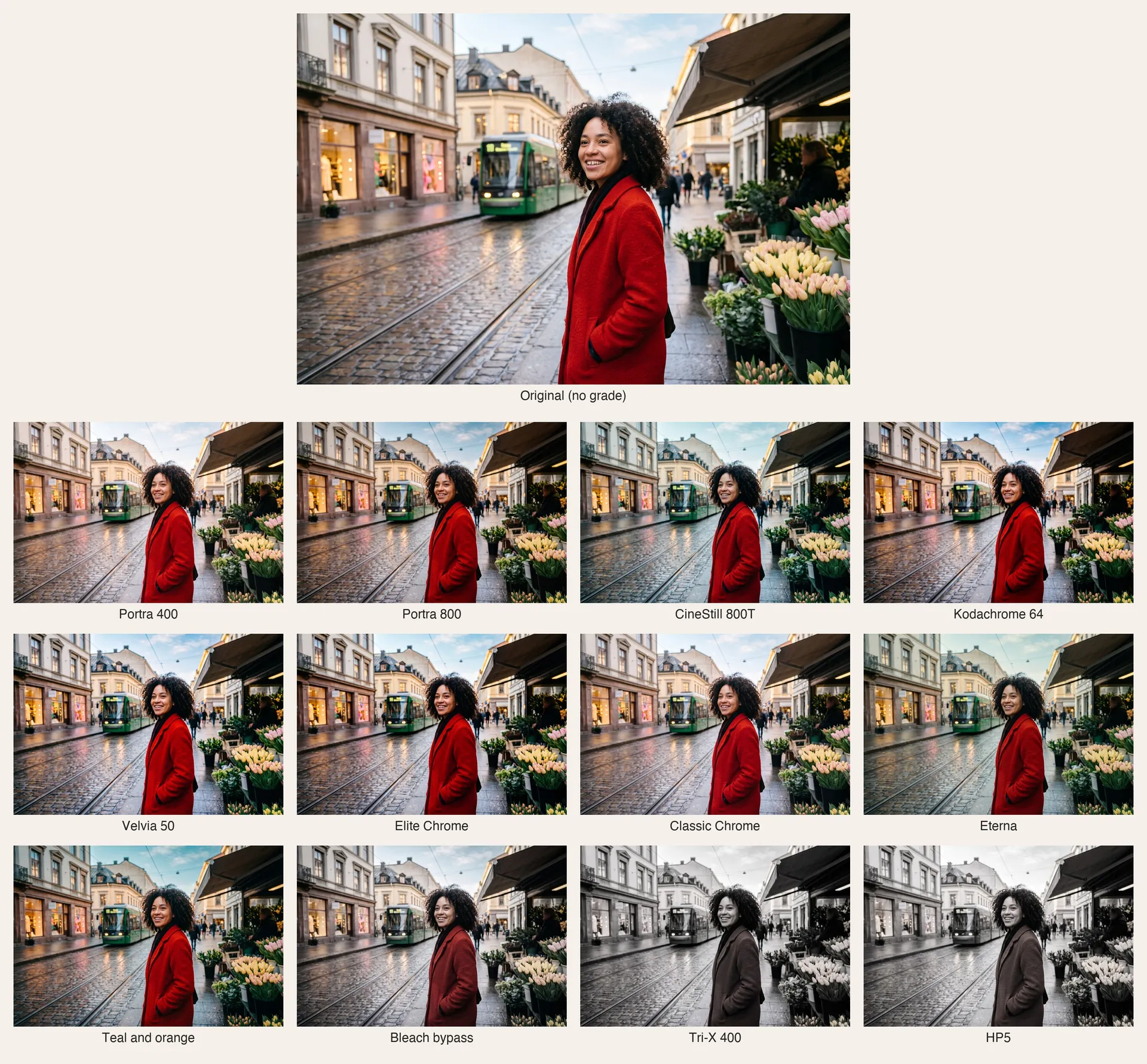
Here are all twelve looks from this guide on the same photo, with the ungraded original at the top. Seen together, the differences are easier to judge: the black and white pair and the cinema grades change the image most, while Portra 400 and Classic Chrome are the gentlest.
Bottom Line
Film looks are shorthand for complete color recipes: Portra 400 for soft, natural skin, Portra 800 for warmer evenings, CineStill 800T for glowing night scenes, Kodachrome for rich nostalgia, Velvia for saturated landscapes, Eterna and Classic Chrome for restraint, teal and orange and bleach bypass for cinema, and Tri-X or HP5 for black and white. Compare them on your own photo before you commit to one for a series. Open Color grading and try all of them on the same shot.
Frequently Asked Questions
Kodak Portra 400 has soft contrast, warm and natural skin tones, gentle saturation and pastel highlights. It's the go-to film look for portraits, weddings and lifestyle photos because it flatters skin without making colors look loud.
CineStill 800T is tungsten-balanced motion picture film adapted for still cameras. Daylight scenes turn cool and blue, lamp-lit scenes look neutral, and bright lights get a red-orange glow called halation. It's most popular for night street and neon photography.
No. Kodak stopped making Kodachrome in 2009, and the last lab that developed it stopped processing at the end of 2010. Its look lives on through presets, LUTs and AI color grading that imitate its deep reds and dense shadows.
Both are Kodak color negative films made for skin. Portra 800 is faster, for lower light, and as a look it reads warmer, denser and more saturated. Portra 400 is softer and more neutral.
Both are ISO 400 black and white films. Kodak Tri-X has punchier contrast and grittier grain. Ilford HP5 Plus is slightly smoother, with more mid-grey tones, which many photographers prefer for portraits.
Yes. AI color grading applies a named film look to the whole photo: white balance, contrast, saturation and the stock's typical rendering of skin and colors. On getimg.ai, the Color grading Action offers 23 looks, including Portra, CineStill, Kodachrome, Velvia, Tri-X and HP5.
Portra 400 is the safest choice for natural, flattering skin. Portra 800 adds warmth for evening and indoor light, and Eterna gives a quieter, cinematic portrait. Avoid strongly saturated looks like Velvia for skin.
Related Articles