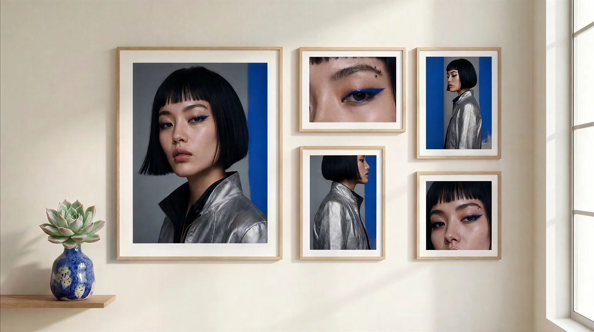
Can AI Keep a Personal Brand Consistent? A 30-Post Stress Test (2026)


AI can keep a personal brand consistent across many different posts, but not by repeating one prompt. Consistency comes from deciding what stays fixed and what is allowed to change: the person stays recognizable and the palette and lighting stay familiar, while clothes, locations, actions, and content formats move freely. To test this properly, we built one fictional AI creator, pushed her identity through 30 posts and five escalating stress tests, and scored every image. She finished at 685 out of 750.
TL;DR
- The test: one AI person, a fictional creative director named Mara, across 30 posts and five escalating stress tests. Every image was scored 1 to 5 in five categories, for a maximum of 750 points.
- The result: 685 out of 750 (91%). Identity held strongest and every genuine post landed in the green band; color was the softest dimension, because environments and product colors nudged the palette.
- A consistent character answers "who is in the image?" A consistent personal brand answers "what visual logic connects all the images?" They are two different problems.
- Consistency can break in four ways: identity drift, style drift, semantic drift, and brand collision. Some images here were generated deliberately off-brand to show each one, because naming which layer breaks is what makes it fixable.
- The system that works is three layers. Identity stays stable, the brand fingerprint stays controlled, and the post purpose changes. That split is the whole formula.
- The real proof: remove the person from six posts. If the colors, light, materials, and composition still feel connected, you built a brand. If not, you only built a consistent face.
How the 30-Post Consistency Test Works
The test uses rules so it measures consistency instead of just showing off good-looking images. One fictional AI person runs through five rounds, and each round adds more variables than the last: Identity Control, Wardrobe, Location, Content Format, and finally Chaos Mode.

Six posts per round, 30 in total. Every image is scored from 1 to 5 in five categories, Identity, Brand Style, Color, Content Fit, and Overall Recognition, for a maximum of 25 points per image and 750 for the whole set. Anything below 20 lands in the danger zone.
Round | What It Tests | Variable It Introduces |
1. Identity Control | Baseline recognition | Camera distance, pose, expression |
2. Wardrobe | Outfit changes | Six complete outfit swaps |
3. Location | Real environments | Cafés, streets, airports, hotels |
4. Content Format | Post types | UGC, keynote, behind-the-scenes, promo |
5. Chaos Mode | Deliberate breakage | Everything at once, plus a rival brand color |
Scoring turns opinion into something measurable. Each image sits in one of three bands, so a whole grid can be read at a glance.
Band | Score per Image | Meaning |
Green | 20 to 25 | On brand |
Yellow | 16 to 19 | Drifting |
Red | 0 to 15 | Off brand (danger zone) |
A Consistent Character Is Not a Consistent Personal Brand
A consistent character and a consistent personal brand are different achievements, and confusing them is why most attempts fail. A character answers one question: who is in the image? A personal brand answers a second, harder question: what visual logic connects all the images, even the ones the person is barely in? You can hold a face perfectly across 30 posts and still have 30 pictures that look like they came from 30 different creators, because the palette, lighting, and materials changed underneath the face.
The face is the easier half. Once you anchor a reference, consistent AI characters are a largely solved problem, which is why Mara's identity holds across all 30 posts. The personal brand is the harder half: a repeatable visual system that stays recognizable whether the person is centered, off to one side, or absent from the shot entirely. That harder half is what the test is built to expose.
Step 1: Build the Person With Identity Anchors
Before running any test, the person needs identity anchors specific enough to track. A generic prompt like "beautiful professional woman" gives almost nothing to preserve, because there is no defined feature to check against later.
So the fictional creative director, Mara, was built from named, trackable details: warm neutral skin, dark brown almond-shaped eyes, defined natural eyebrows, a straight narrow nose, medium-full lips, a subtle beauty mark beneath the left eye, and shoulder-length dark brown hair with a center part. Now there are real things to score: eye shape, brows, hair, the beauty mark, and facial proportions.
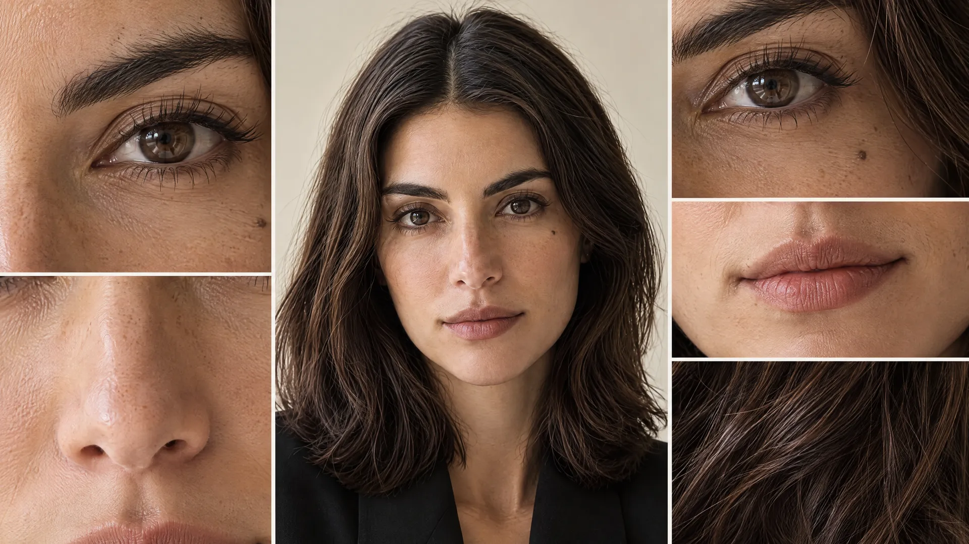
Text alone is not enough for a person who has to reappear 30 times, so Mara was saved as a reusable Person Element named `@Mara`. Instead of six near-identical selfies, the reference set uses useful variation: front, three-quarter, and profile angles, different expressions, and wider shots. The goal is not to recreate one photograph but to teach the system one person. The guide to Elements covers how to build and call a reference like this.
Step 2: Define the Brand Fingerprint
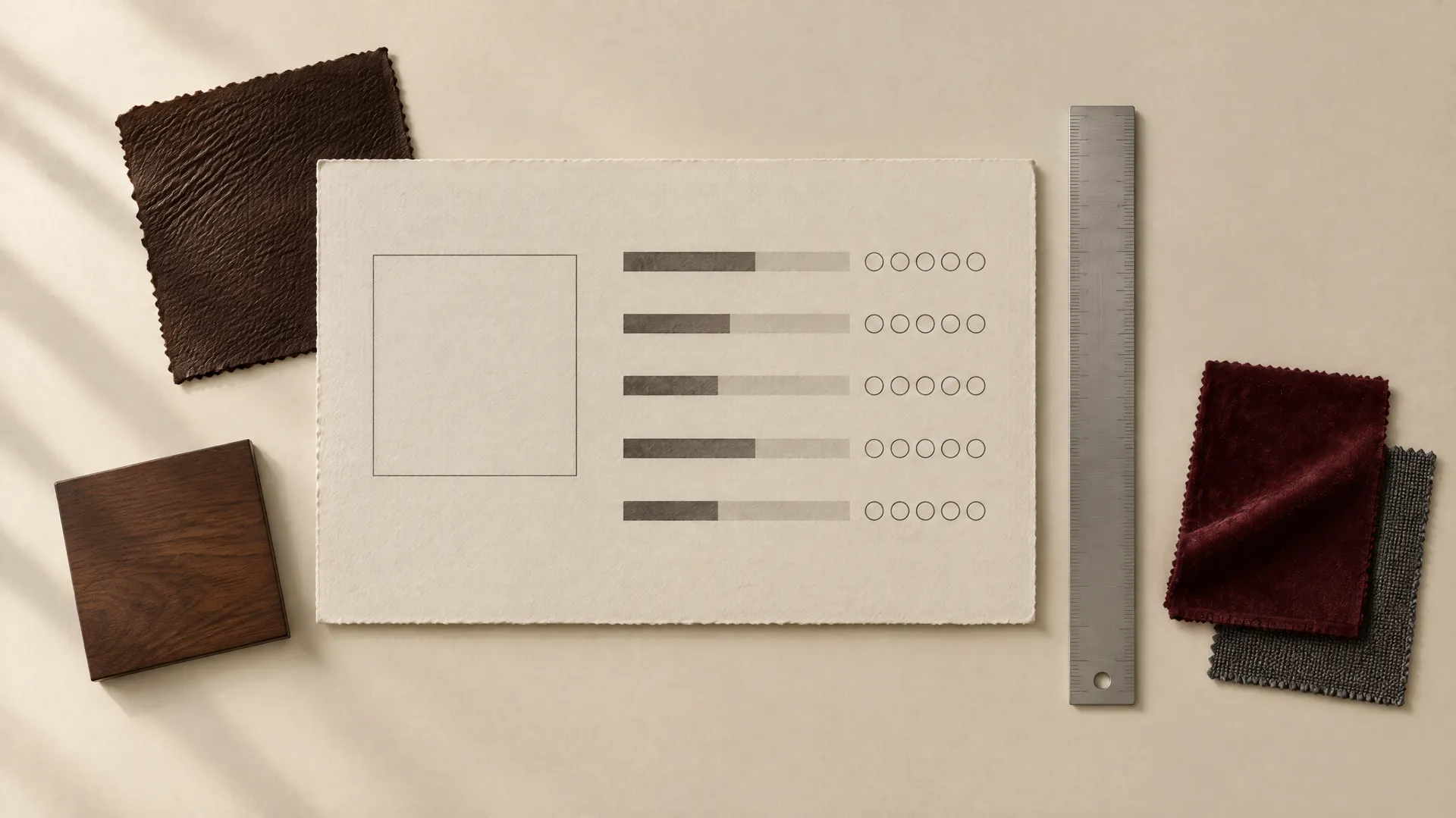
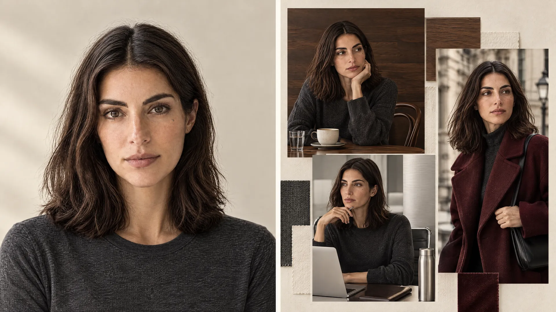
With the person locked, the next step is a brand fingerprint: a short set of visual rules that every post checks itself against. Those rules are what turn a folder of unrelated pictures into images in a consistent brand style, and having them is the difference between a coherent personal brand and a lucky run of nice generations.
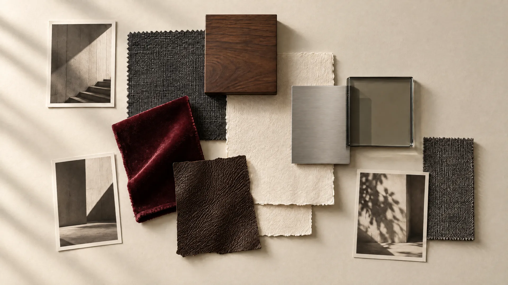
Mara gets five simple rules, written as constraints rather than adjectives.
Element | Mara's Rule |
Palette | Graphite, warm cream, dark brown, silver, occasional burgundy |
Lighting | Soft directional daylight, controlled contrast |
Materials | Dark wood, glass, brushed metal, paper, natural textiles |
Camera Style | Editorial realism, with occasional smartphone content |
Composition | One clear focal point, negative space, slight asymmetry, minimal clutter |
The point is not to make 30 images identical. It is to make 30 images recognizable. The fingerprint is what carries recognition into shots where the wardrobe, the location, and even the purpose have all changed.
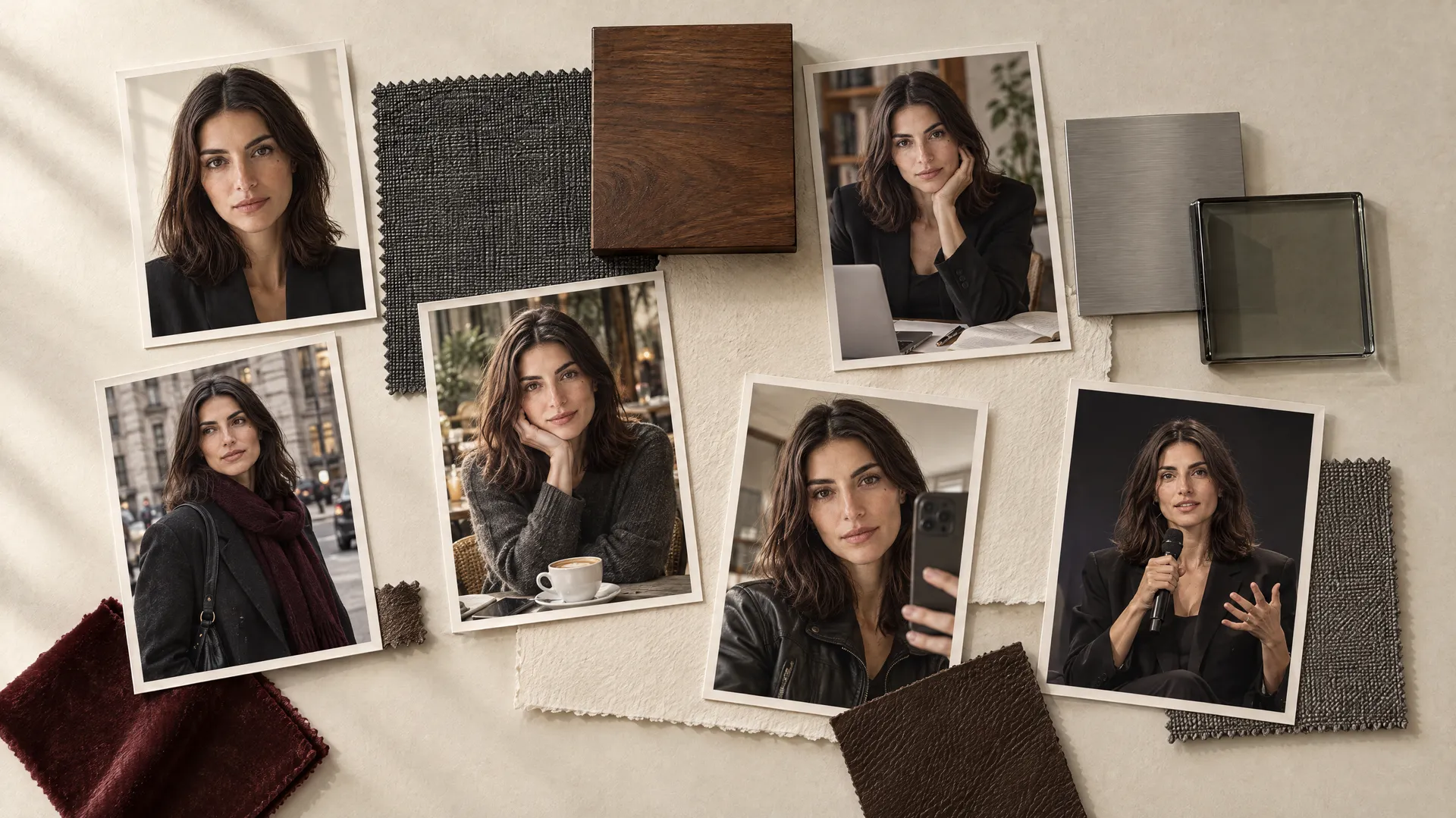
Round 1: Identity Control
Round 1 is easy mode, and it establishes the baseline every later round is measured against. The six posts keep the same visual world but vary the camera distance, pose, and expression: a clean portrait, a three-quarter view, seated, standing, smiling, and a profile.
One of the prompts reads:
- Editorial three-quarter portrait of `@Mara` wearing a structured graphite blazer, warm off-white background, soft directional daylight from camera left, realistic skin texture, calm expression, negative space on camera right.


-1920x1079.webp)



The profile shot is the one that matters most here. Front-facing portraits are the easiest angle for any model to reproduce, so a clean front view proves little. A profile reveals whether the system actually understands Mara's facial structure or only recognizes one familiar view.
Round 1 scored 142 out of 150, comfortably in the green band, with the full-length and profile shots the only ones to give up a point. If the identity survives this, the test moves on.
Post | Score | Band |
Clean front portrait | 24/25 | Green |
Three-quarter view | 24/25 | Green |
Seated | 24/25 | Green |
Full-length | 23/25 | Green |
Smiling | 24/25 | Green |
Profile | 23/25 | Green |
Round 2: The Wardrobe Stress Test
Round 2 changes the clothes completely while holding the identity fixed: cream knitwear, a black oversized blazer, burgundy tailoring, a gray sweatshirt, a white shirt, and a dark leather jacket. The logic is simple. Identity stays constant, wardrobe becomes the variable.
The prompt defines only the change:
- `@Mara` wearing an oversized dark leather jacket over a simple cream top, walking through a minimal contemporary interior, natural relaxed expression, soft directional daylight, graphite and warm-neutral palette.






This round introduces semantic drift, the subtlest failure in the whole test. The face can stay technically correct while the outfit quietly changes who Mara reads as. The leather jacket can make her look harsher. The sweatshirt can make her look ten years younger.
The white shirt can turn her into generic corporate stock photography. So the real question is not only "same face?" but "same person?"
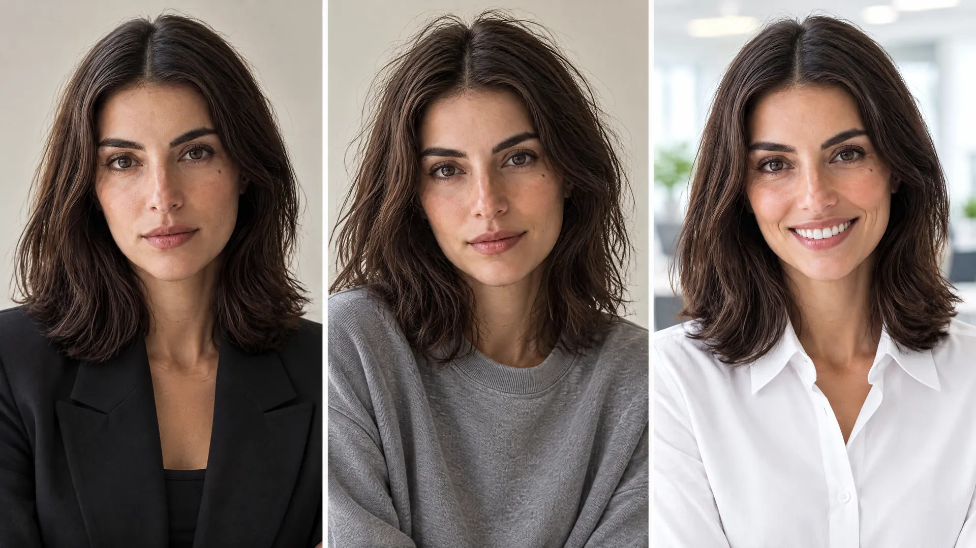
Round 2 scored 137 out of 150, with all six wardrobe swaps holding in the green band. The leather jacket and the white shirt were the ones to watch for semantic drift, but both stayed recognizably Mara rather than sliding into a harder or a more corporate read.
Post | Score | Band |
Cream knitwear | 23/25 | Green |
Black oversized blazer | 23/25 | Green |
Burgundy tailoring | 24/25 | Green |
Dark leather jacket | 22/25 | Green |
Gray sweatshirt | 23/25 | Green |
White shirt | 22/25 | Green |
Round 3: The Location Stress Test
Round 3 leaves the controlled studio for real environments: a coffee shop, a city street, an airport, a hotel room, a conference venue, and a home office. This is harder because every location brings its own colors, materials, and light.
A café prompt reads:
- `@Mara` working alone at a dark wood café table with an open laptop and notebook, contemporary concrete interior, soft window daylight, muted cream, brown, and graphite palette, candid personal-brand photography.






The failure to watch for here is environmental takeover, where the location hijacks the brand. To see it clearly, we forced it on purpose: an airport lit cold blue, a café pushed orange, a hotel turned into a glossy luxury campaign. In each, Mara survives but her palette does not. The environment is supposed to support her, not become the new brand.



Round 3 scored 137 out of 150, with all six on-brand locations landing green, from the café and home office to the airport and the conference hall. The cold-blue airport, orange café, and golden hotel shown alongside them were generated deliberately off-brand to demonstrate takeover, and are not counted in the score.
Post | Score | Band |
Café | 23/25 | Green |
City street | 24/25 | Green |
Airport | 24/25 | Green |
Home office | 23/25 | Green |
Hotel room | 22/25 | Green |
Conference venue | 21/25 | Green |
Midpoint Check: Read the Grid, Not the Faces
After 18 posts, it helps to stop and place everything into one grid. The instinct is to stare at faces, but the more useful move is to zoom out and read the set as a whole. Which image feels wrong immediately, before you have analyzed why? Maybe one is too glossy. One introduced a bright blue that belongs to no rule. One has completely different contrast from its neighbors. Circle those outliers.
-900x502.webp)
This is the difference between generating nice pictures and directing a visual system. An image can be individually beautiful and still be completely wrong for the brand, and you only catch that by comparison, not in isolation. Reading the grid at the midpoint also tells you which drift type is emerging early, so the second half of the test becomes a chance to correct rather than a repeat of the same mistakes.
Round 4: The Content Format Stress Test
Round 4 is where the test gets genuinely hard, because personal branding is not only portraits. Posts turn into different content types: educational content, a speaking event, behind-the-scenes, a UGC-style selfie, a brand collaboration, and a promotional visual.
A UGC prompt deliberately loosens the polish:
- Casual smartphone-style photograph of `@Mara` sitting at her kitchen table holding a coffee mug, relaxed morning expression, slightly imperfect composition, natural window light, warm cream and dark-brown interior.
A keynote prompt does the opposite:
- `@Mara` speaking on a minimal conference stage, photographed from audience level, dark graphite stage design, restrained warm spotlight, confident natural body language.






These posts should not look identical, and that is the point. A phone selfie that looks like a keynote photograph has failed at being a selfie. This is where consistency needs flexibility: force exactly the same style onto every format and the result stops feeling believable.
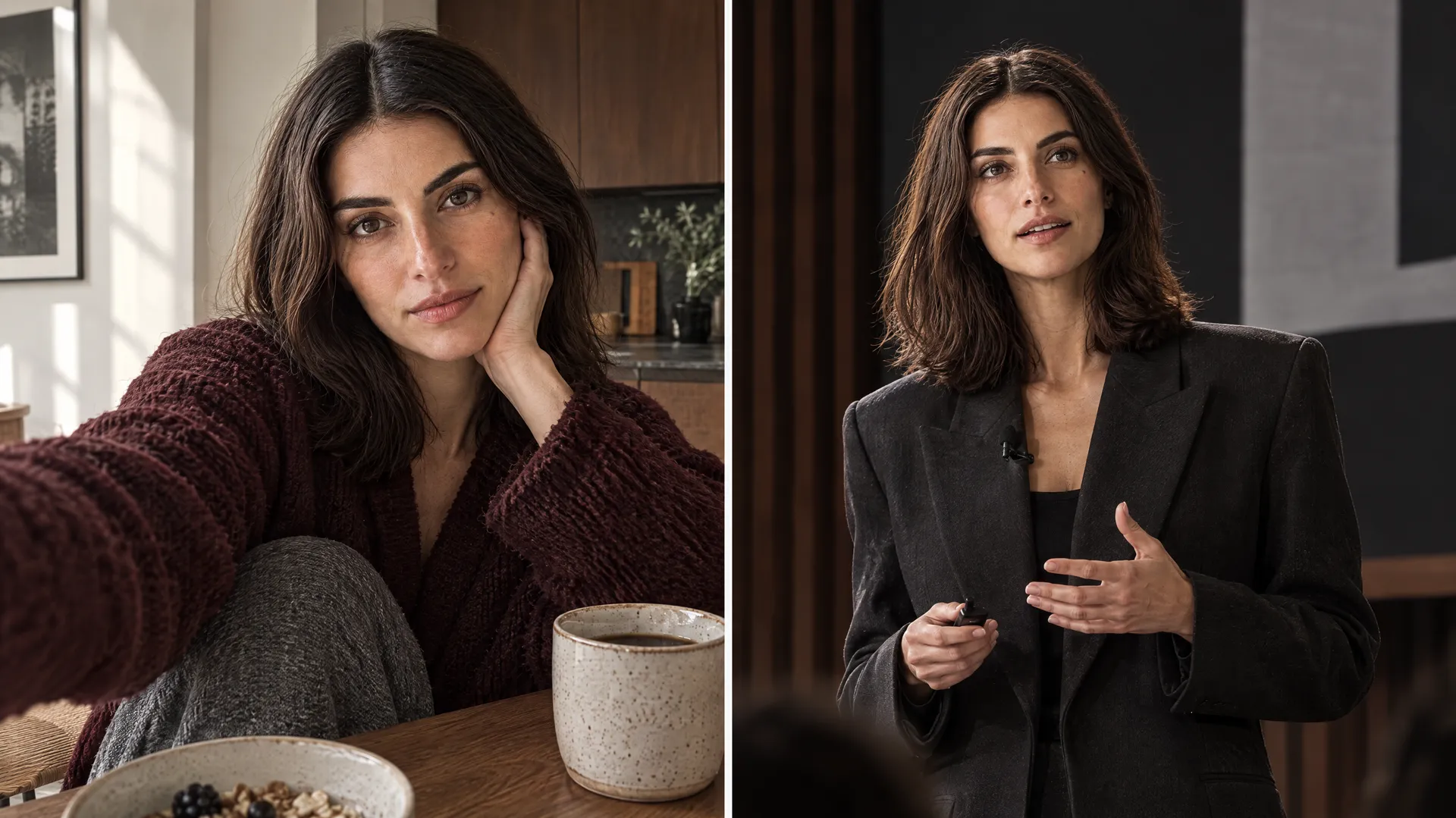
The test rewards images that stay connected while looking right for their format. Round 4 scored 137 out of 150, with the UGC selfie scored on its own terms, a green 21, rather than penalized for looking casual.
Post | Score | Band |
Educational content | 23/25 | Green |
Speaking event | 24/25 | Green |
Behind-the-scenes | 23/25 | Green |
UGC selfie | 21/25 | Green |
Promotional visual | 23/25 | Green |
Brand visual | 23/25 | Green |
Round 5: Chaos Mode
Round 5 is a deliberate attempt to break the system, stacking the hardest variables at once: a near-profile angle, low night light, harsh outdoor daylight, a motion shot, a completely different city, and a product collaboration in a color Mara never uses.
The collaboration is the real test. Imagine the partner product is cobalt blue, a color outside the entire palette:
- `@Mara` holding the cobalt-blue product naturally inside her warm neutral studio, graphite outfit, dark wood table, soft directional window light, preserve Mara's cream, graphite, and brown visual system, use cobalt blue only as a controlled product accent.






This introduces brand collision, where two visual identities enter the same image and one has to win. Then the final post changes almost everything at once, country, architecture, outfit, light, and camera, while still needing to look like Mara.

Round 5 scored 132 out of 150, the lowest round but still fully green. The cobalt collaboration held at 21 by keeping the rival color to a controlled product accent, and even the night and motion shots kept her palette and face intact.
Post | Score | Band |
Near-profile angle | 22/25 | Green |
Night / low light | 23/25 | Green |
Bright daylight | 22/25 | Green |
Motion shot | 21/25 | Green |
Different city (Seoul) | 23/25 | Green |
Cobalt collaboration | 21/25 | Green |
The Final Score: 30 Posts, One Person
Across all 30 posts, the experiment scored 685 out of 750, or 91%. The headline number matters less than its shape. Identity was the strongest dimension, because the person reference did its job and carried the face across every scene. Color was the softest, because environments and product colors nudged the palette more than anything else did.
That single split, strong identity and softer color, is the most useful finding in the test: a face is easier to hold than a whole visual world.
Dimension | Score | Read |
Identity | 145/150 | Held strongest; the person reference carried the face |
Overall Recognition | 140/150 | Read as Mara even in profile, motion, and night shots |
Content Fit | 136/150 | Formats matched their purpose |
Brand Style | 134/150 | Held; loosened only in the deliberately casual UGC shot |
Color | 130/150 | The softest dimension; environments and product colors nudged the palette |
Total | 685/750 | 91%, every genuine post in the green band |
Read by round, the pattern is just as clear: consistency degrades gracefully as the variables pile up, rather than collapsing all at once.
Round | Score | Band |
1. Identity Control | 142/150 | Green |
2. Wardrobe | 137/150 | Green |
3. Location | 137/150 | Green |
4. Content Format | 137/150 | Green |
5. Chaos Mode | 132/150 | Green |
Where Consistency Breaks: Four Types of Drift
The off-brand images in this test were generated on purpose, because a controlled failure teaches more than a clean success. Every way a personal brand can break falls into one of four types of drift. The value of naming them is diagnostic: once you know which layer broke, you stop restarting from scratch and repair only that layer.
Drift Type | What Changed | What Was Still Right | The Fix |
Identity Drift | The face, age, or proportions | Nothing to lean on | Strengthen the person reference |
Style Drift | The visual world (it belongs to another creator) | The face is correct | Reassert the palette, materials, and lighting |
Semantic Drift | The personality (corporate, influencer, or stock read) | The face is technically right | Adjust the wardrobe and context cues; name the intended read |
Brand Collision | A product or environment overpowers the brand | Nothing dominant enough | Simplify the environment; demote the rival color to an accent |
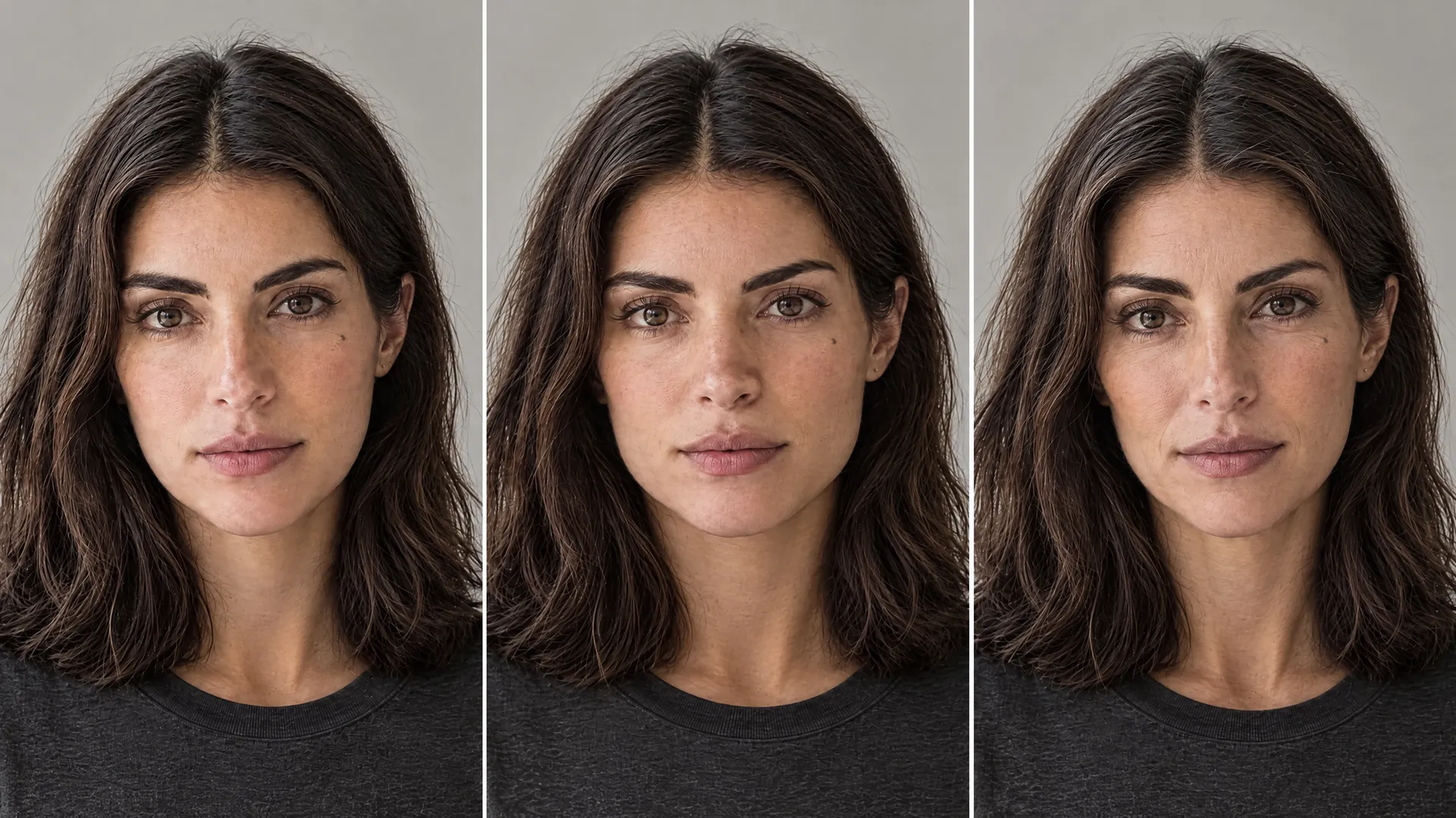
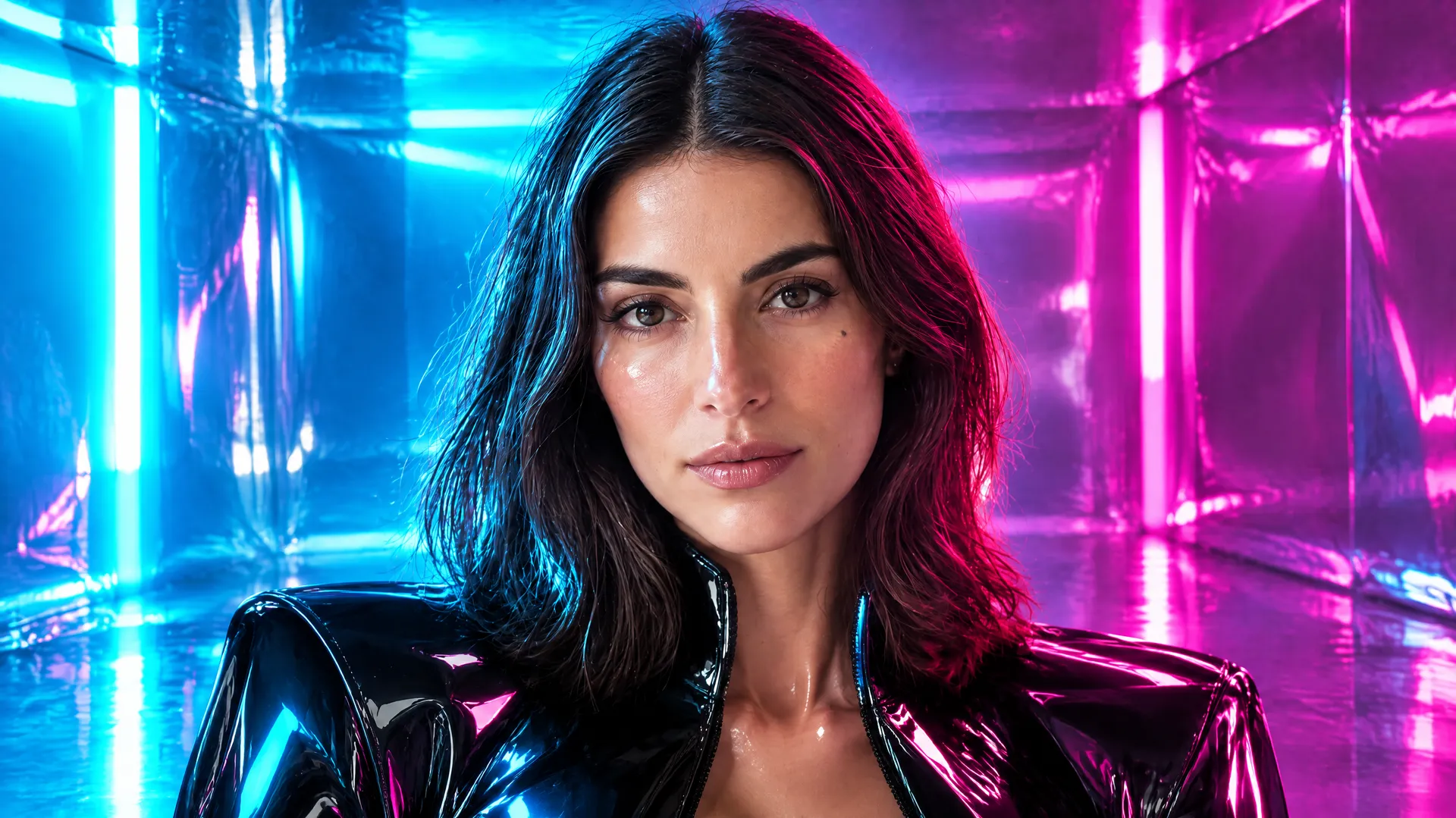


The repair logic follows the diagnosis directly. If the face changed, strengthen the reference. If the style changed, bring back the recurring palette, materials, and lighting. If the location took over, simplify the environment. If the format feels wrong, reduce the style influence and prioritize the content type.

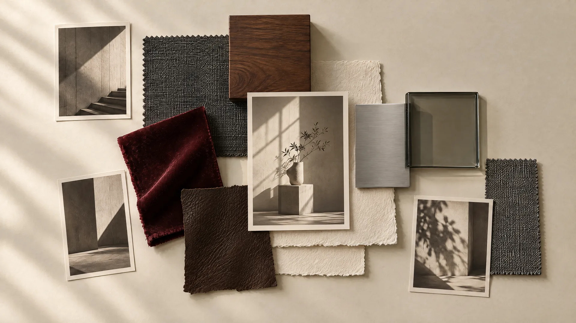
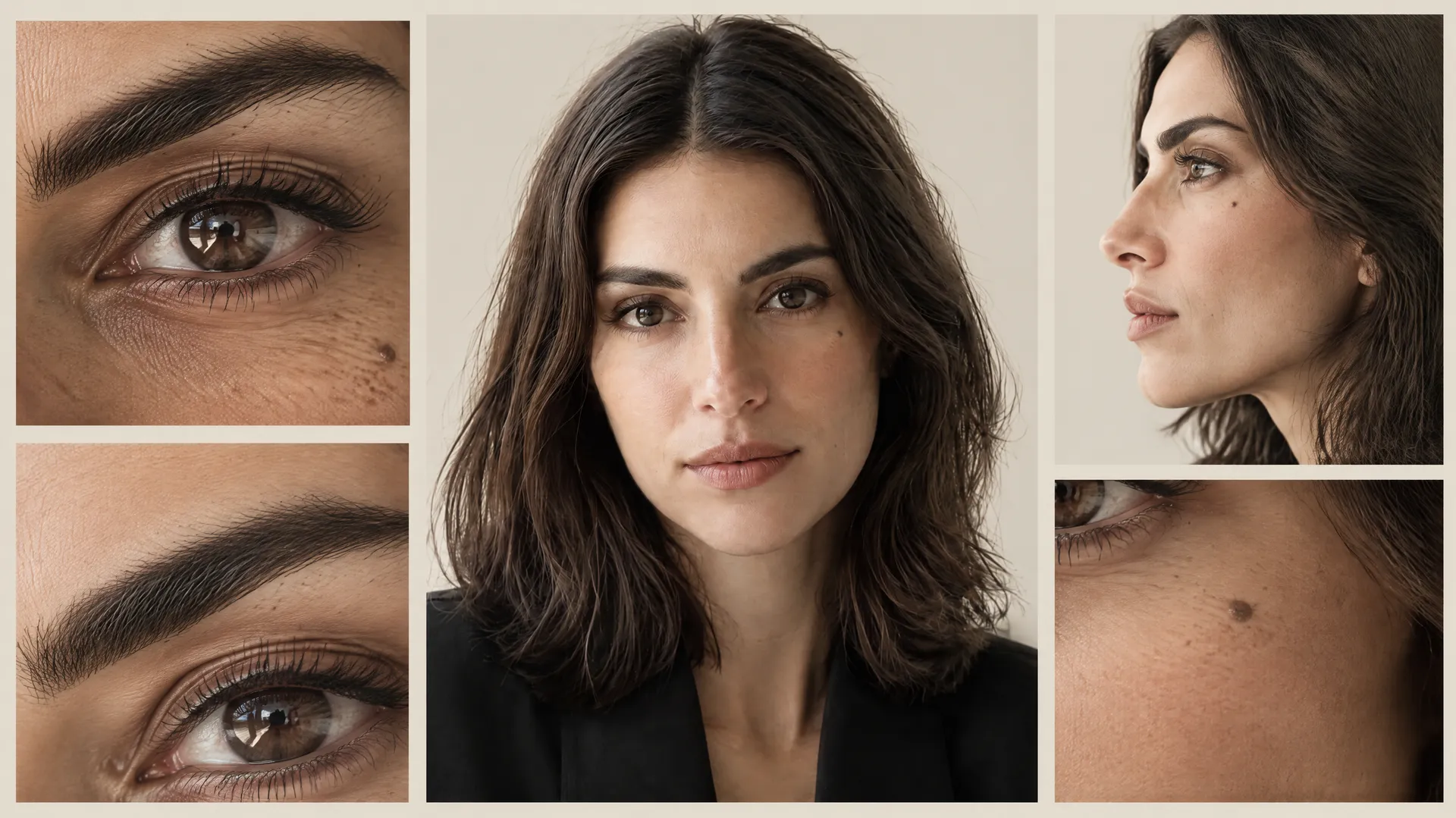
And when an image is already 90% correct, edit the winner rather than restarting: you can fix a single region without regenerating the whole image.
The Three-Layer System That Keeps a Personal Brand Consistent
After 30 posts, the system worth actually using comes down to three layers, each with a different job and a different amount of freedom. This is the mental model that prevents most drift before it starts, because it tells you in advance what you are allowed to change in any given post.
Layer | Question It Answers | How It Behaves |
1. Identity | Who is this? | Stable, never changes |
2. Brand Fingerprint | What visual logic connects the images? | Controlled, changes only within the rules |
3. Post Purpose | What is this post for? | Changes freely, post to post |

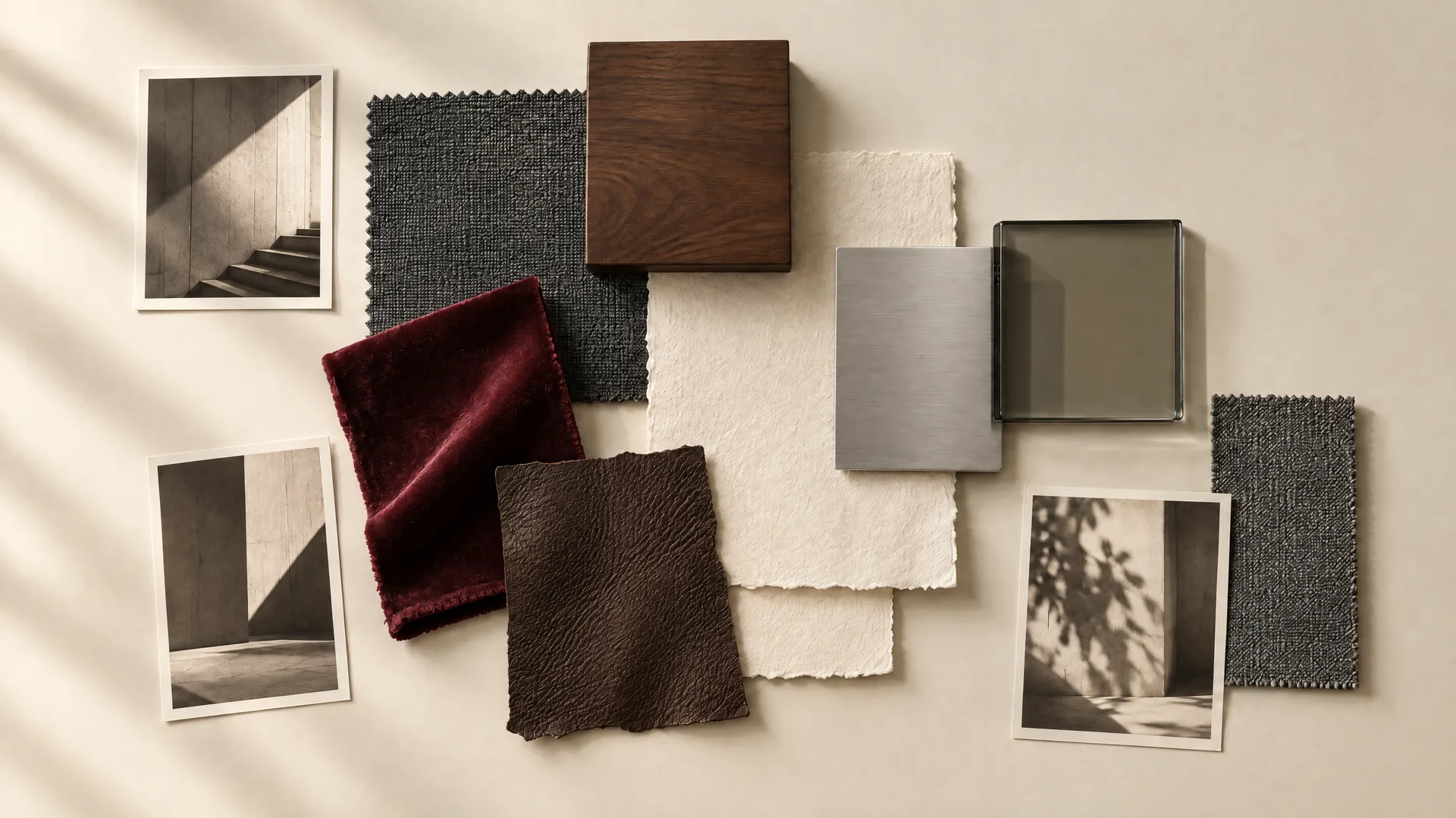
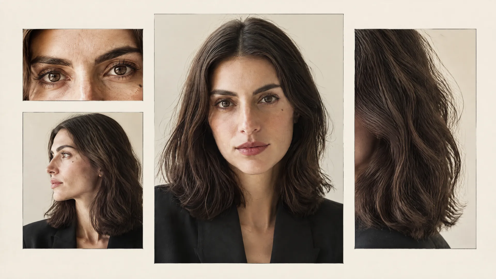
Identity is stable. The brand fingerprint is controlled. Purpose changes. Keep those three in their lanes and variation stops threatening recognition, because the things that make Mara recognizable never sit in the layer you are editing.
The Final Test: Remove the Person
There is one test that matters more than the score, and it is subtractive. Take six of the posts and remove Mara from them entirely. Look only at what is left: the colors, the lighting, the materials, the composition, and the environment. Do the six images still feel like they belong to the same person's brand?

If the answer is yes, you built a personal brand. If the answer is no, you built a consistent face, and those are completely different things. A consistent face is a solved problem the moment the person reference works. A personal brand only exists if the visual system survives the person's absence.
This is why color scoring lowest in the test is the finding that should worry you most: color is a fingerprint property, and a weak fingerprint is exactly what the remove-the-person test exposes.
What a Scalable Visual Brand Actually Requires
So can AI keep a personal brand consistent across many different posts? Yes, but not by making every generation identical. Consistency at scale comes from deciding what stays fixed and what is free to move. The person stays recognizable. The palette stays familiar. Lighting follows one philosophy. Composition repeats certain patterns. Clothes, locations, actions, and content formats are all free to change. That is how you get variation without losing recognition.
The workflow follows from the three layers: build the person, lock the identity, define the brand fingerprint, then stress-test it. Change the clothes, change the location, change the camera, change the format, introduce another brand, and break your own rules on purpose. Then see what survives.
Teams running this at scale reuse the same person and fingerprint across all of their marketing and social content, so nothing has to be rebuilt from one post to the next. Anyone can generate one consistent AI portrait. The harder, more useful question is whether that identity can survive 30 completely different pieces of content, and this test says it can.
Build a consistent AI person on getimg.ai!
Frequently Asked Questions
Yes, provided you separate what stays fixed from what is allowed to change. In getimg.ai's 30-post test, one AI person scored 645 out of 750 across five escalating stress tests, staying recognizable through outfit changes, new locations, different content formats, and a deliberate chaos round.
Consistency does not come from repeating one prompt. It comes from holding the identity and the brand fingerprint steady while letting the wardrobe, setting, camera, and post purpose vary. The failures that did occur clustered in the final round, where every variable changed at once.
A consistent character answers one question: who is in the image? A consistent personal brand answers a second question: what visual logic connects all the images, even the ones where the person is barely visible? You can hold a face perfectly across every post and still produce pictures that look like they came from different creators, because the palette, lighting, and materials changed.
A character is the person; a personal brand is the repeatable visual system around them. The brand is what stays recognizable when the person steps out of the shot.
Text prompts drift because the model generates from scratch each time, so the reliable method is visual conditioning. Save the person as a reusable reference, a Person Element built from several photos at different angles and expressions, then call it by name in every prompt.
The reference carries the face across new scenes automatically, and it holds identity more tightly than a single image because it teaches the model the person from multiple views. Reinforce the defining features, such as eye shape, hair, and any distinctive marks, in the prompt text as well.
Consistency breaks in four ways. Identity drift is when the face, age, or proportions change. Style drift is when the person is correct but the visual world belongs to another creator. Semantic drift is when the face is technically right but the personality shifts, turning the person corporate, influencer, or stock-photo generic. Brand collision is when a product, environment, or campaign identity becomes stronger than the person's own brand.
Naming which one occurred is what makes it fixable: strengthen the reference, reassert the palette, adjust the context, or simplify the environment.
Remove the person from several images and look only at what remains: the colors, lighting, materials, composition, and environment. If those images still feel connected and recognizable as the same brand, you built a personal brand. If they fall apart without the face holding them together, you built a consistent face, which is a different and lesser thing.
This subtractive test is more revealing than any score, because a personal brand is defined precisely by the visual system that survives the person's absence.
Keep the identity fixed: facial structure, eye shape, hair, skin tone, and any signature details. Keep the brand fingerprint controlled: palette, lighting logic, materials, camera style, and composition rules. Let the post purpose change freely: educational content, lifestyle, promotion, UGC, thought leadership, or collaborations, along with the wardrobe, location, and camera.
This three-layer split, stable identity, controlled fingerprint, and changing purpose, is what produces variation without losing recognition, and it is the core finding of the 30-post test.
Related Articles