How to Design a Product Label With AI: 7 Label Ideas With Prompts

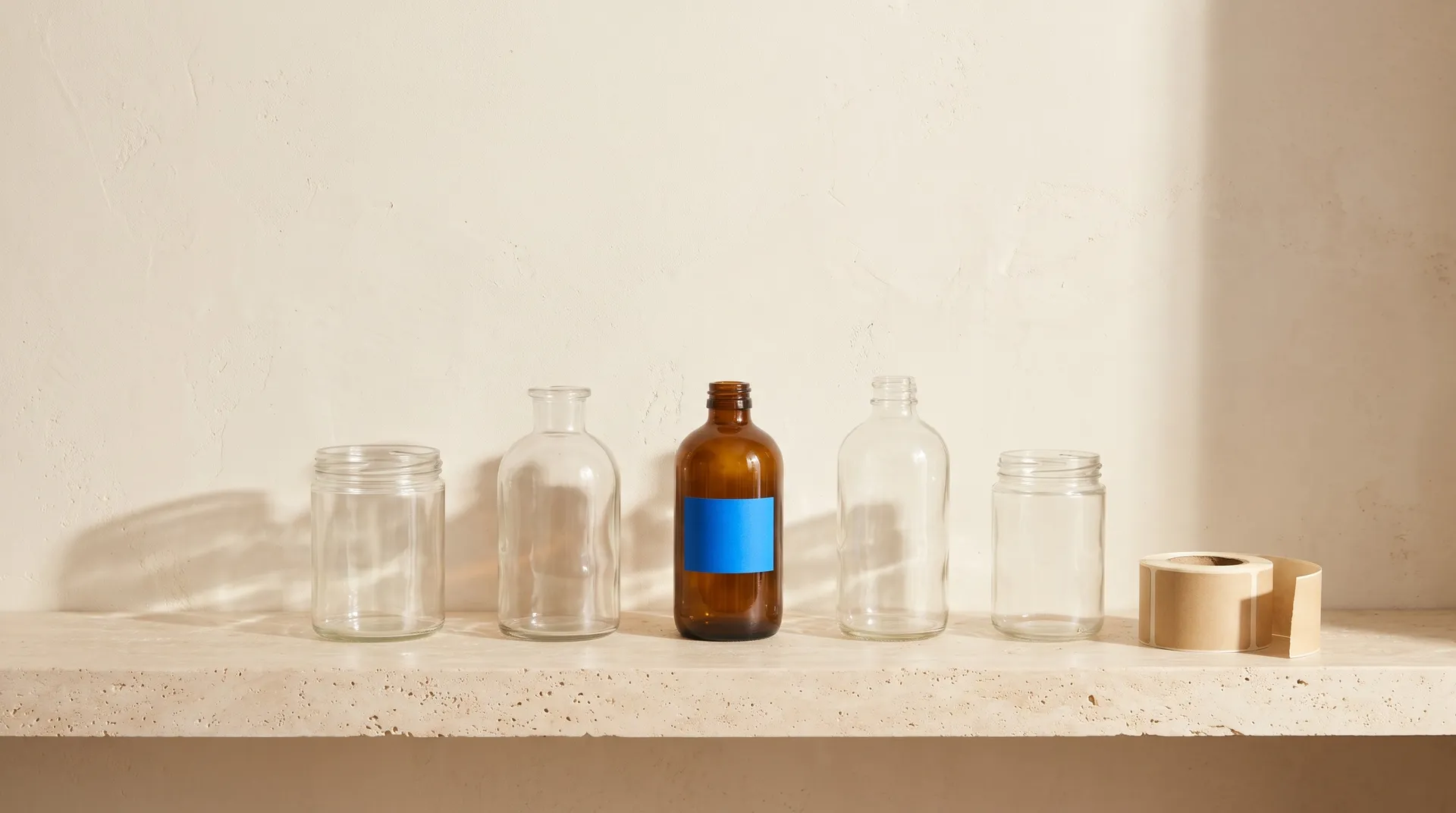
To design a product label, decide what goes on the front, pick a shape that fits the container, choose one print style and two or three colors, and set the product name large enough to read from a shelf. With AI, you write those decisions into one prompt, with every word in quotes, and get finished label artwork in a minute. Below is the process step by step, followed by seven label types, from wine to pickles, each shown as a flat design and on the product.
What goes on a product label
A label has two jobs. The front sells the product, and the back or side carries the information buyers and regulators expect. AI is good at the first job. The second needs a layout tool and a check of the rules where you sell.
Element | Where it goes | Notes |
Brand name | Front, top or center | The largest or second largest text |
Product name or flavor | Front | "Smoked Habanero", "Wet Moss & Fig", "Hazy IPA" |
Net weight or volume | Front, usually at the bottom | Write it exactly, for example "12 oz (340 g)" |
Alcohol content | Front, for beer, wine and spirits | For example "5.8% ABV" or "14.2% alc./vol." |
Ingredients, allergens, nutrition facts | Back or side | Set in a layout tool and check local labeling rules |
Barcode, batch code, warnings | Back or side | Added by your printer or in your layout file |
The front label is where design matters most, and it's what the examples below focus on.
How to design a product label with AI
1. Measure the container and pick a shape
Measure the area the label will cover before you design anything. A wine bottle takes a tall rectangle, a can takes a wide wrap, a jar lid takes a circle and a coffee bag usually takes a square. Generate at the closest aspect ratio so the design doesn't need to be cropped later. Ask your printer how much bleed they need around the edges.
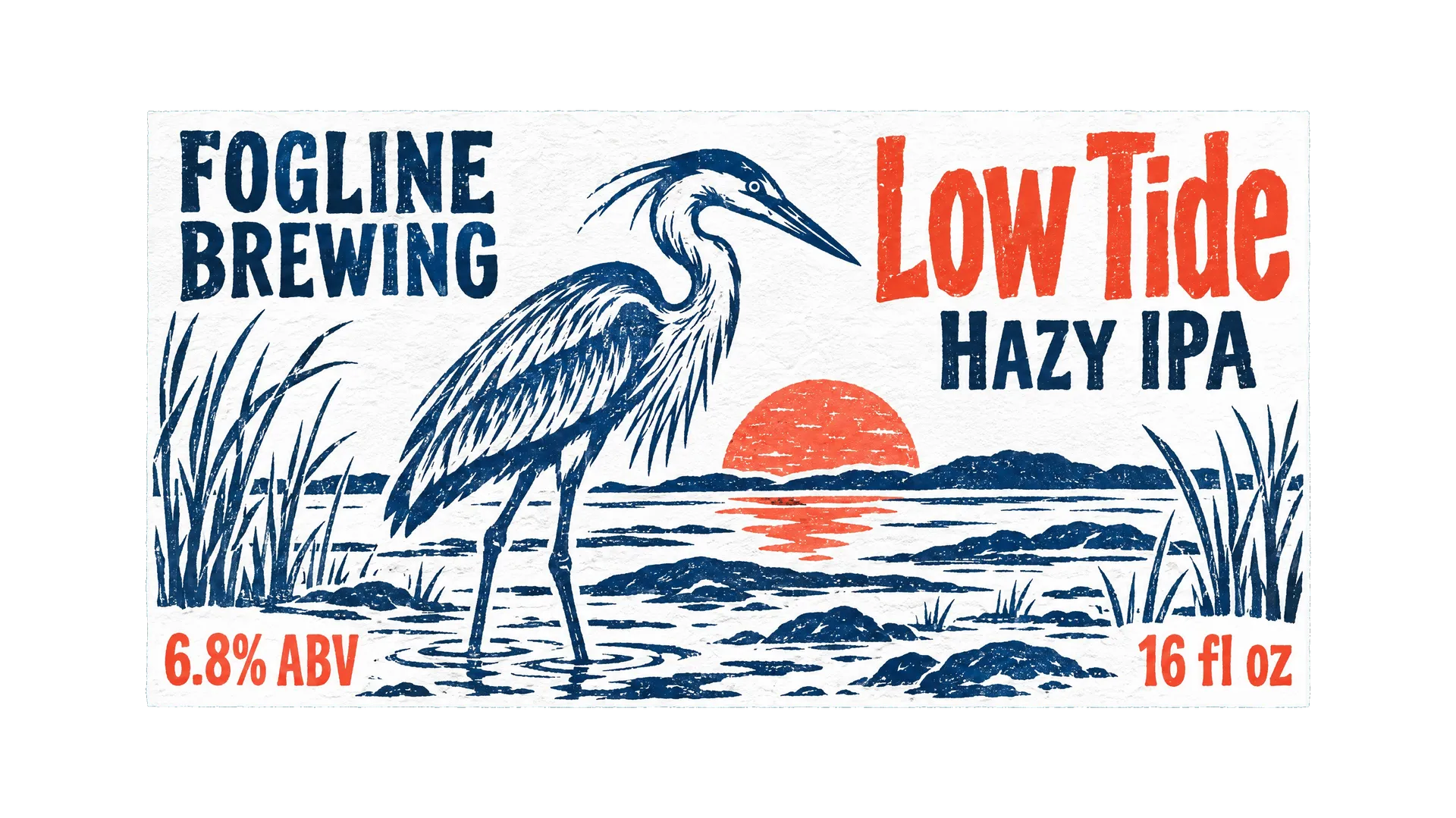
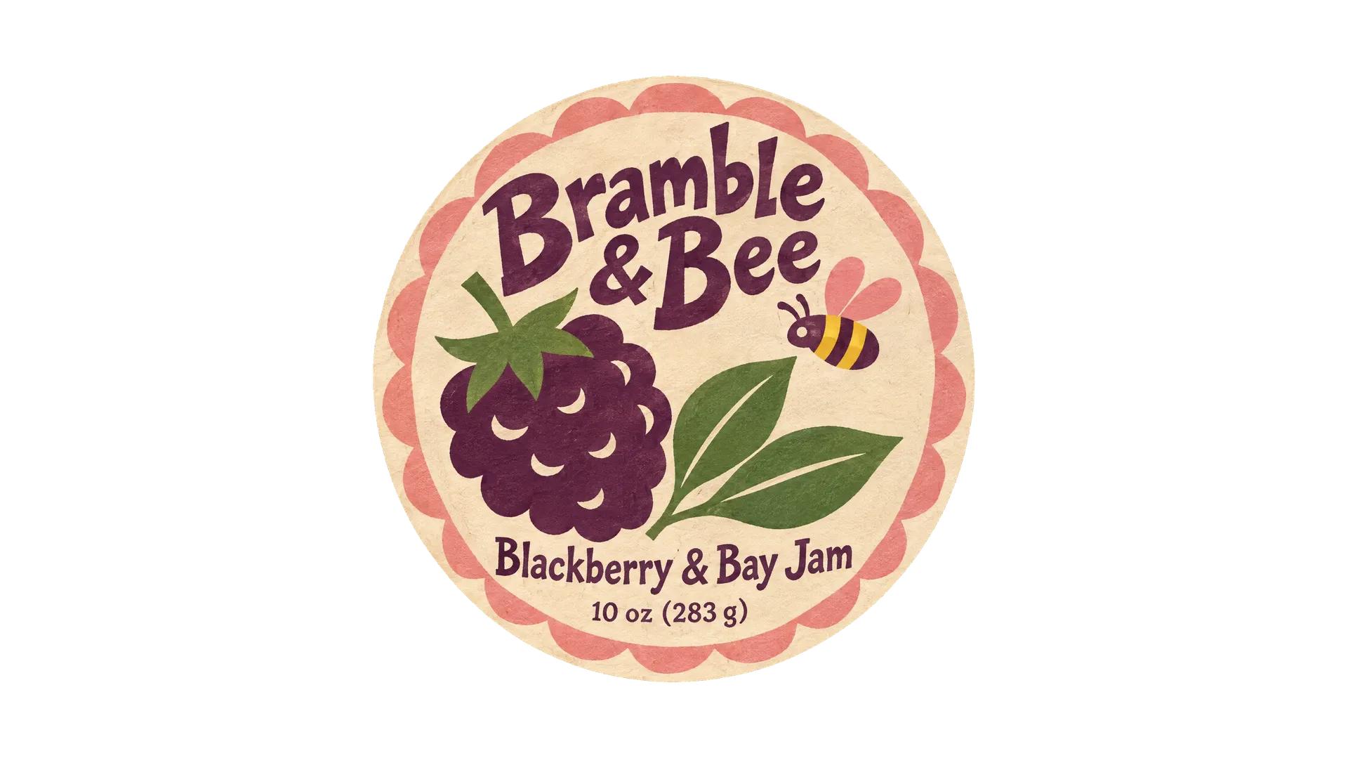
These three labels show the usual shapes: a tall wine label, a wide wrap for a can and a round label for a jar lid.
2. Write the label copy
List every word that will appear on the front, exactly as it should be printed: brand, product name, variety, size and any short descriptor such as "Cold pressed" or "Light roast". Keep it short. A front label with four or five lines reads better than one with ten. Then write three words for the feel you want, such as "coastal, botanical, old-fashioned".
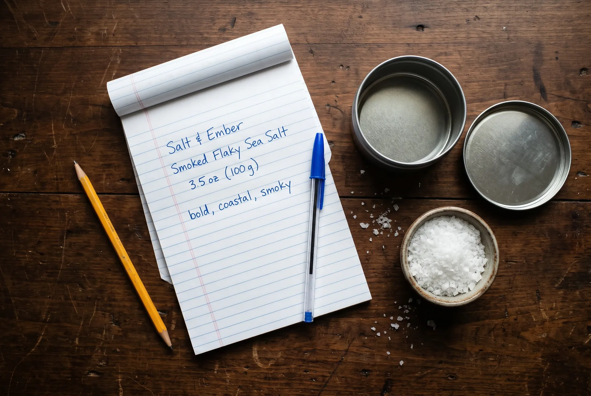
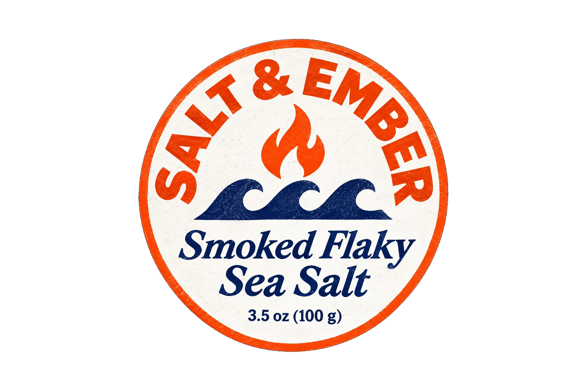
For a tin of smoked sea salt, the whole front label fits in four lines, plus three words for the feel.
3. Choose a print style
A named print tradition gives the model a whole set of decisions at once: line weight, texture, type and color. Some that suit labels:
- Engraving or etching for wine, spirits and anything that should feel established
- Woodcut or linocut for beer, coffee, honey and craft products
- Botanical illustration for gin, tea, skincare and herbal products
- Swiss grid type for modern, minimal brands
- Art Deco, 1970s supergraphics or sign-painter lettering for a retro look
- Cut-paper collage or gouache for natural wine, bakeries and playful brands
Keep the palette to two or three inks. Real labels are often printed with few colors, and a short palette looks more like a printed object than a digital illustration.
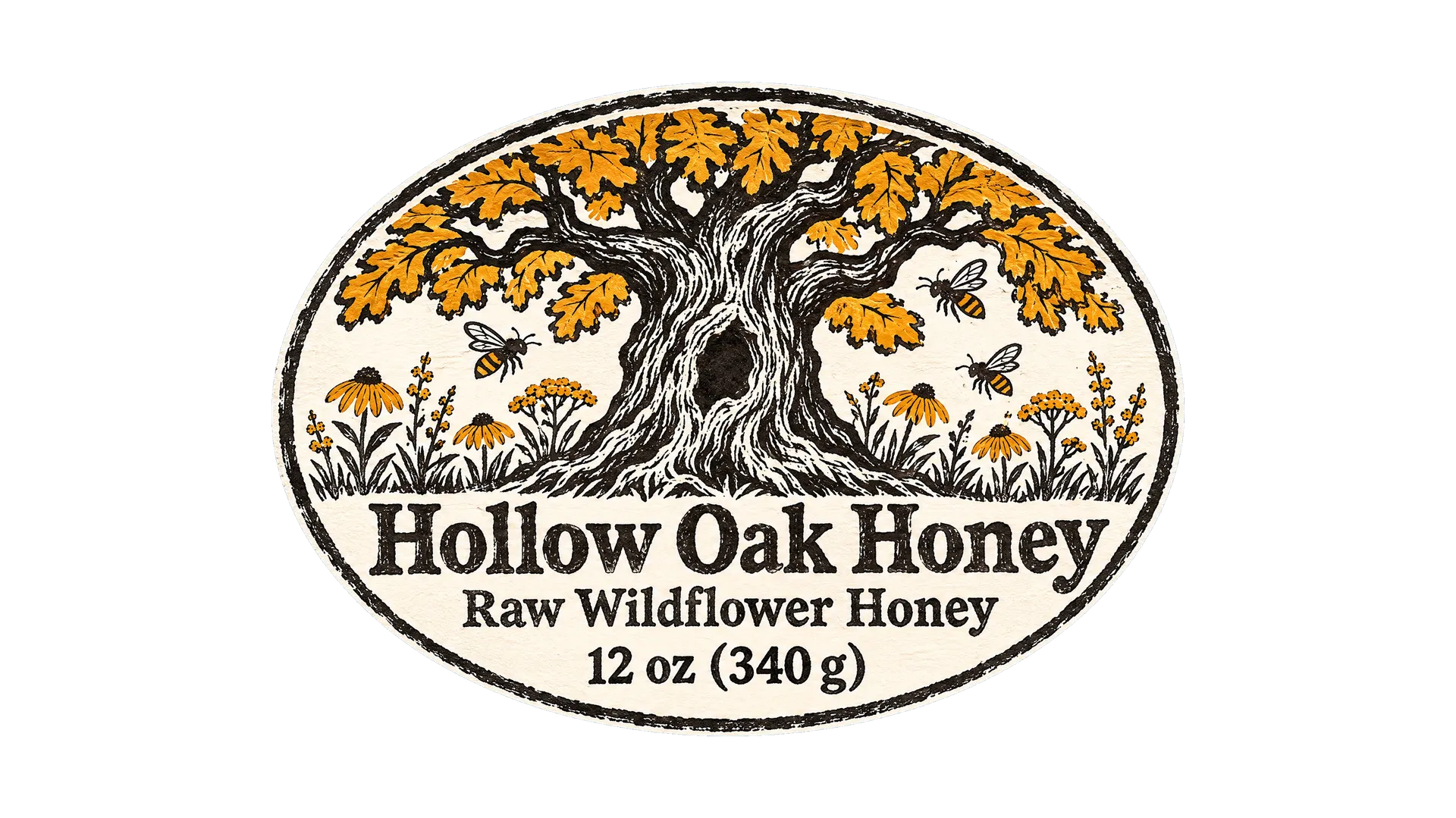
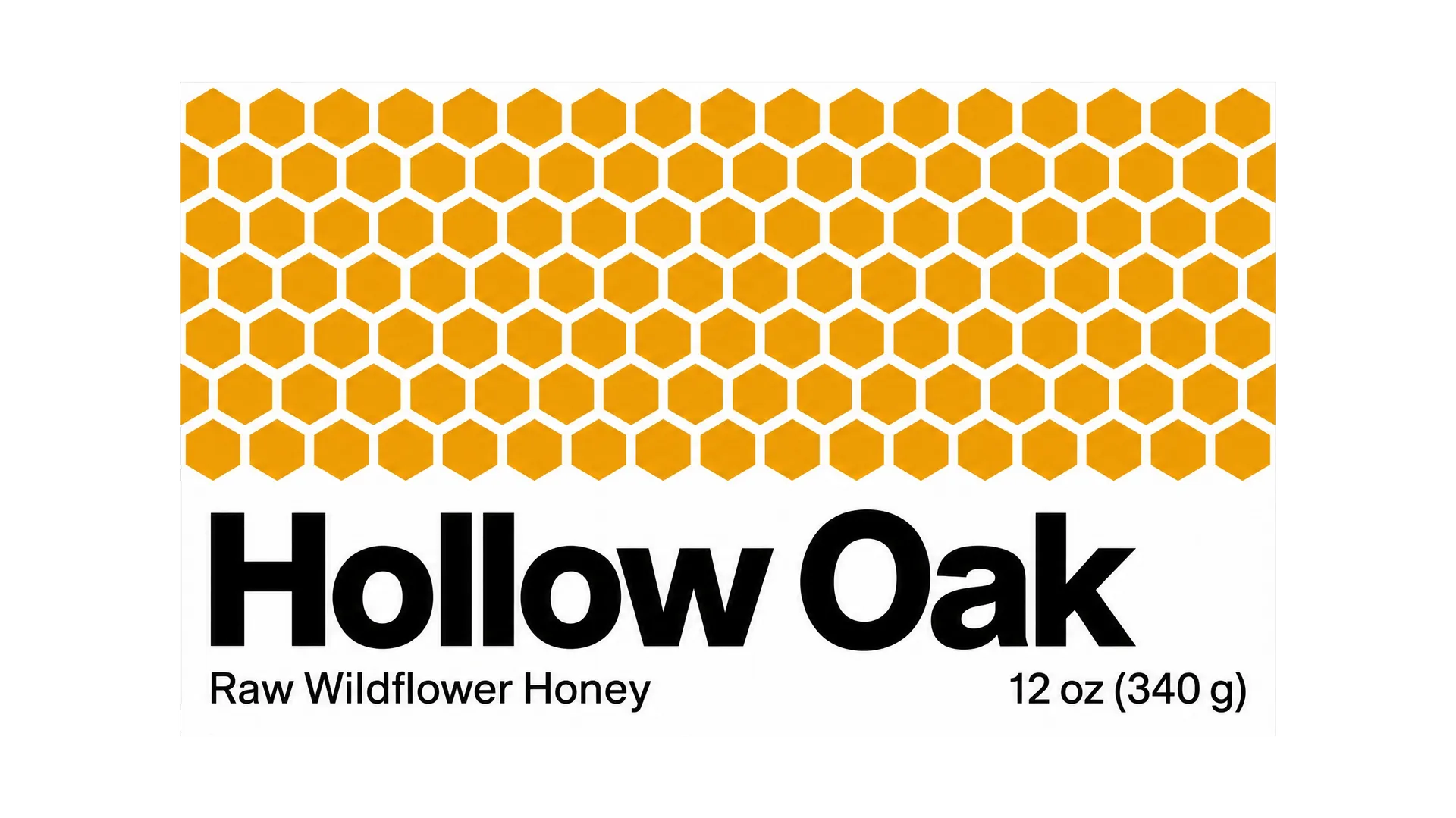
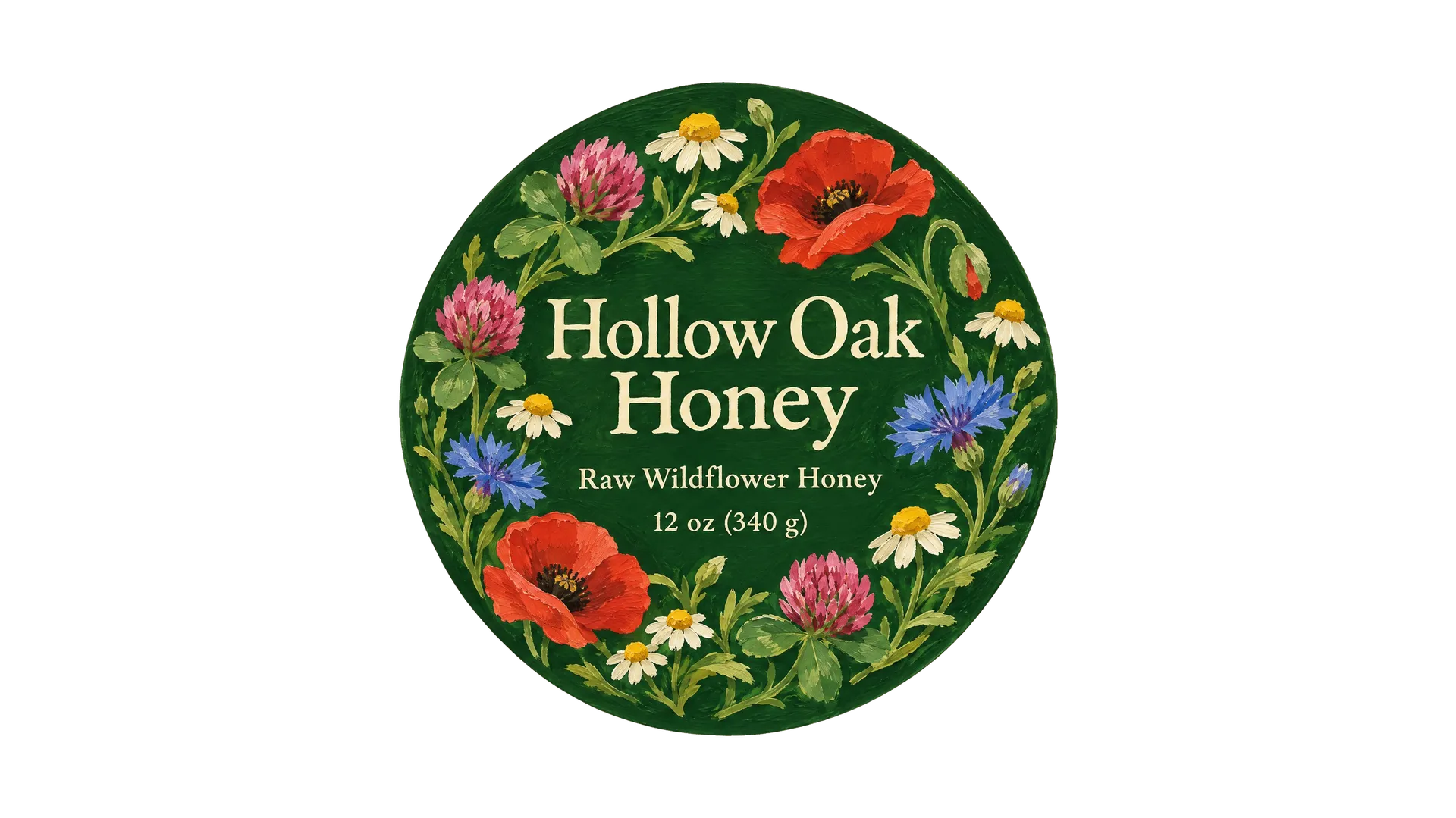
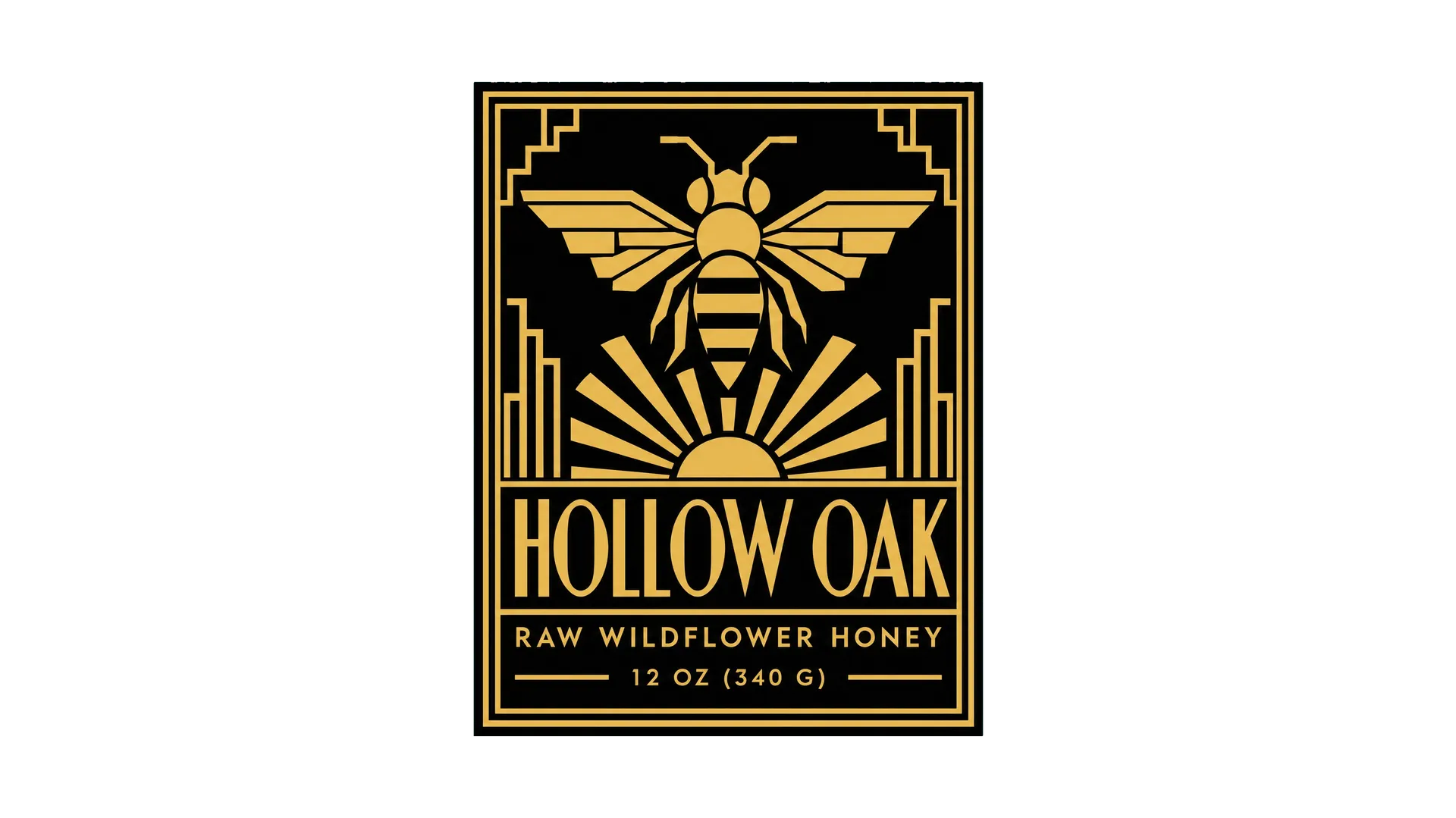
Here is the same honey label in four of those styles, from four prompts with the same words: a woodcut, Swiss grid type, a gouache wreath and black and gold Art Deco.
4. Write the prompt
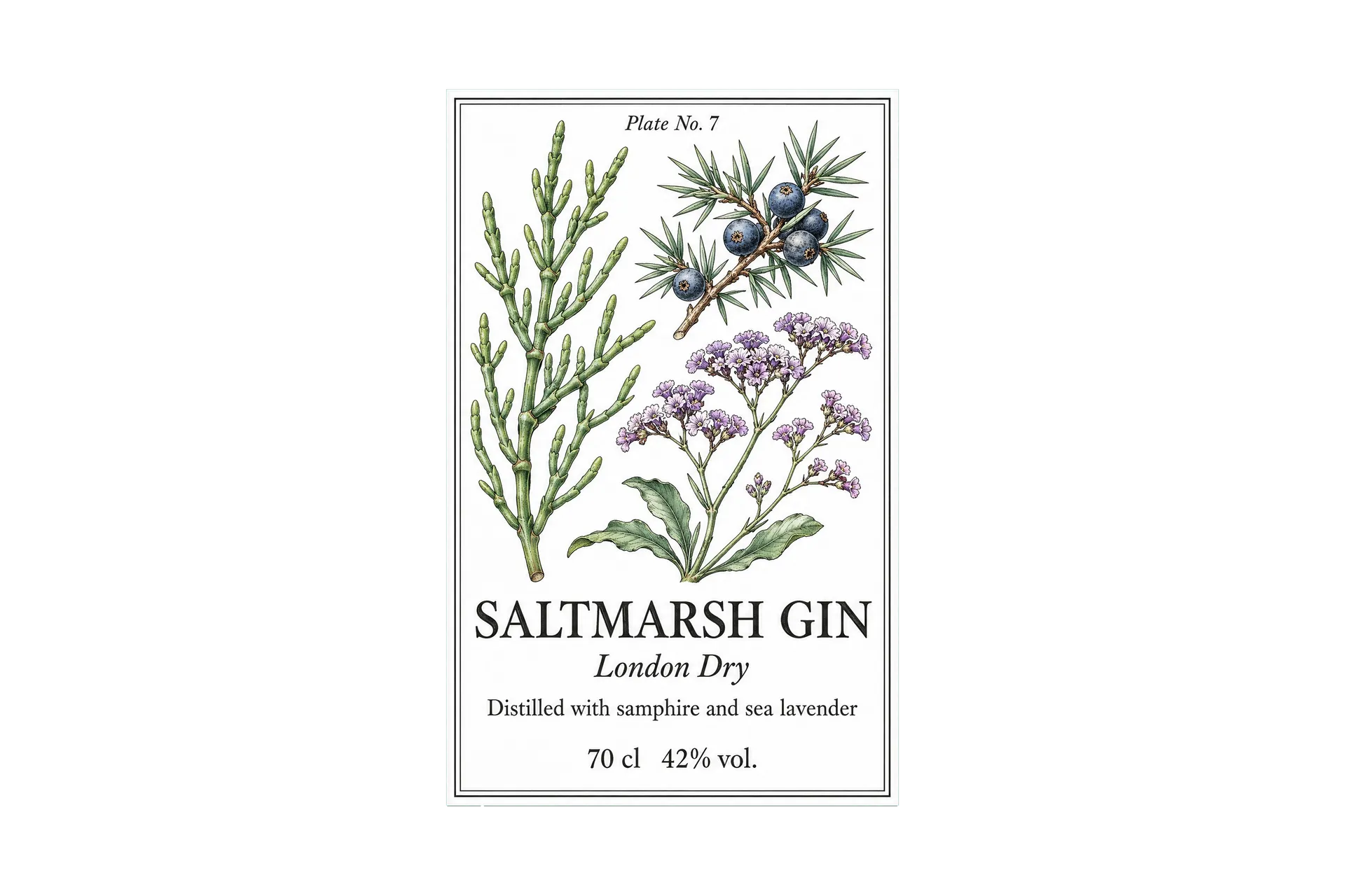
Put the decisions together in one prompt: the shape, the background behind the label, the style, the colors, the illustration and every line of text in quotes. This is the prompt behind the gin label further down:
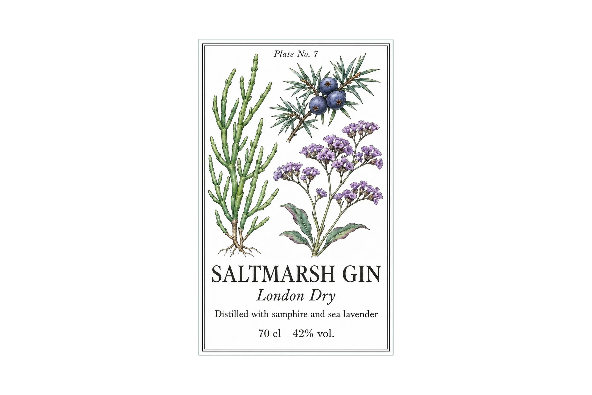
Flat front-facing artwork of a tall rectangular gin bottle label, centered on a solid deep sea green background with wide margins. A Victorian scientific botanical plate on white paper: finely drawn samphire, juniper berries and sea lavender in black ink with sea green and violet watercolor washes, a thin double rule frame, "Plate No. 7" small at the top. Text in a refined old-style serif: "SALTMARSH GIN", "London Dry", "Distilled with samphire and sea lavender", "70 cl 42% vol." at the bottom. No gradients, no swashes, no barcodes, no other text.
End the prompt with what you don't want ("no gradients, no swashes, no barcodes, no other text"). It stops the model from adding decorative flourishes and invented small print.
5. Generate several versions and check the type
Run the prompt a few times and compare the results at the size the label will be printed. Pick the one where the name reads first and the details stay legible. Then read every word and number. Current models set short text well, but a letter can still slip, especially in the smallest lines. Regenerate if anything is off.
Two runs of the gin prompt above gave two different arrangements of the same botanicals. The second one won because the name sits lower and the juniper reads more clearly at a small size.
6. See it on the product
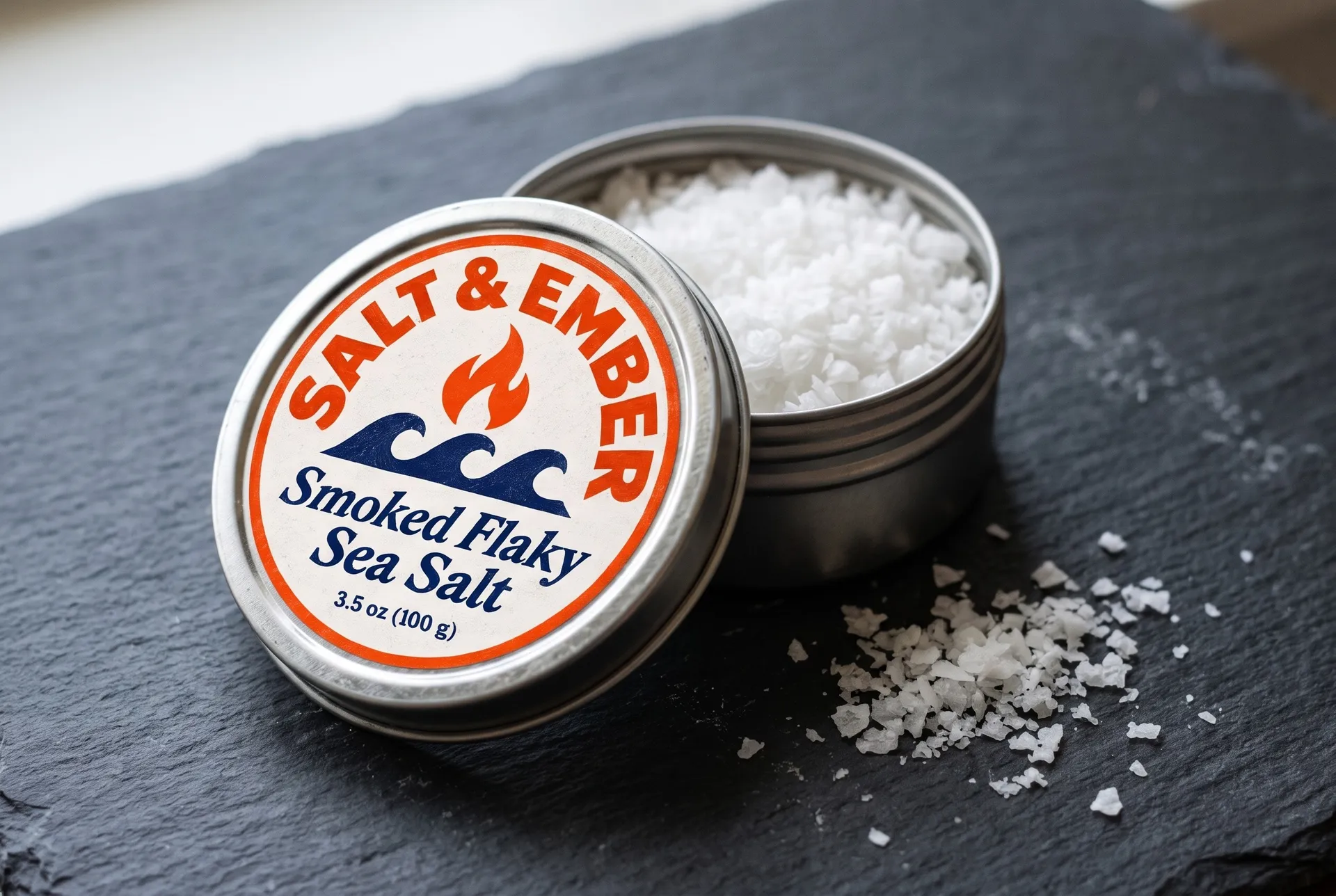
Add the finished label as a reference image and describe the product, the surface and the light, for example "a tall clear glass gin bottle with a wooden stopper on a stone windowsill, soft overcast daylight". A product photo shows whether the label still works once it curves around glass or sits on a crinkled bag, before you order a print run. The packaging mockup generator covers boxes, pouches and other formats.
The sea salt label went in as a reference with one sentence describing a steel tin on a slate board.
7 product label design ideas
Each label below was made on getimg.ai from the prompt shown under it, then added as a reference image to put it on the product. Copy a prompt, swap in your own product name, words and colors, and generate your version. The tip under each prompt points to the part that does the most work.
1. Wine label
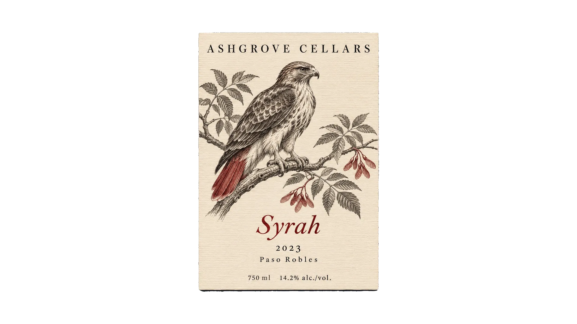
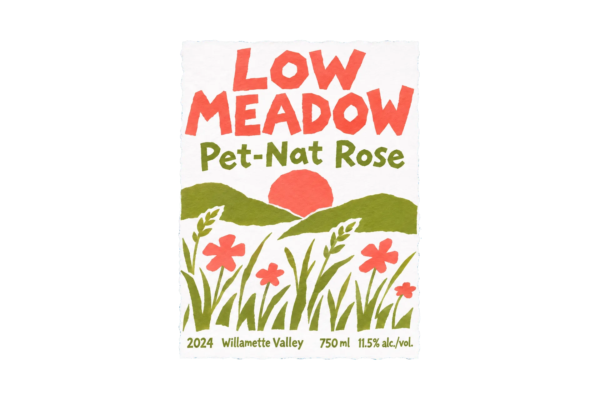
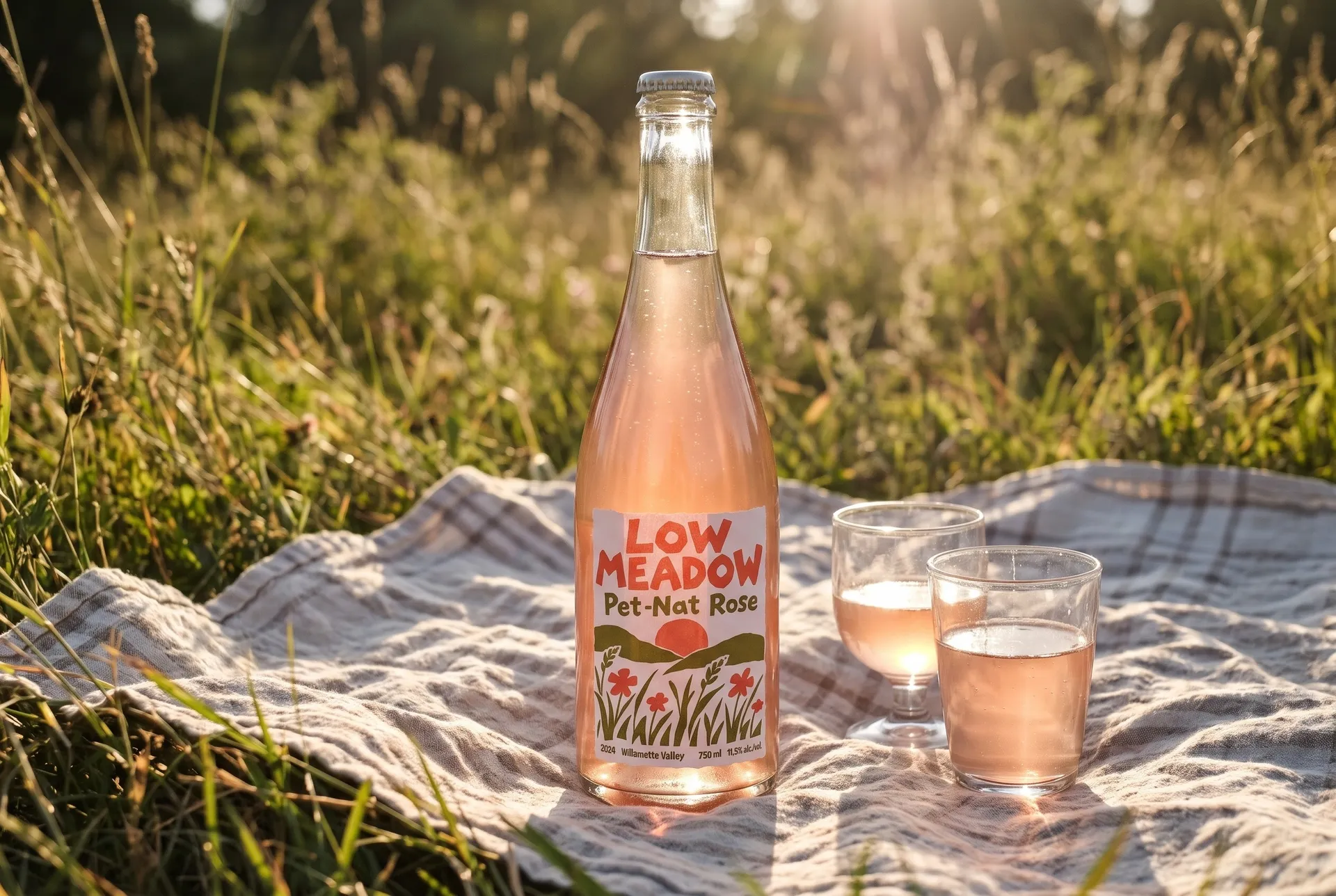
Wine labels often lean on engraving and classic serifs, so a loose, colorful design stands out on the shelf. This pet-nat rosé label uses cut paper shapes of a meadow and a hand-cut sans serif, which suits a natural, unfussy wine. The vintage, region, volume and alcohol content sit in one line along the bottom.
The prompt:
Flat front-facing artwork of a tall rectangular wine label, centered on a solid pale sky blue background with wide margins. A bold cut-paper collage label on white: torn and cut paper shapes of meadow grasses, a coral sun and two olive green hills, playful and loose. Text in a hand-cut sans serif: "LOW MEADOW" in coral capitals, "Pet-Nat Rose" in olive, "2024 Willamette Valley" and "750 ml 11.5% alc./vol." small at the bottom. Four flat colors, visible paper edges. No gradients, no swashes, no barcodes, no other text.
Describe the material of the illustration ("torn and cut paper shapes, visible paper edges"). It gives flat colors a handmade texture that reads as printed.
2. Beer label
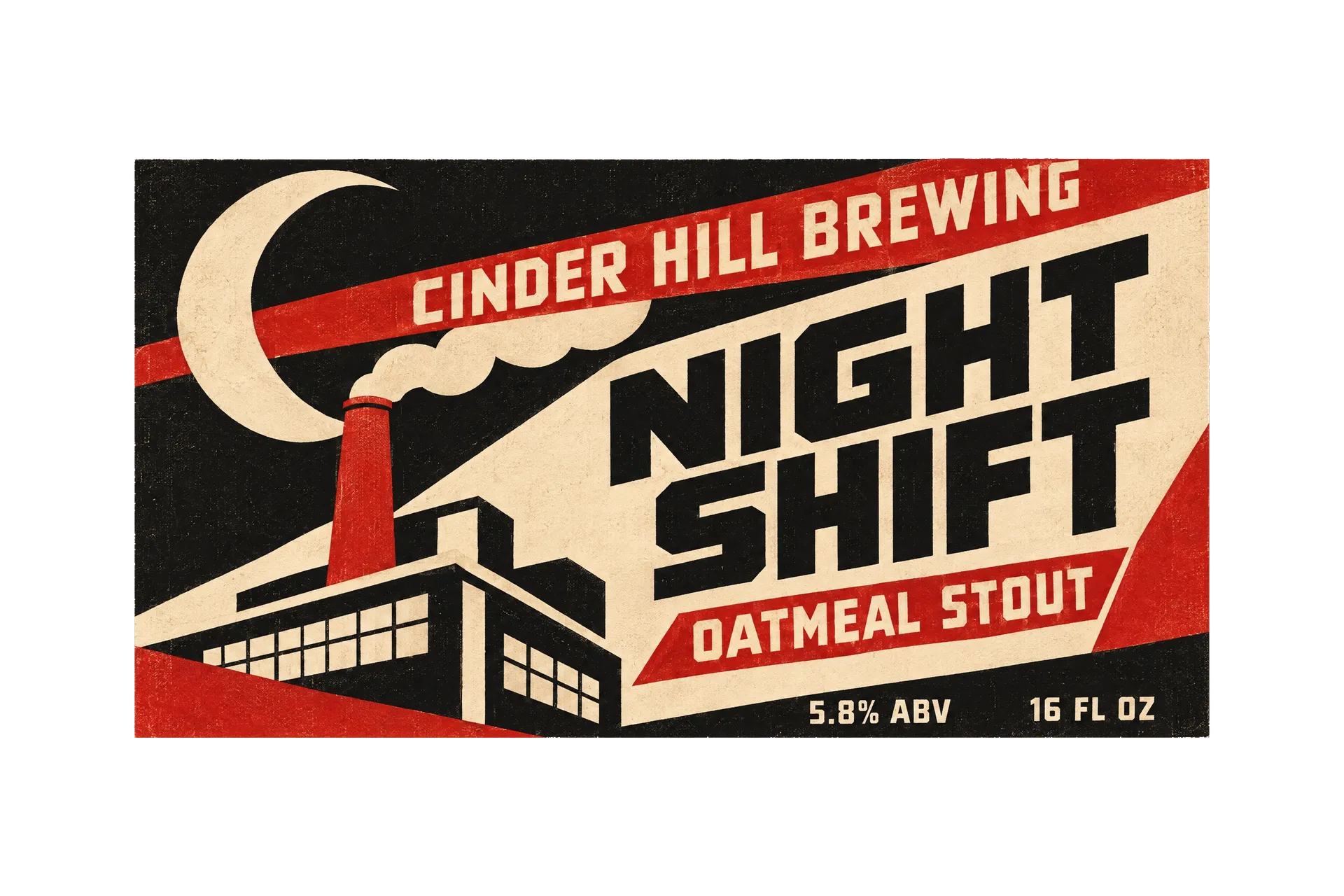
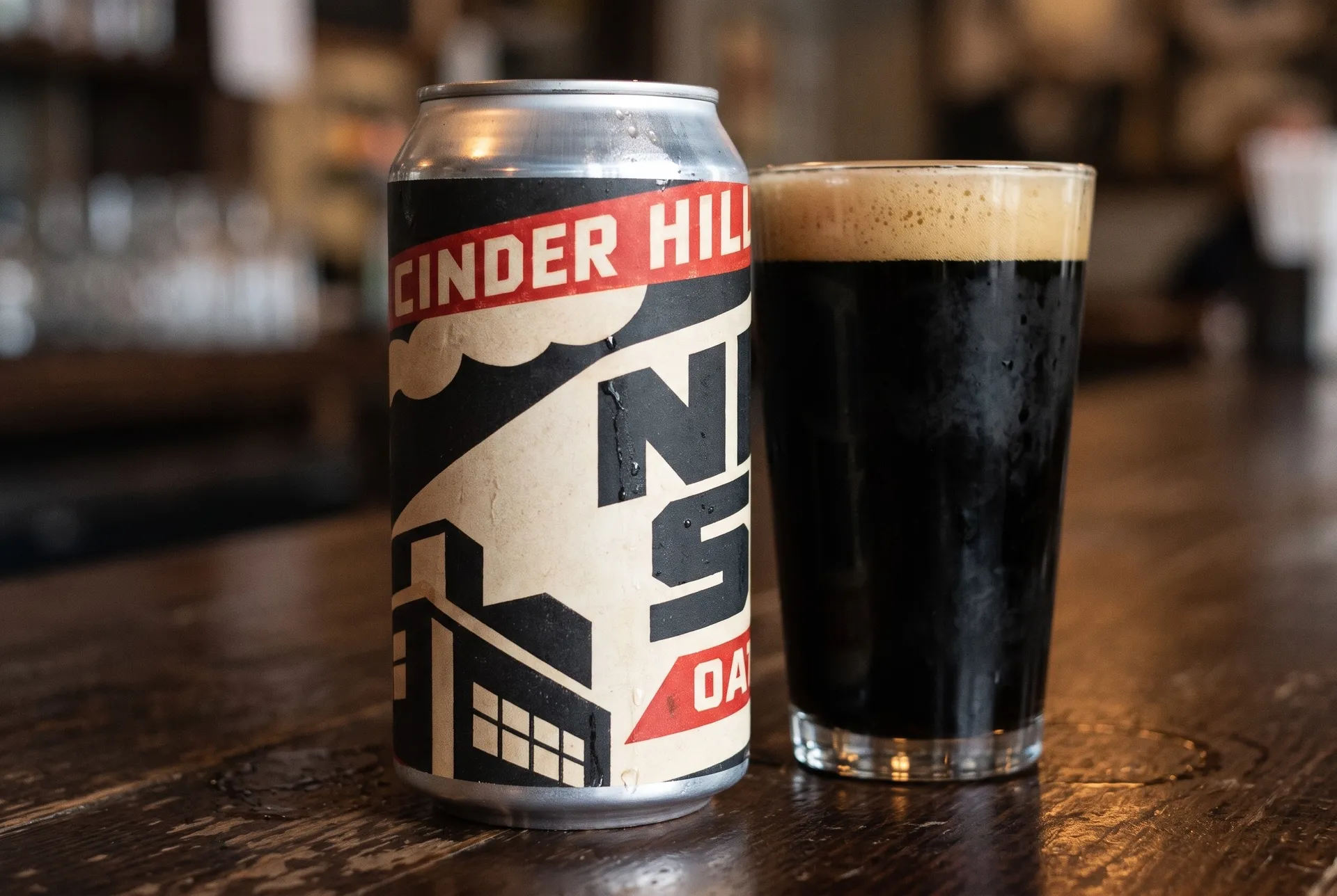
A can label is wide and wraps around, so design it as one long rectangle and keep the name near the middle where it faces forward. This stout label borrows from 1920s Constructivist posters: diagonal bands, a factory chimney under the moon and heavy geometric type, in red, black and cream.
The prompt:
Flat front-facing artwork of a wide rectangular beer can label laid out flat, centered on a solid warm grey background with wide margins. A 1920s Constructivist poster style in red, black and cream: bold diagonal shapes, a factory chimney under a large crescent moon, heavy geometric type. Text: "CINDER HILL BREWING" along a red diagonal band, "NIGHT SHIFT" large in black, "Oatmeal Stout", "5.8% ABV" and "16 fl oz" in small capitals. Flat inks, slight print texture. No gradients, no swashes, no barcodes, no other text.
Lay a beer can label out as "one wide flat rectangle" and keep the brand and beer name in the center third. The edges wrap around the can and are only seen from the side.
3. Bottle label
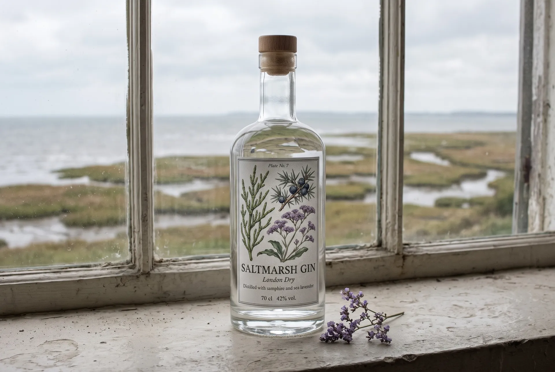
Spirits, oils and syrups on clear glass let the label carry the whole look. This gin label is styled as a plate from an old botany book, with the three botanicals drawn in ink and washed with color. The plate number at the top is a small detail that makes the reference clear.
The full prompt for this label is in step 4 above.
Name the botanicals or ingredients you want drawn ("samphire, juniper berries and sea lavender"). Specific plants give a far more convincing illustration than "herbs".
4. Food label
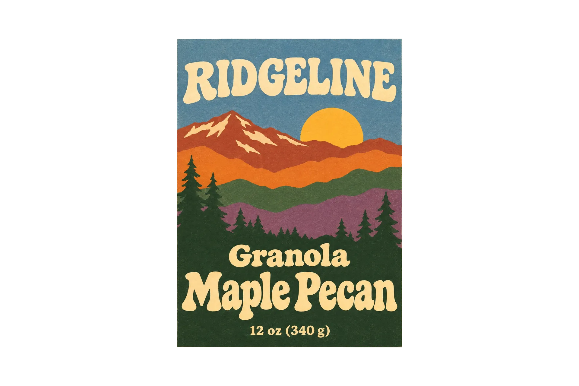
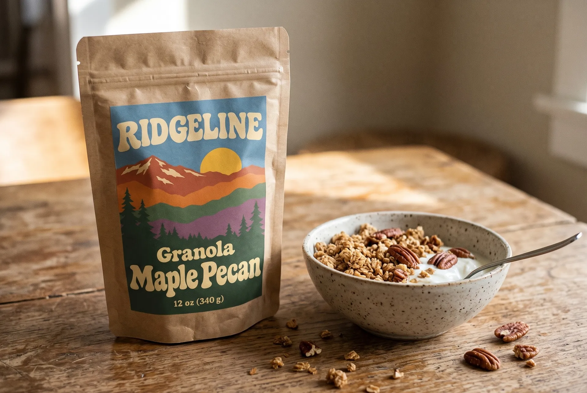
Food labels need to show the product name and flavor clearly at a glance, because buyers scan a shelf full of similar packs. This granola label uses layered mountain ridges in the style of a 1970s national park poster, with the flavor set larger than anything else.
The prompt:
Flat front-facing artwork of a tall rectangular granola bag label, centered on a solid pale butter yellow background with wide margins. A 1970s national park poster style: layered flat mountain ridges in rust, burnt orange, pine green and dusk purple under a pale sky with a low sun, simple screen print look. Text in a rounded bold 1970s serif: "RIDGELINE" in cream on the sky, "Granola", "Maple Pecan" large, "12 oz (340 g)" small at the bottom. Flat colors, slight paper grain. No gradients, no swashes, no barcodes, no other text.
Make the flavor the biggest text on food labels ("Maple Pecan" large). Buyers usually look for what's inside before the brand.
5. Candle label
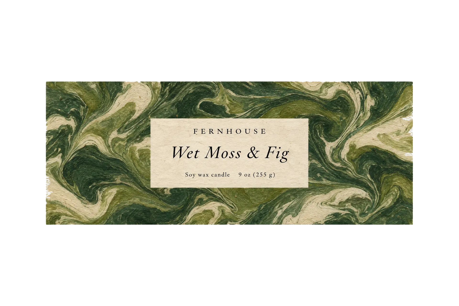
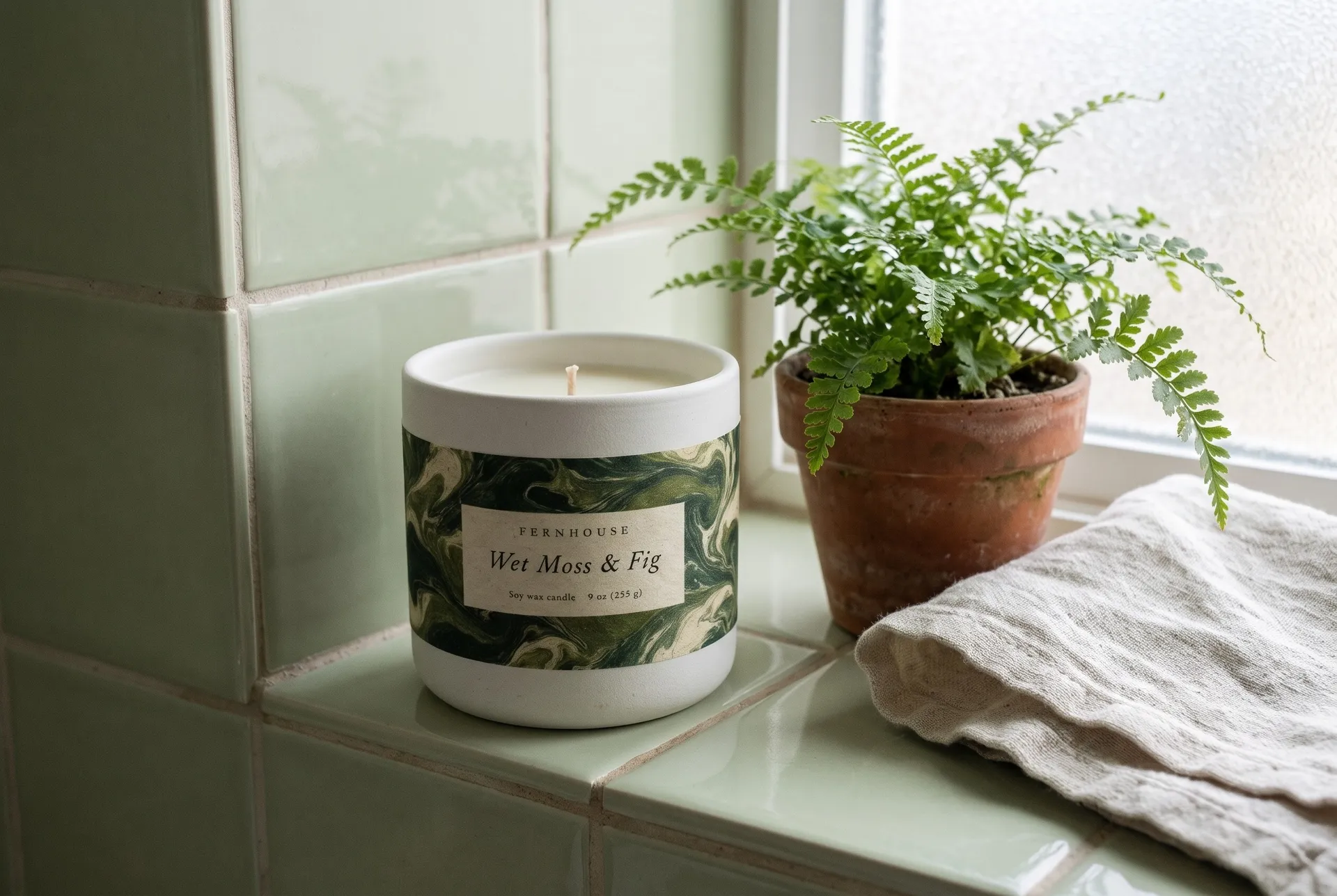
Candle labels sell a scent, which is hard to show, so the texture and color do the work. This one uses hand-marbled paper in forest greens with a small cream panel for the text, which suggests moss and damp woods without drawing either.
The prompt:
Flat front-facing artwork of a wide rectangular candle label, centered on a solid pale stone grey background with wide margins. The label is hand-marbled paper in deep forest green, moss and cream swirls, with a small clean cream rectangle panel in the middle holding the text in a delicate black serif: "FERNHOUSE" in small spaced capitals, "Wet Moss & Fig" larger in italic, "Soy wax candle 9 oz (255 g)" in tiny type. Real marbling texture, no other decoration. No gradients, no shine, no swashes, no barcodes, no other text.
Let a pattern carry the mood and put the text on a plain panel ("a small clean cream rectangle panel in the middle holding the text"). Busy backgrounds and small type don't mix.
6. Coffee label
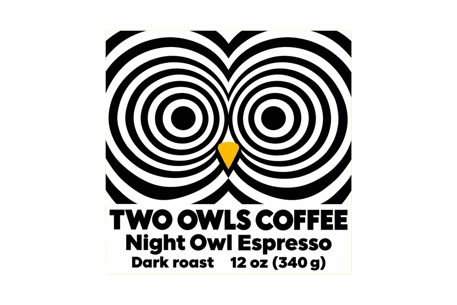
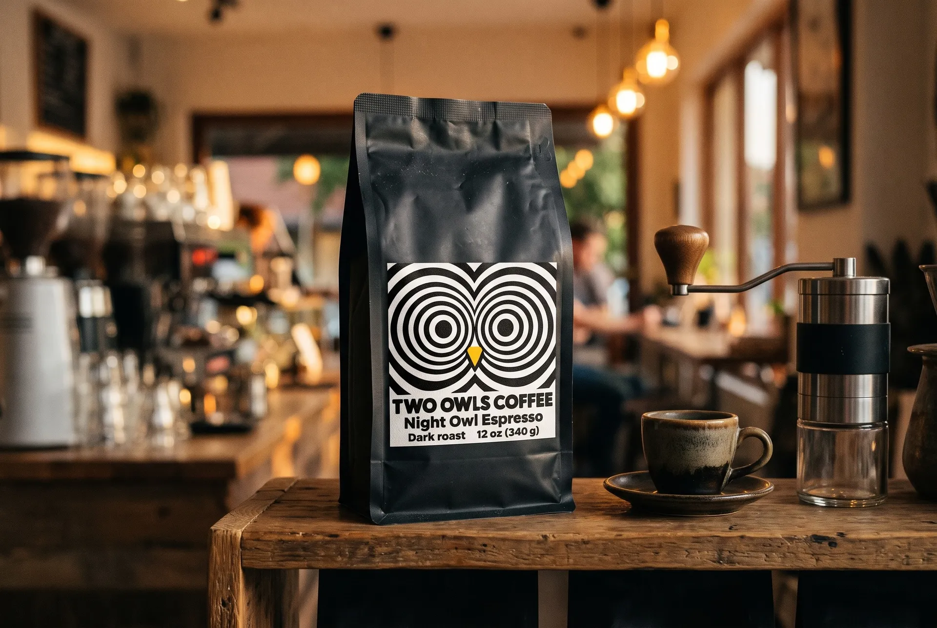
Coffee is often sold in plain bags with a sticker label, so one bold square can do the branding. This espresso label turns the name into a picture: concentric op art rings form two owl eyes, in black and white with one mustard accent for the beak.
The prompt:
Flat front-facing artwork of a square coffee bag label, centered on a solid mustard yellow background with wide margins. A 1960s Op Art label in black and white: concentric black and white rings forming two large owl eyes with a small mustard beak, bold optical pattern. Text in a heavy geometric sans in black on a white band: "TWO OWLS COFFEE", "Night Owl Espresso", "Dark roast 12 oz (340 g)". Three colors only. No gradients, no swashes, no barcodes, no other text.
Look for a visual idea in the product or brand name ("concentric rings forming two owl eyes"). A label that shows the name reads faster than one that only spells it.
7. Jar label
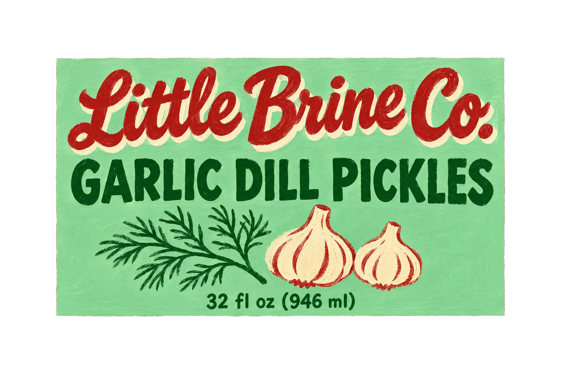
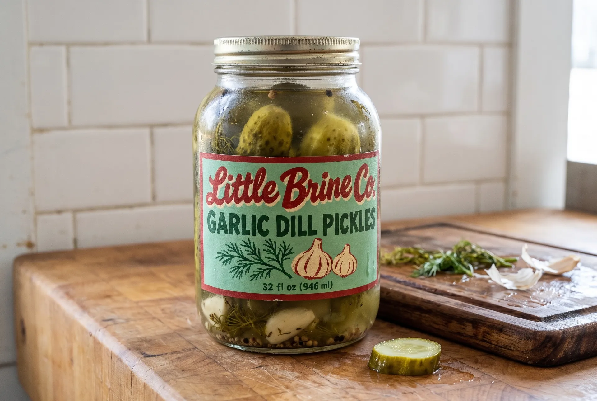
Jars are seen from the front on a shelf and from above in a fridge, and the contents show through the glass. This pickle label uses hand-painted sign lettering in red and dark green on mint, with simple drawings of dill and garlic that match what's floating inside the jar.
The prompt:
Flat front-facing artwork of a wide rectangular pickle jar label, centered on a solid brick red background with wide margins. A sign-painter style label on mint green: hand-lettered "Little Brine Co." in a bold red script with a cream drop shade, "GARLIC DILL PICKLES" in dark green block capitals, simple flat illustrations of a dill sprig and two garlic bulbs, "32 fl oz (946 ml)" small at the bottom. Three colors plus cream, flat brush lettering with slight paint texture. No gradients, no shine, no swashes, no decorative underlines, no barcodes, no other text.
Pick label colors that work with the product behind the glass. Mint and red sit well against green pickles, while a green label would disappear.
Labels for a product line
Once one label works, the rest of the range can follow it. Add the first label as a reference image and describe the next flavor, scent or size with its new name and colors. Ask for "the exact same layout, typefaces and positions" and say which elements change. Compare each new label with the first one before you print, since small details like spacing can shift. The AI product label design page shows a four-flavor kombucha range made this way, plus more prompts for olive oil, skincare and jam.
Bottom Line
A good product label starts with the facts: the size of the container and the exact words on the front. Choose one print style, keep the palette to two or three inks, write every word in quotes and make the most important line the largest. Generate a few versions, read every letter, then see the label on the product before you print. To start with your own product, design your label on getimg.ai using one of the prompts above.
Frequently Asked Questions
Measure the container, list every word for the front, pick a print style and two or three colors, then design the label at the right proportions. With AI, you put all of that into one prompt with the words in quotes and pick the best of several versions.
It depends on the container. Measure the area the label will cover, leaving space at the top and bottom of curved surfaces, and add the bleed your printer asks for. Generate the artwork at the closest aspect ratio: tall for bottles, wide for cans and candle jars, square or round for lids.
Use AI for the front label artwork. Required information such as ingredients, allergens, nutrition facts and barcodes should be set in a layout tool, where you can edit it precisely, and checked against the labeling rules where you sell.
Yes. You get a high-resolution image that you can upscale and place in your printer's label template. For special finishes such as foil or embossing, or very large runs, a designer can trace the final design into a vector file.
Add your first label as a reference image and ask for the same layout and typefaces with a new flavor name, illustration and colors. Check each new version against the first one for spacing and type before you print.
Related Articles