AI Pop Art Generator: Create Art from Text or Photos
Create pop art from a prompt or reference image
getimg.ai's AI Pop Art Generator creates pop-art-style images from text prompts or visual references: portraits, product artwork, posters and comic-inspired graphics built on flat colour, strong contrast, repetition, halftone patterns and print-inspired texture. Describe an original composition or upload a photo, set the palette, linework and halftone treatment, generate several directions, then refine the strongest one. The output is a generated raster image rather than a physical screenprint, an editable vector file or an installable font.
How to create pop art with AI
From prompt or photo to a finished piece.
1. Open Create image
Sign in to getimg.ai and open Create image in the prompt box. You can go straight there here.
2. Describe the artwork or add a photo
Write what the artwork shows, or attach a photo of a person, pet or product as a reference. Then name the palette, the outline style, the halftone or screenprint texture and any repetition or grid layout.
3. Generate, refine, resize
Generate several visual directions at once, compare palettes and halftone density, then refine the strongest result from the prompt box. Resize or upscale it for the format you need.
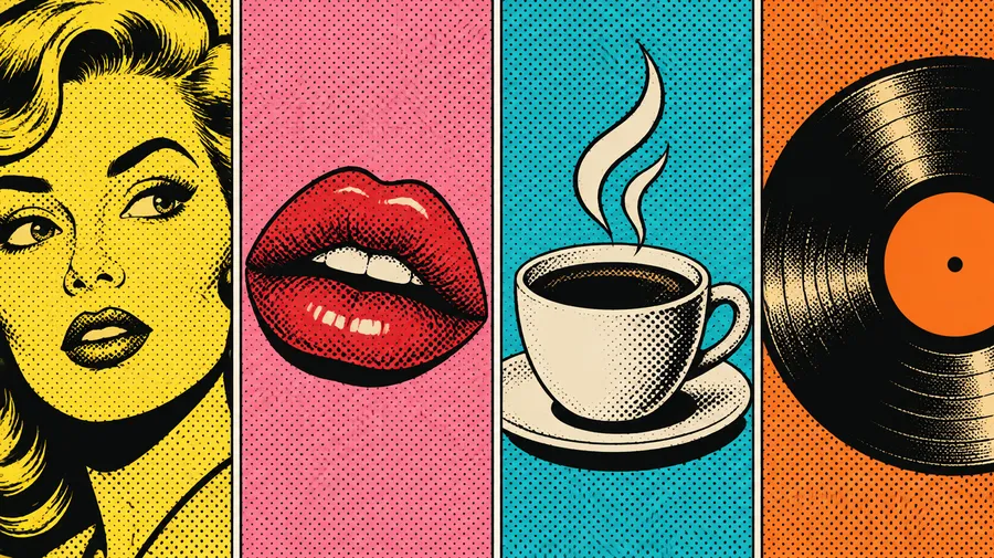
What defines pop art?
Pop art is a visual-art movement associated with imagery from advertising, comics, consumer products, celebrities and mass media. Its graphic language leans on strong colour contrast, repetition, simplified shapes and techniques borrowed from commercial printing. Describing those characteristics in a prompt gives you far more control than naming a single artist.
The movement was international and drew on television, packaging, political imagery and popular culture, not just celebrity portraits. Treat artist names as historical context and prompt the visual language instead.
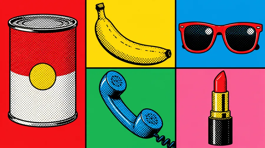
Explore multiple pop art directions before choosing one
Generate several interpretations of the same subject and compare them side by side: primary red-yellow-blue against neon magenta and cyan, dense Ben-Day dots against flat colour blocking, a single portrait against a four-panel grid. Paid plans generate 2 to 10 images at a time, so a first pass gives you real options instead of one guess. Pick the direction that works, then refine it with a follow-up prompt.
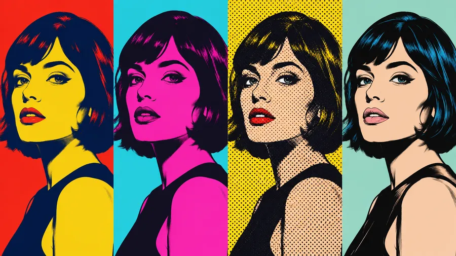
Pop art, silkscreen portrait of a glamorous 1960s male movie star, repeated four times in a grid, vibrant contrasting colors, high contrast, Andy Warhol style
What can you create with a pop art generator?
Pop art portraits, pet portraits, posters, social graphics, album and cover concepts, product campaign artwork, editorial illustrations, merchandise and t-shirt artwork, digital wall art, comic-style graphics and party invitations. For anything headed to print, finalise the artwork first, then resize or upscale it to the pixel dimensions your printer asks for, and check their colour space, bleed and file requirements before you order.
.webp)
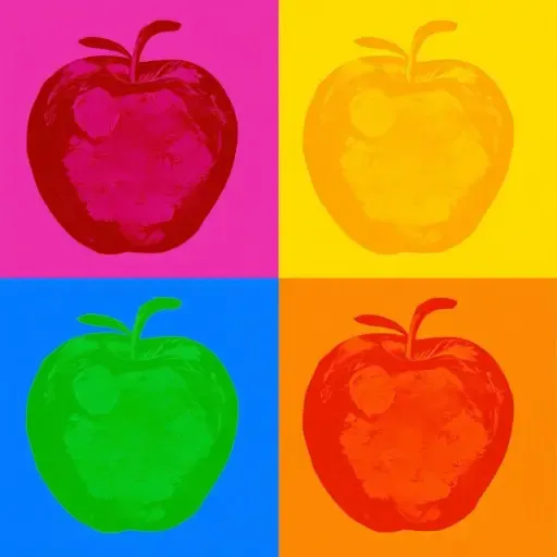
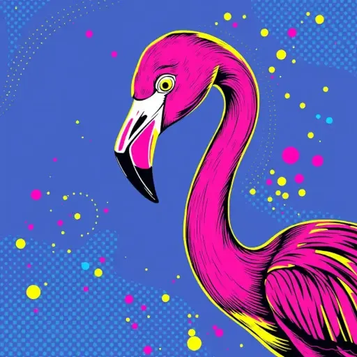
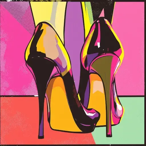
Image references
Create a pop art portrait from a photo
Upload a selfie, a couple or family shot, a pet photo or a product image and use it as a visual reference while the model regenerates it in a pop-art direction. Clear faces, strong lighting, a simple background and a tight crop give the best results. Reference images guide the subject and composition, but stronger stylisation can simplify or change smaller facial, clothing or product details, and individual faces drift more as a group scene gets busier.
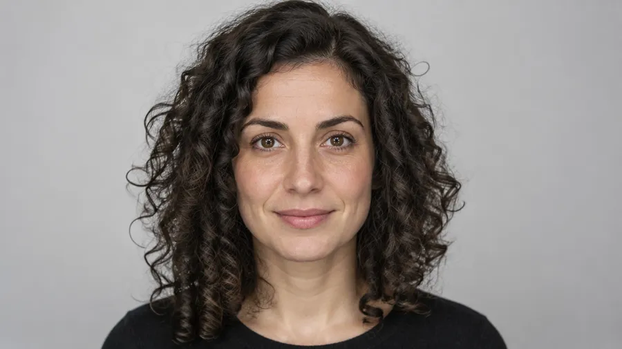
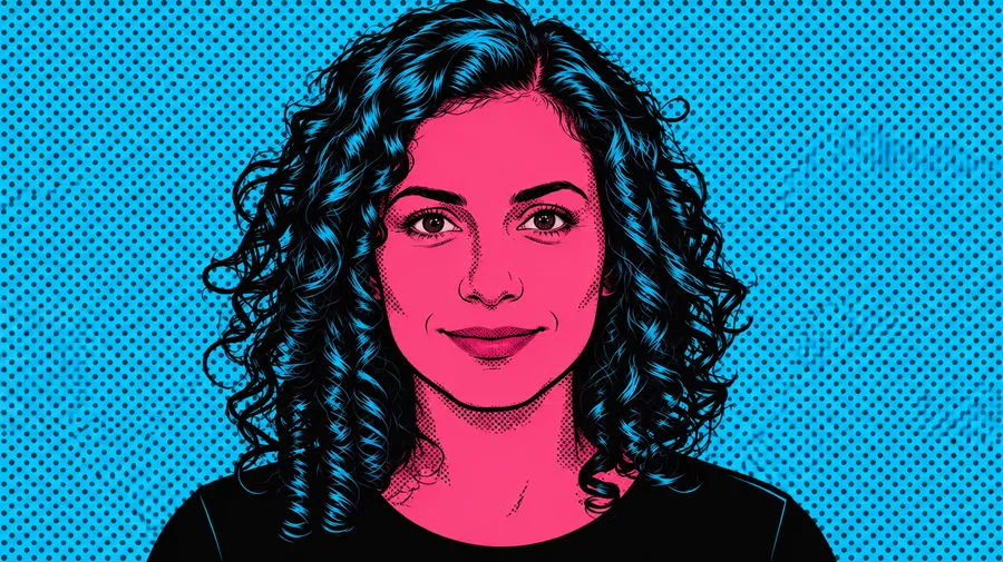
Pop art filter vs generative pop art
A pop art filter applies a fixed graphic treatment on top of an existing image: the pixels stay where they are and the result is predictable. Generative pop art reinterprets the picture. Colours, shapes, linework, texture and background are all redrawn while your source image guides the subject and composition.
That difference matters when likeness is important. Attach the photo as a reference through Image to Image when you want the person, pet or product to carry through, and expect smaller details to shift as the stylisation gets stronger.
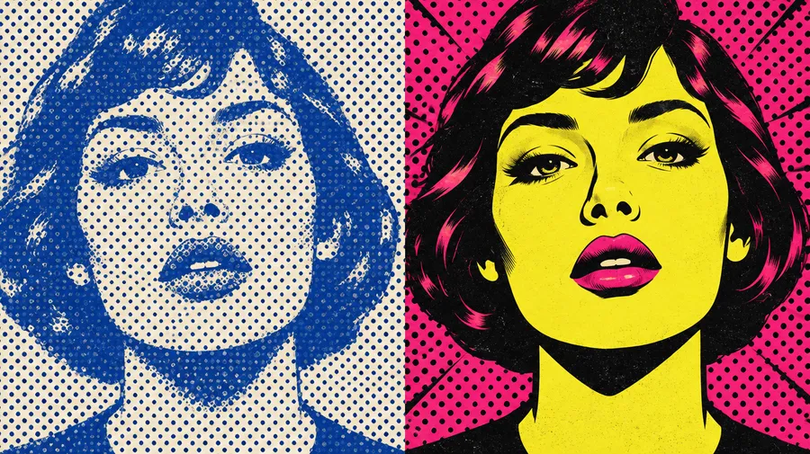
Explore screenprint, halftone and repeated-grid directions
Pop art is not one preset. Name the direction you want and the palette that goes with it: primary red, yellow and blue; neon magenta and cyan; high-contrast complementary pairs; pastel; monochrome with a single accent; or your own brand colours.
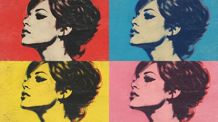
Screenprint-inspired portrait
1960s screenprint look: hard colour separation, minimal shading, visible print texture and a high-contrast face. Ask for four repeated panels in contrasting palettes to get the classic grid.
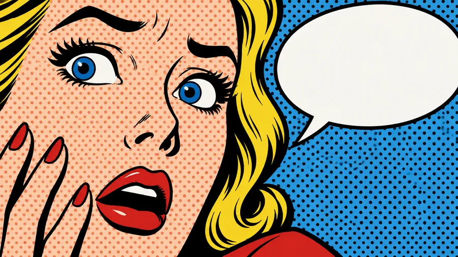
Comic halftone
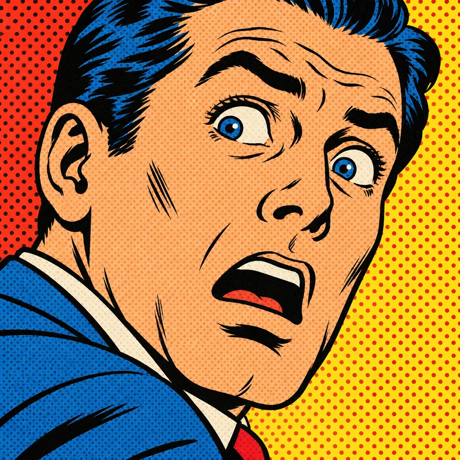
Bold black contours, flat red-yellow-blue colour, a regular Ben-Day-style dot pattern, minimal shading and a dramatic cropped close-up. This is the comic-print end of the movement.
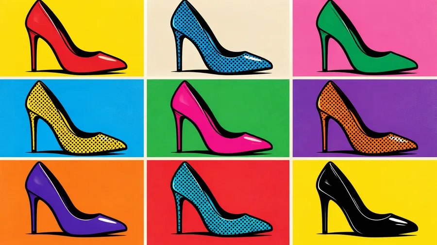
Repetition and grids
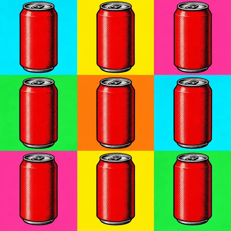
2x2 portrait grids, 3x3 product layouts, diptychs and four-panel arrangements of the same subject in contrasting palettes. Repetition is part of the movement's core vocabulary.
Turn products into bold campaign visuals
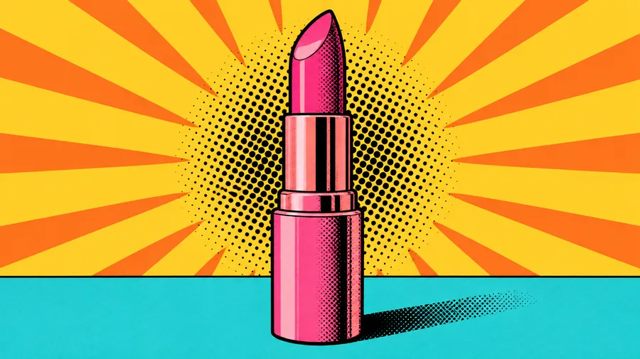
Cosmetics, drink cans, footwear, food packaging, fashion accessories: attach the product shot as a reference, set a pop-art direction, lock the brand palette and generate the channel variations you need. Then resize each asset with the AI Resizer and upscale the hero version with the Upscaler.
Add bold pop-art lettering and comic captions
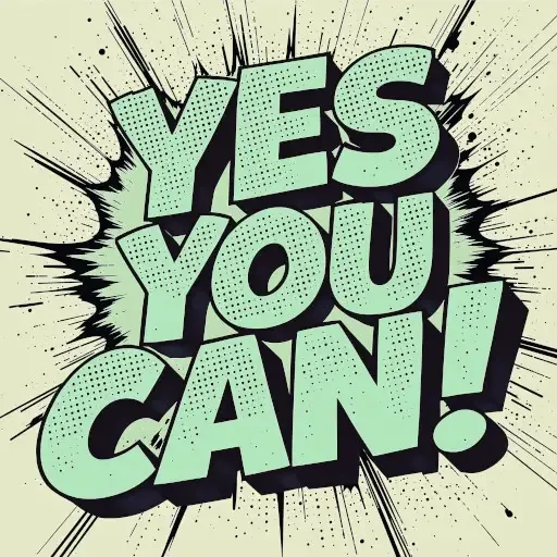
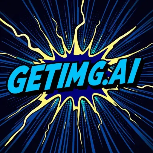
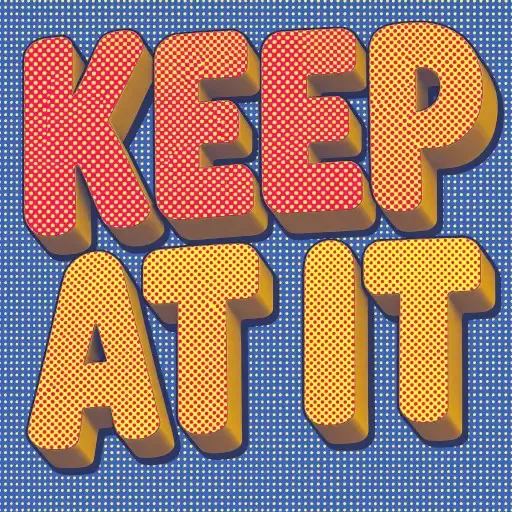
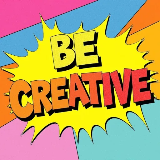
Use short headlines, speech bubbles, sound effects and retro display lettering as part of the generated artwork. Put the wording in quotes in your prompt, keep it to a word or two, and say where it sits: "speech bubble with the exact text 'NO WAY!', bold black outline, yellow halftone background". Generated lettering is part of the image rather than an installable font or a separately editable text layer, so review important wording before you publish.
Keep a consistent palette and style across a series
Save the product, the person, the style or the colour palette as an Element, then call it with @ElementName in every follow-up generation instead of re-attaching the same references. It is the fastest way to build a set of social posts, posters and campaign variants that clearly belong together. The Elements guide covers setup.
Elements guide consistency, but exact halftone placement, colour distribution and small graphic details still vary between generations, so review a series before you ship it.
AI pop art prompt examples
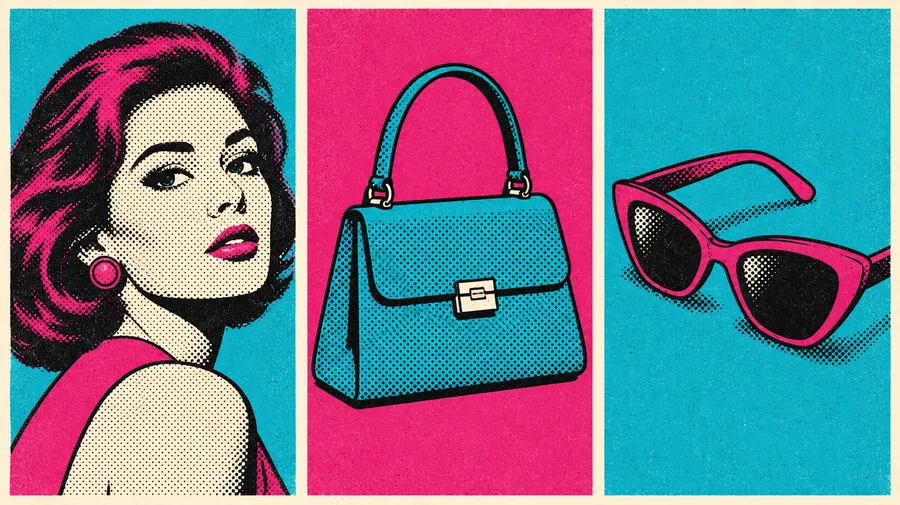
A prompt that works follows a formula: subject, pop-art direction, palette, outline style, halftone or print texture, repetition or layout, any text, background and intended use. More examples live in the AI Image Generation Prompt Book.
Portraits
Portrait prompts work best with a clear face, strong lighting and a simple background.
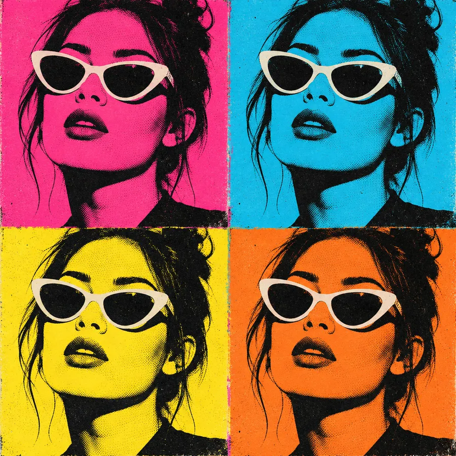
"Close-up portrait of a woman wearing white sunglasses, 1960s screenprint-inspired pop art, four-panel 2x2 grid, a different neon palette in each panel, hard colour separation, minimal shading, visible print texture."
"Turn the person in image 1 into a pop-art portrait, bold black contour lines, flat magenta and cyan colour blocking, halftone dot background, centred square composition."
How to get better pop art results
Most weak results come from a busy scene or a prompt that names a mood instead of a technique.
Composition
Give the image one clear subject and remove competing detail.
Frequently Asked Questions
Pop art is an art movement built on imagery from advertising, comics, consumer products, celebrities and mass media. Visually it relies on flat saturated colour, strong contrast, simplified shapes, bold outlines, repetition and techniques associated with commercial printing such as halftone dots and screenprint-style colour separation.
Yes. Attach the photo as a reference in Create image and describe the pop-art direction you want. The source image guides the subject and composition while the model regenerates it, so it is a restyle rather than a filter applied over the original pixels.
Yes. Selfies work well when the face is clearly lit, the crop is tight and the background is simple. Group portraits can be generated too, but individual facial details drift more as the scene gets more complex, so generate a few variations and pick the closest likeness.
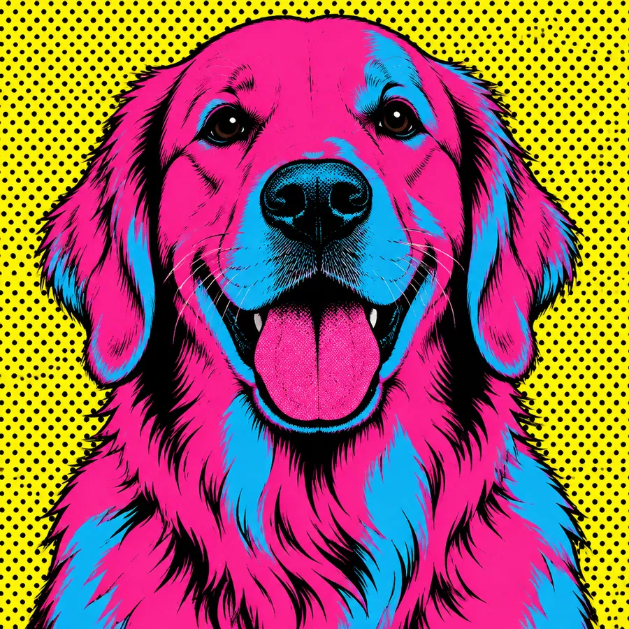
Yes. Upload a clear photo of the pet and name the markings you want preserved, such as floppy ears or a black eye patch, along with the palette and outline style. Pet portraits hold up well in flat colour-blocked treatments with a halftone background.
A filter applies a fixed graphic treatment to an existing image and leaves the composition untouched. Generative pop art reinterprets colour, shape, linework, texture and background while using your source image as guidance, which gives you far more control but can simplify small details.
Comic aesthetics are one ingredient of pop art, mainly through halftone dots, bold outlines, panels and speech bubbles. Pop art is the broader movement and also draws on advertising, consumer products, celebrity imagery and mass-media repetition, so comic styling is a subset rather than a synonym.
Yes. Ask for a regular dot pattern, bold black contour lines, flat colours and minimal shading in your prompt. You can also specify dot density and where the pattern sits, for example a coarse red dot field behind a high-contrast portrait.
Yes. Describe the layout directly: a 2x2 portrait grid, a four-panel arrangement or a 3x3 product repetition, and give each panel a different palette if you want the contrast between them. You do not need to name an artist to get the repeated-panel look.
Yes. Put the wording in quotes and say where it belongs, for example a speech bubble or a display headline. Keep it to one or two words for reliable rendering, and review the final wording before publishing.
No. It generates pop-art-style lettering inside an image. There is no TTF or OTF file, no installable typeface and no separately editable text layer. If you need a real font or an editable typography system, use a dedicated font or layout tool.
No. getimg.ai generates raster artwork as PNG, JPEG or WebP. You can prompt a clean vector-like appearance with flat colours and hard outlines, but if you need editable SVG paths for production or large-format work, the image will need to be vectorised separately.
No. The output can imitate screenprint texture and colour separation convincingly, but it is a digital raster image rather than a physical silkscreen print. Treat the screenprint look as a visual direction, not a production process.
Yes. Save the person, product, style or colour palette as an Element and call it with @ElementName in each generation. Elements guide consistency across a series, though halftone placement, colour distribution and small graphic details still vary between images.
Yes. Finalise the artwork first, then resize or upscale it to the pixel dimensions your printer or final physical size requires. For merchandise production, also check the printer's preferred colour space, bleed, transparency and file specifications.
Paid getimg.ai plans include commercial usage rights under our Terms. You remain responsible for rights to third-party photos, trademarks, logos, recognisable people and other protected material used in your prompts, references or final designs, so review the final image before commercial publication.