Nano Banana 2 Review: What’s New and Is It Better?

There was a moment, not that long ago, when image models and text had a complicated relationship. Then Nano Banana showed up and did what most models couldn’t: generate long, readable text without falling apart. Now, Nano Banana 2 has arrived, and naturally, expectations are high. But is it actually better? Let’s break it down.
Can't wait to try it? You can start generating & editing images with Nano Banana 2 in getimg.ai right now.
TLDR: Nano Banana 2 Review
- Nano Banana 2 (Gemini 3.1 Flash Image) is Google DeepMind’s latest AI image generation model and the successor to Nano Banana and Nano Banana Pro.
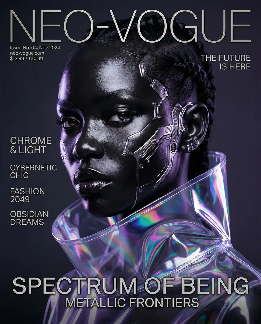
- It maintains industry-leading text rendering inside images, including dense infographics, UI mockups, and magazine-style layouts.
- Compared to Nano Banana Pro, it shows stronger photorealism, skin texture detail, cinematic lighting, and prompt accuracy.
- It is available in getimg.ai, where you can compare it side by side with other leading image models.
A Quick Recap: Why Nano Banana Went Viral
When the original Nano Banana dropped, it didn’t just improve text rendering. It bulldozed the problem.
Other models were cautiously getting better at letters. Nano Banana casually generated a full page of small, readable magazine-style text. Paragraphs. Headings. Structure. Only minor hiccups.
Then came Nano Banana Pro (Gemini 3 Pro Image). Text got even sharper. Alignment improved. Spacing made sense. Now we have Nano Banana 2 (Gemini 3.1 Flash Image).
So the obvious question is: is it actually better?
Infographics: Marginal Gains on an Already Elite Model
Let’s start with the obvious use case. Google’s own benchmarks put Nano Banana 2 only slightly ahead of Nano Banana Pro for infographics. And in our hands-on tests inside getimg.ai, that checks out. The results are extremely similar.
But that’s not a knock. Nano Banana Pro was already operating at “why are we even double-checking this?” levels of accuracy for dense data layouts, small typography, structured diagrams, and multi-column text.
Nano Banana 2 continues that standard. Clean rendering. Strong hierarchy. Reliable spelling. Good layout logic. If you’re using it for data-heavy design, you’re in safe hands. The bigger story is somewhere else.
Where Nano Banana 2 Really Improves: Visual Quality
When we wrote about Nano Banana Pro, we said something important. It was unbeatable for text-on-image work. It was a strong all-rounder. But for highly photoreal portraits or very artistic work, a few other models still had a slight edge.
Nano Banana 2 closes that gap. And in some cases, overtakes it.
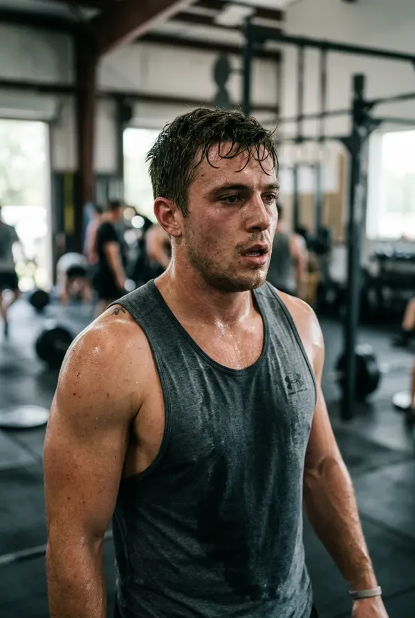
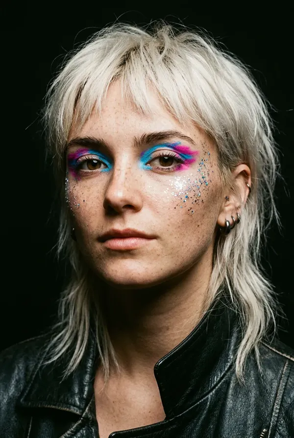
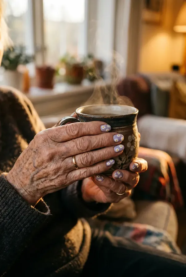
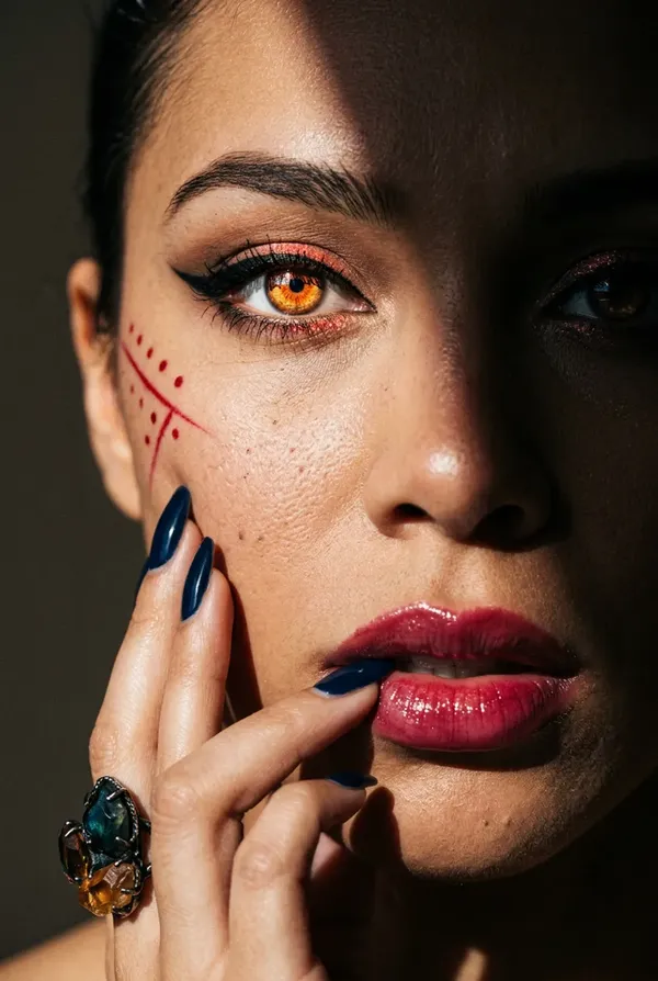
1. Skin, Texture, Detail
Portraits and other human-focused images now show:
- visible pores
- subtle skin texture
- natural light falloff
- less plastic smoothing.
Faces feel less like “AI portrait preset” and more like a real camera was involved.
2. Cinematic Lighting
Earlier versions sometimes produced images that looked a little flat.
Nano Banana 2 handles things like directional light, dramatic shadows, soft ambient glow, and depth in darker scenes much more confidently.
3. Abstract and Artistic Prompts
This is where it gets interesting.
Some models are great at realism but struggle when you ask for something slightly weird.
Nano Banana 2 follows complex, layered prompts more strictly. If you describe something surreal or concept-heavy, it sticks closer to the brief.
Nano Banana 2 Knows What You’re Talking About
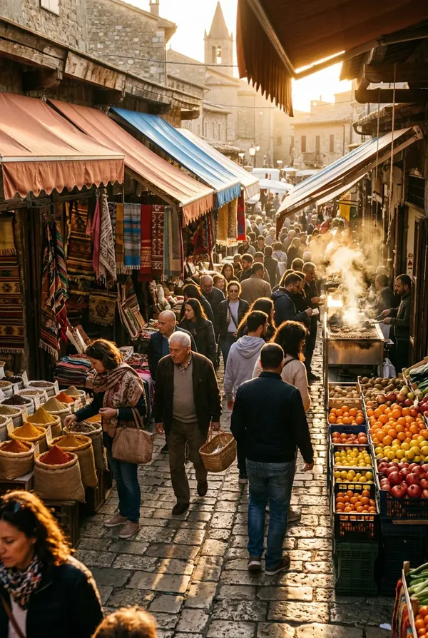
Nano Banana 2 leans heavily into Gemini’s broader world knowledge and web grounding.
That means you can reference real places, real objects, and real historical contexts, and get more grounded outputs.
For content creators, this opens the door to location-aware travel visuals, historically accurate scenes, educational content, and context-rich marketing images.
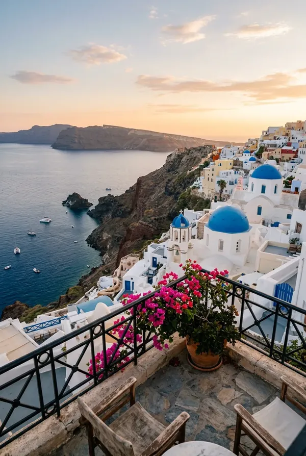
Photoreal view from a small balcony overlooking Santorini, whitewashed buildings with blue domes, steep volcanic cliffs, Aegean Sea in the distance, golden hour lighting, realistic depth
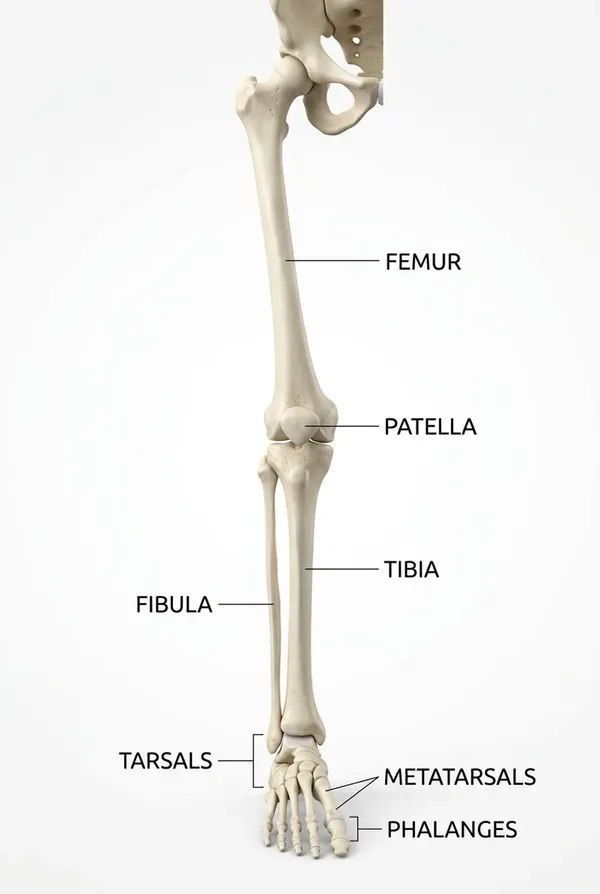
Detailed educational infographic of the human leg bones labeled correctly, clean typography, anatomically accurate structure, white background
It understands the world better, so the images feel less generic.
Text Rendering and Localization: Still a Power Move
If text rendering was Nano Banana’s breakthrough moment, Nano Banana 2 refines it even further with improved in-image localization. That means translating text directly within an image while maintaining the layout.
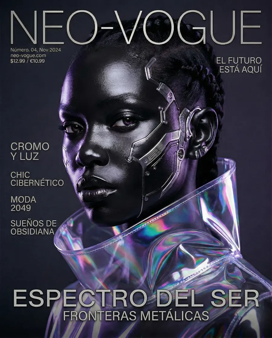
If you’re building a tool that generates social ads, posters, product mockups, UI screens, or marketing materials at scale, you can now easily handle multilingual outputs without manually rebuilding everything.
For teams operating internationally, that’s not a gimmick. That’s leverage.
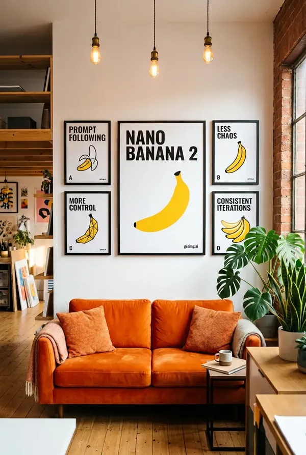
Consistency and Instruction Following
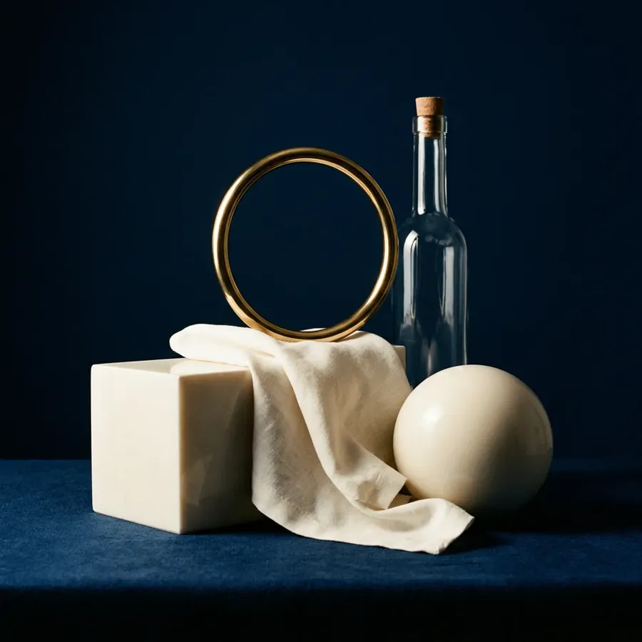
One subtle but important improvement is stricter adherence to complex prompts.
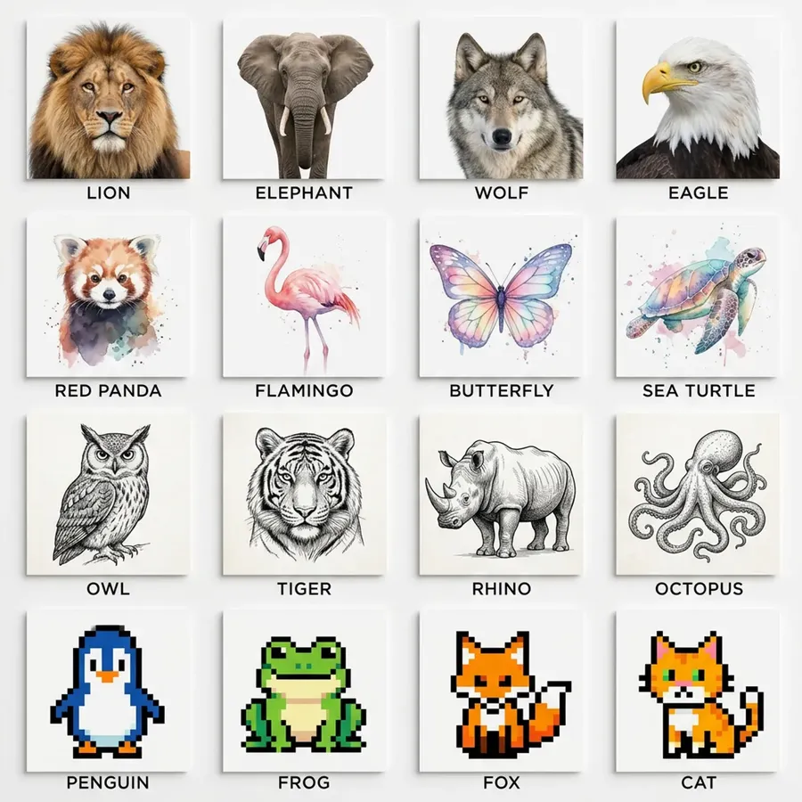
Create a 4x4 grid of square panels. Each panel contains a different animal illustrated in a distinct artistic style. Top row must be realistic photography. Second row must be watercolor style. Third row must be black and white ink sketch. Fourth row must be retro pixel art. Centered under each panel include the animal name in small uppercase letters. Clean white background, balanced spacing.
Create a surreal still life composition using only three colors: deep blue, ivory, and gold. Include exactly five objects: a sphere, a cube, a folded cloth, a metallic ring, and a glass bottle. Arrange them in a triangular composition. Dramatic studio lighting.
That also means better consistency, and consistency is gold if you’re generating character-based content or creating branded assets.
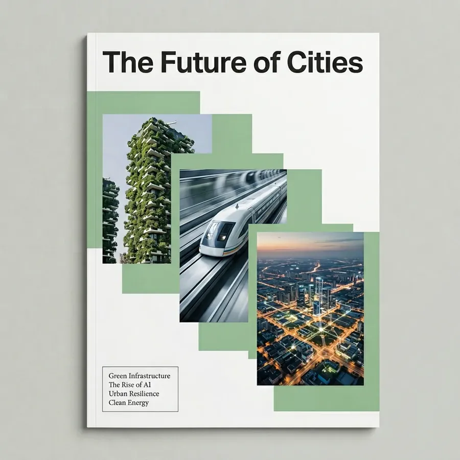
Modern magazine cover design. Title “The Future of Cities” centered at the top. Place exactly three overlapping rectangular image blocks diagonally across the page from top left to bottom right. In the lower left corner include a small text box with exactly four short teaser headlines in smaller font. Minimalist design, muted color palette.
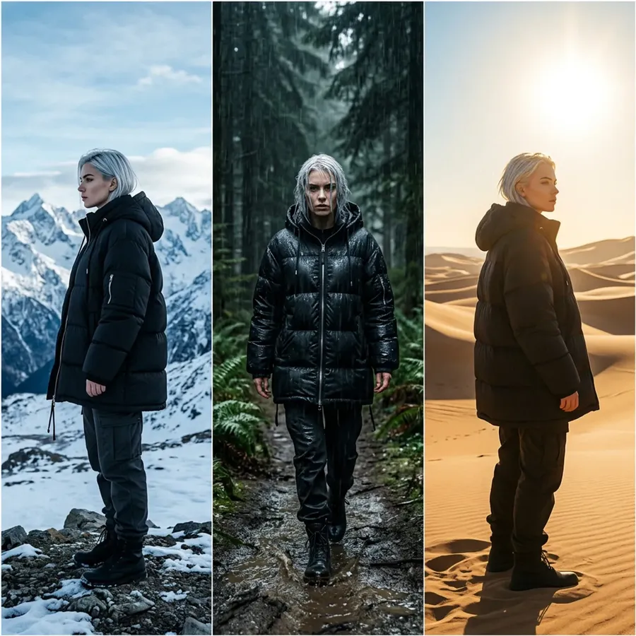
Single image divided into three vertical panels. Each panel shows the same young woman with short silver hair, dressed in trendy streetwear. Panel one: standing in snowy mountains, turned to the left. Panel two: walking through a rainy forest at night, facing forward. Panel three: in a sunlit desert landscape, turned to the right. She must retain identical facial features, hair, and coat in all three panels.
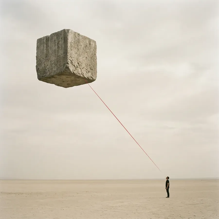
Minimalist surreal composition. In the upper left quadrant place a large floating stone cube. In the lower right quadrant place a small human figure facing the cube. A thin red line must connect the two diagonally. Pale beige background, lots of negative space.
It reduces babysitting… especially when you combine this model with our new Elements feature, which lets you save reusable building blocks (people, styles, color palettes, products, and so on).
So… Is It Worth Switching?
If you already love Nano Banana Pro for infographics and text-heavy designs, Nano Banana 2 won’t shock you there. It’s more of a refinement.
But if you also care about:
- high-end portrait realism
- cinematic lighting
- rich textures
- more artistic flexibility
- stronger prompt obedience.
Then yes, it’s a noticeable step forward. Think of it less as a reinvention and more as Google tightening every screw.
The viral moment happened with the original. The professional polish came with Pro. Nano Banana 2 feels like the version that wants to compete everywhere.
You Can Try It Right Now
Nano Banana 2 is available in getimg.ai, alongside Nano Banana, Nano Banana Pro, and other leading models from other labs.
Which means you can test the same prompt across models and compare outputs side by side. Push it with text-heavy layouts or see how far you can take photoreal portraits. Believe us, you’ll be impressed.
If the first Nano Banana felt like the “wow” moment for text in image generation, Nano Banana 2 feels like the one that says:
“Okay. Now let’s do everything else properly too.”
And honestly, that’s a pretty good place for a banana to be. 🍌
Frequently Asked Questions
Related Articles